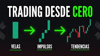

Japanese Candlesticks Explained Simply
51sVisually clear explanation of a core trading concept that is essential for beginners and often misunderstood.
▶ Play Clip"The title promises essential trading terms and delivers a thorough explanation of key concepts, though it's more educational than a quick cheat sheet."
This video covers essential trading chart analysis concepts, including Japanese candlesticks, timeframes, trends, support and resistance, chart patterns, breakouts, and moving averages. It explains how to interpret price action using impulses and retracements to make informed trading decisions.
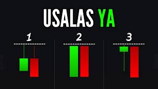
Japanese candlesticks are the primary way to view charts. Green candles indicate upward movement, red candles indicate downward movement.
Timeframes determine the speed of chart movement. Faster timeframes (e.g., 30 seconds) are less secure; longer timeframes (e.g., 15 minutes) provide more reliable analysis.
An uptrend has stronger upward movement (more green candles), a downtrend has stronger downward movement (more red candles), and a sideways market has equal movement in both directions.
Impulses are larger movements that advance with more volume; retracements are smaller counter-movements. In a trend, impulses are larger than retracements. In a sideways market, they are equal.
Support is a level where price tends to reverse upward; resistance is where price tends to reverse downward. These levels act as walls and remain static unless broken.
Dynamic support/resistance lines move diagonally, forming trend channels. In an uptrend, dynamic support is at the bottom; in a downtrend, dynamic resistance is at the top.
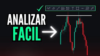
Chart patterns like head and shoulders or channels help predict trend reversals or continuations. A channel is defined by parallel support and resistance lines.
A breakout occurs when price breaks through a support or resistance level, signaling a potential trend change. A pullback is a retracement after a breakout, offering an entry point.
Exponential moving averages (e.g., 35 and 50 periods) can act as dynamic support/resistance. When above price, they indicate a downtrend; when below, an uptrend.
Understanding these foundational concepts—candlesticks, timeframes, trends, support/resistance, impulses/retracements, and moving averages—enables traders to analyze charts effectively and execute more informed trades.
What is a Japanese candlestick?
A Japanese candlestick is a charting element that shows price movement over a specific timeframe. Green candles indicate upward movement, red candles indicate downward movement.
00:13
How does timeframe affect trade security?
Faster timeframes (e.g., 30 seconds) are less secure because movements are faster and less significant. Longer timeframes (e.g., 15 minutes) provide more secure analysis.
02:51
What defines a downtrend?
A downtrend is when the chart moves with greater force downward, characterized by more red candles and larger downward impulses.
03:30
What is an impulse in trading?
An impulse is the movement that advances with the most volume and largest size on the chart, representing the dominant trend direction.
06:22
What is a retracement?
A retracement is a smaller counter-movement against the impulse. In a trend, retracements are smaller than impulses.
06:49
How do impulses and retracements behave in a sideways market?
In a sideways market, impulses and retracements have the same size, causing the chart to move within a range.
08:53
What is a support level?
A support level is a price level at the bottom of the chart where price tends to pause and reverse upward, acting like a wall.
09:34
What is a resistance level?
A resistance level is a price level at the top of the chart where price tends to pause and reverse downward, acting like a wall.
11:27
What is a dynamic support or resistance?
Dynamic support/resistance is a diagonal line that moves with the trend, marking changing price levels where the chart tends to reverse.
12:48
What is a breakout?
A breakout occurs when an impulse move breaks through a previously established support or resistance level, signaling a potential trend change.
17:46
What is a pullback after a breakout?
A pullback is a small retracement after a breakout, which can be used as an entry point in the direction of the breakout.
19:42
How can moving averages be used as dynamic support/resistance?
When moving averages are above price, they act as dynamic resistance (downtrend). When below price, they act as dynamic support (uptrend).
21:17
Japanese Candlesticks Explained
Fundamental concept for all chart analysis; green/red candle interpretation is the starting point for traders.
00:13Timeframe Impact on Trade Security
Critical insight: longer timeframes provide more reliable signals, guiding traders to choose appropriate timeframes.
02:51Impulse and Retracement Dynamics
Core principle of price action: trends are built on larger impulses and smaller retracements.
06:22Support and Resistance as Walls
Clear analogy helps traders understand key levels where price tends to reverse.
09:34Moving Averages as Dynamic Tools
Practical application of moving averages to identify trend direction and entry points.
21:17[00:01] most important terms you need to know to analyze your charts correctly and profit from trading, from what a candlestick is, to what support and resistance levels are, and indicators. So grab your notebook and stay until the end of this
[00:13] video. Okay, traders, let's begin. What is a Japanese candlestick? Remember that when use Japanese candlestick charts. Regardless of your trading style, you can view your charts in different ways, and
[00:26] most of us understand them using Japanese candlesticks. When you open your charts, you might see them as hollow candlesticks, volume candlesticks, or even as lines, but most of us use
[00:39] Japanese candlesticks, which is the best way to understand them. No matter how you view your charts, remember that the timeframe is fundamental. Each of these candlesticks is how we
[00:52] determine how our chart is moving. If our chart is moving upwards, you'll see it represented by an upward-moving candlestick, a green candlestick. If you see your chart moving
[01:06] represented by a red candlestick. And that's how most people... We understand our charts. When we see our chart start showing many red candles, we know that our chart, or our
[01:19] asset, is moving downwards. When we see our chart our chart is moving upwards. So, Japanese candlesticks are the way we view our charts. But it's also
[01:33] important to understand the timeframe. The timeframe represents how quickly our charts move and how quickly these candlesticks move. Here, with the timeframe, you can select how you want to view
[01:46] your charts. The faster the timeframe, the example, if I select a 30-second timeframe, regardless of whether
[01:58] I have an up or down candlestick, each candlestick represents 30 seconds. If I increase the timeframe to one minute, then my chart changes slightly because now the representation, or
[02:13] the way we view our charts, represents one minute. Each candlestick, whether it's a large candlestick, a red candlestick, a green candlestick, or a small candlestick, represents one minute. So, the timeframe represents how
[02:25] quickly... We look at our charts, and this can be fundamental since each of us can interpret the same chart differently. For example, here I have a one-minute timeframe, and I see that my
[02:38] chart is moving downwards. But what happens if I change the timeframe to 15 minutes? Now I see that my chart is moving upwards. So it's important to select the timeframe that works best for your
[02:51] trading and your strategies. The timeframe represents the speed at which our chart moves, something you should know. The faster the timeframe, the less secure your trades will be, since you
[03:04] 're seeing faster movements that are likely less significant. The longer the timeframe, the more secure your analysis and the more secure your trades will be. So, use the timeframe that works best
[03:18] for your strategies. Once we understand what Japanese candlesticks are and what the timeframe is that we use to view our charts, what a downtrend is, and what an uptrend is, we can our charts, what a downtrend is, and what an uptrend is, we can
[03:30] our chart has greater downward momentum. Therefore, when you have a downtrend, you can see that your chart is... Moving with greater force downwards in the case of an uptrend is the opposite; it's
[03:44] when your chart is moving with greater force upwards. For this reason, in a downtrend, you are more likely to see many more red candles since, as the chart has downward force, the candles with
[03:57] greater force are the red candles, which are bearish candles. In the case of an uptrend like the one we have here, the candles with greater force are more likely to be green candles because the chart
[04:10] is moving upwards. So, the green candles represent greater upward force. But what happens if my chart doesn't move up or down, if it has no force in either direction? Well, that's when
[04:22] we understand our charts as a sideways zone. We already had a downtrend, we had an uptrend, but a sideways market is when you have the same amount of movement; you don't see many
[04:35] because the chart is moving sideways. In a downtrend, you see the force in the downward movements; in an uptrend, you see the force in the upward movements. In a sideways market, you see that your chart lacks
[04:50] strength in either direction. Remember that if you want to start in the world of trading and open your first trades in both forex and of this video you have the links to the brokers and
[05:03] trading platforms I use so you can open an account and begin trading. my private trading academy, we have a specific contact number you can information about mentorships. So, let's continue. When you have a
[05:18] downward trend, you should always try to enter at the top of this trend because it's at the top that
[05:30] depth. Since our chart is moving more strongly downward, if you trade at the top of the trend, that's where your chart advances with greater depth. In the case of an upward trend, and
[05:43] your chart tends to move further upward, then you should always try to trade at the bottom of your trend because it's at the bottom that impulse movements begin and advance with greater depth. For
[05:56] this reason, in a sideways area like... You don't have a preference for either up or down. Well, in a sideways zone, you can trade on both sides of the structure. Since our chart doesn't tend to go up or
[06:09] down, it doesn't matter, as your chart will continue to move within these two extremes. Now, why does a trend advance more in one direction than the other? Because we have impulses and retracements, and both an uptrend and a downtrend,
[06:22] impulses and retracements, and both an uptrend and a downtrend, general, move with impulses and retracements. But what is an impulse? Quite simply, an impulse is always the movement that advances with the most volume, the
[06:35] largest size, on our charts. That's why sometimes you see movements like these, movements that advance a lot downwards or that advance a lot upwards, and an impulse always represents the movement that advances the most on our
[06:49] chart. Our charts always move with impulses and retracements, or we can also call them waves. So, pay attention: in a downtrend, since it has downward strength, the impulses are always the movements
[07:04] that advance the most, and the retracements are the movements that advance the least. And generally, the retracements are always limited by the impulses. What do I mean by this? For example, here in a downtrend, the force is
[07:17] bearish, so the impulse or the movement that advances the most is a comes to mind when you hear the word impulse: a movement that advances a lot, a movement that advances with great depth. And a retracement
[07:32] is always the smallest movement that you will be able to see on the charts. For this reason, we call them impulses and retracements. You can see that here my impulse is the movement that advances the most, and the retracement is the movement that advances the least. The
[07:45] impulse advances more, the retracement advances less, and in an uptrend or a downtrend, the impulses will always be larger than the retracements. That's how a trend is formed. So when
[07:58] you have a trend, you will see your charts like this: impulse (larger movement), retracement (smaller movement), impulse (larger movement), and so on. In the case of an uptrend, it's the opposite,
[08:14] but it works the same way. You can see here that in my trend, which goes more upward, you can see how the impulses are the larger movements, and you see them represented in the same way. Only, since it's upward...
[08:26] So, my impulse is all green candles that advance much further, and the pullback is always the smaller movement. The impulse, pullback, and the next impulse is again a movement that advances with greater volume or a
[08:40] larger size. That's why in a trend you have it like this: impulse that advances plus a small pullback, impulse that advances plus a small pullback, impulse that advances plus a small pullback. And that's how a trend is formed, with impulses
[08:53] always larger than pullbacks. But in the case of a sideways market or a sideways zone, you can see that the impulses and pullbacks have the same size. That's why the chart stays in a sideways zone. Because all my
[09:07] movements, both impulses and pullbacks, have the same extent. My impulse advances this size, but my pullback is no longer smaller; it reaches the same point as my previous impulse. That's why the chart stays in a
[09:20] sideways zone when the impulses and pullbacks have exactly the same size. So that's how our charts are formed: impulses, pullbacks, processes, bullish trends, bearish trends, and sideways markets. Now, a very
[09:34] basic fundamental of trading: What is support? What is resistance? And what is a channel? Or a trend channel? Well, quite simple: we will always mark support at the... The bottom part of our chart is this line we
[09:48] marked, where we can see that our chart has moved and paused. Literally, a support level is like a wall. Imagine your chart is moving in a downward trend, but when it reaches a certain price, it
[10:02] reverses upward. Well, at this point where your chart reverses, we mark a support level. Support levels are always marked at the bottom, and it's a line we mark that we'll use as a
[10:15] reference in the future. For example, here I saw that my chart respected and reached this point. So I marked a line where my chart pauses; this is a support level. My chart reaches this point and pauses; it reverses
[10:30] upward. Perfect, it changes from an upward impulse to a pullback. So this is a support level, and we use a support level as a reference to see that our chart will reach the support line again. Then we know that our chart will
[10:44] start to reverse upward. That's what support and our chart, it's reaching the support line and starting to reverse upward because, as I was saying, support and resistance levels... Resistance levels function like
[10:58] a wall, but in the case of support, you always mark it at the bottom when you see your chart move and a momentum pause. You mark that as a support line, and you know that probably in the future, when your
[11:12] chart reaches this support again, it will respect it. Those are support lines. And if that's a support, what is a resistance? It's worth resistance always stay in the same place. Here, where I marked my
[11:27] support line, it doesn't matter. If my chart continues to move for 3 hours, the support always stays in the same place. And most of our trades to know if a chart will go up or down are based
[11:40] on support and resistance because they are places where we can see that our chart has already respected it, reached the wall, and changed. That's how a support works. So, if we mark a support level to know that our
[11:53] chart will change from bottom to top, well, a resistance is the opposite. A resistance is marked at the top of your chart, which is when an upward movement changes to a downward one. The same as a
[12:07] support line, but at the top. A wall that our chart could no longer break through. For example, here I saw that when my chart reached this point, it reached it and went back down, reached it again, and went back down. So the
[12:20] exact point where my chart changed is a wall. At the top, it's a resistance, and at the bottom, it's a support. And as I was saying, it always stays in the same place. So we can determine that when the chart
[12:34] touches this wall of support or resistance, our chart can change. And a support and resistance always stay in the same place. Now, what is a dynamic support and resistance? A normal support and
[12:48] resistance is when our chart keeps bouncing, but our line doesn't change. Imagine that this is price one, and my chart keeps bouncing at price one in the same place. But a dynamic support and resistance
[13:00] is when a resistance or support line moves diagonally. It's no longer the same price. I see that my chart respected price one, then price two, and now I expect my chart to respect price TR. But it
[13:16] works the same way. A dynamic resistance will always be marked at the top of your chart, and in the case of In a downtrend, everything makes sense. As I mentioned at the beginning, in a
[13:28] downtrend, you'll trade at the top because that's when your chart dynamic resistance line will help you determine at what point your chart will change and continue its next impulse move. It works
[13:43] the same way, only the price is constantly changing. In the case of dynamic support, it's exactly the same. If we mark normal support levels at the bottom of my chart, well, in an
[13:57] uptrend, dynamic support is also marked at the bottom, and everything makes sense again. In an uptrend, we trade at the bottom, and we know that support and resistance levels are when
[14:11] our chart usually changes. When a trend reaches my diagonal support line or dynamic line, then we see that our chart begins its next impulse move. And why
[14:24] impulse? Because in a trend, an impulse is always the movement that advances the most. So, those are normal and dynamic support and resistance levels. Now, what are chart patterns?
[14:37] Chart patterns help us determine when a chart might change from one movement to another. As I explained, an uptrend is always the movement that moves further upward, and if it changes to a downtrend, then my chart
[14:51] will start moving further downward. Chart patterns are literally those patterns that we can see or identify on our chart. When we see them repeating, then we know a
[15:05] change in movement is coming. For example, here I have a very basic chart pattern called the head and shoulders. This pattern helps us determine that what was an uptrend is now going to change to a downtrend. So that's
[15:18] a chart pattern. We can identify a head and shoulders pattern here, which tells us that if my chart had upward momentum, it will now start to have downward momentum. The impulses that had upward momentum will now have downward
[15:32] momentum. And we can use these patterns as a reference to place our trades, to know when the chart is going to go up or down, and where I'm trading. Well, quite simply, with a
[15:45] resistance line. And remember that a resistance line is always marked at the top of the chart, and with a chart pattern, you can then identify the change. A chart pattern is more than just a structural pattern and a change in movement; it's
[15:58] a figure you can identify on your chart to know if it's going up or down. Within chart patterns, you should know that a downtrend or uptrend counts as a chart pattern. For
[16:11] example, a downtrend channel is a chart pattern. What do you understand by the word "channel"? Imagine a water channel, a water channel that keeps bouncing between two extremes. What are these two extremes? Easy: support at
[16:25] the bottom and resistance at the top. For example, a downtrend channel is when your chart keeps bouncing between two extremes, like a water channel, but with a downward preference, between support and
[16:40] resistance levels. An uptrend channel is when your chart keeps bouncing between two extremes in the same way, between support and resistance, only now this channel has upward strength and
[16:54] keeps bouncing between my dynamic support and resistance lines. And remember that we will always trade an uptrend market at the bottom of the trend, and a sideways channel... what do you think? Imagine a sideways channel, like
[17:08] a water channel. The chart keeps bouncing between two extremes. What are our extremes? Easy, our support and resistance lines. These are normal support and resistance levels because, since there are no
[17:22] larger impulses than pullbacks, my chart keeps bouncing between the two extremes. This way, we can determine that when the chart keeps bouncing between the two extremes, when it reaches the
[17:34] support, we can buy because we know our chart will go up. And when it reaches the resistance, we can sell because we know our chart might go down. This is how our chart patterns are formed. And finally,
[17:46] traders, what is a breakout? When an impulse move breaks through the zone we had confirmed. For example, here I had my sideways channel. The chart doesn't have a preference in any sense. If an impulse breaks strongly and breaks through this
[18:02] channel, that's a breakout. When you have a move that breaks through the last zone you had, that is, when a move no longer respects either your support or resistance line, that's a breakout. The
[18:16] exact move, or the exact moment when a move ends with the zone you had marked, for example, here I had a trend towards Upwards, each impulse is bigger than the previous one. Here I mark my support line. My
[18:31] support line, or a support, always goes at the bottom. Now, a breakout is when an impulse move no longer respects my support line. There you can see that a move no longer respected my support. This represents a breakout. And that's
[18:47] when you... You can also identify a change in structure. What you had as an uptrend changes when you have a move that breaks your support or resistance line. You know that now your chart can change.
[19:01] And instead of having larger upward impulses, you can now start having larger downward impulses, and that completely changes the structure of your chart. Because remember what I mentioned at the beginning of this video, which is that
[19:14] the key in an uptrend is to trade on the downside. But when I see that a move has broken my zone and now my chart is going to change downwards, well, now I have to stop buying and start
[19:28] selling because now my chart will start to stay in a downtrend, and now I have to start trading on the upside. What served as support now becomes resistance because it will now be at the
[19:42] top of the chart. And now, to enter a trade, you can use what we call a pullback. And what is a pullback? A pullback is a retracement. Look closely here: a pullback is a retracement after a
[19:55] breakout. I mentioned it at the beginning of this video: an impulse is always the A movement that advances with greater depth is perfect, and a pullback can never exceed the impulse. So this small pullback is what
[20:09] we call a pullback or a trigger. So, for example, here my chart starts to settle in a downward trend, and in a downward trend, I need to enter at the top of my chart. So,
[20:22] to be able to enter, I have to wait for a small pullback, which is what we call a pullback. There you can see. Look, impulses are larger than pullbacks. The chart makes a pullback, and here we know that my chart
[20:35] will then begin to give me a next impulse move because now it starts to settle in a downward trend. You should always understand charts in two parts: impulses and pullbacks. An impulse is the movement that advances with
[20:50] greater depth, and a pullback is always the movement that advances less. So, an impulse is like this: the movement that advances with greater depth, and a pullback is the movement that advances less. And by understanding these
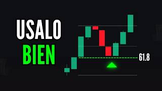
[21:02] concepts, you will be able to have a better analysis. And all of this that I use as a roadmap—supports, resistances, tools like Fibonacci, moving averages—is what we call a charting tool. A
[21:17] charting tool is the set of tools that we use to understand all our charts. There are many different methodologies in trading that use many different tools, but here I'm going to show you the
[21:31] you have an upward or indicators tab and select two exponential moving averages (EMAs). You should configure the first moving average to 35
[21:46] periods in blue, and the second moving average second moving average to 50 periods in white. What is this tool for? Well, it's quite simple. When you open a
[22:00] chart and see that the lines or the indicator on your charting tool are above your chart, you know that your chart has a downward trend. You're going to use the same tool or the same moving average as
[22:14] dynamic resistance to place your trades. Every time your chart reaches the moving average again, you're going to place your trades downward because in a downtrend, the price always moves more strongly downward. And when your
[22:28] moving average is below your chart, you know that your chart is moving strongly upward, and you're going to use the same line or the same moving average as dynamic support. And that's where you can... Look for
[22:42] your trades, but don't forget that in an uptrend, you'll always trade on the downside. I hope you're taking notes on all of this concepts, then you won't be able to have a good analysis in trading. And this
[22:56] moving average tool is the easiest of all because if I see that they are above the chart, I know that my chart is moving down; if they are below, I know that my chart is moving up. And this
[23:08] helps you understand where on your charts you should trade. If it's above, then I'm going to trade on the upside of my chart. In a downtrend, every time it reaches the line, perfect. If now the moving average
[23:22] crosses below, well, I'm going to trade on the downside because now my chart is moving up. And with these concepts, you can start to analyze your charts in a better way and thus understand when you
[23:34] have an impulse or a pullback. And this will lead you to have perfect trades in training. But don't forget the most important detail: all our charts, regardless of whether we see them in Japanese candlesticks, small timeframes, or
[23:47] large timeframes, always move in two parts. So you can't understand your charts based on a single candlestick. Every time you see an impulse, you must identify its retracement, impulse with retracement, and so on. This is how you'll come to
[24:00] understand price action and be able to make enjoyed this video and learned something new, some concept you like this video and tell me in the comments what you'd like us to
[24:14] explain in future videos. Here's a link to our next video; be sure to click on it, and we'll see you next time, traders!
⚡ Saved you 0h 24m reading this? Transcribe any YouTube video for free — no signup needed.