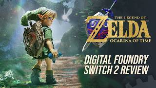
[00:21]
Heat. [music]
[00:34]
>> There aren't many series that can claim to have genuinely influenced the course of gaming history with each new release, but The Legend of Zelda is arguably one of the select few. and its first 3D entry, Ocarina of Time, is arguably one
[00:48]
of the most important games ever made, helping define what was possible in a 3D space by bringing together countless new ideas into a single cohesive experience. Now, nearly 30 years later, Nintendo is revisiting Ocarina of Time for the
[01:03]
second time with a brand new remake for Nintendo Switch 2. So, for this special occasion, we're examining three generations of Valkcarina of Time, the revolutionary N64 original, the enhanced 3DS remaster, and the brand new Switch 2
[01:19]
remake. How do they compare? What was gained, and what was lost along the way? So, sit back, relax, and join us as we take a journey through one of Nintendo's take a journey through one of Nintendo's most celebrated games.
[02:02]
inseparable from the Nintendo 64 itself. Nintendo was making the leap from 2D Pixar to fully 3D worlds at a time when there were few established rules for game design in three dimensions. Following the success of Super Mario 64,
[02:17]
where they pulled this off brilliantly, anticipation quickly shifted to Nintendo's next challenge, bringing The Legend of Zelda into 3D. Initially known Legend of Zelda into 3D. Initially known as just Zelda 64, the project captured
[02:31]
imaginations after its debut at Spacew World 95 with screenshots and footage offering a tantalizing yet rather basic look at what was to come. Imaginations ran wild and after 3 years of anticipation, The Legend of Zelda:
[02:45]
Ocarina of Time finally arrived in late 1998. To fully appreciate what was accomplished, though, it's important to consider the challenges Nintendo faced. The formula had already been established
[02:58]
by A Link to the Past. You explore Hyrule, conquer puzzle-filled dungeons, acquire new tools and abilities, and ultimately go on to defeat Ganon. Translating that design into a full 3D world, however, required Nintendo to
[03:11]
rethink nearly everything. You see, unlike Mario, Link relies on a vast arsenal of items and abilities that are all completely different from one another. So, how would those work in 3D? How do you build truly intricate
[03:26]
dungeons in a 3D space while still challenging the player without frustrating them? What about combat and movement? These were problems that few developers had solved at this point. Nintendo's answers were remarkably
[03:40]
elegant. The dynamic camera smoothly tracks the player through the world, while Ztargeting allows the player to lock onto enemies and important objects with a single button press. It seems obvious in retrospect, but it was a
[03:53]
breakthrough that solved one of 3D gaming's most persistent problems, camera control. Movement was similarly refined. Rather than relying on a dedicated jump button, Link automatically vaulted gaps and climbed
[04:06]
ledges where appropriate. This contextual system made navigation easy to understand while giving the designers the confidence to build out more intricate environments and dungeons, and those dungeons are essential. Zelda's
[04:20]
identity has always been built around atmospheric puzzle solving, often centered on newly acquired items. Consider the hook shot. In a game like A Link to the Past, potential targets were always obvious from the top- down
[04:33]
perspective. But in 3D, players can look anywhere, forcing Nintendo to establish clear visual rules and iconography that communicates exactly what you can grapple onto. And that gets to the heart of the genius of Ocarina of Time.
[04:47]
Nintendo embraced complexity, but they grounded it in a set of consistent, readable rules that made the players feel clever rather than frustrated. Then perhaps quaint from a modern perspective, Ocarina of Time was a
[05:03]
release, making excellent use of the Nintendo 64 hardware, the system can render very large triangles without distortion while deploying texture
[05:15]
filtering and hardware anti-aliasing to smooth out the presentation. The key here is that they were able to do these massive maths with large surfaces to walk across. And due to its limited texture cache, N64 games often suffered
[05:28]
from very poor quality texture work. But I think Nintendo was very strategic in its texture selection. You look at something like the ground texture, which you see all the time. These are higher resolutions than the surfaces you spend
[05:42]
less time close to. It's about picking and choosing where to use the resources. I also love things like the water rendering. Nintendo basically deploys these two flat water textures that simply scroll infinitely in opposing
[05:56]
directions. It's a simple effect, but when viewed at the native 240p resolution, it takes on this almost magical like effect, making it appear more detailed than it actually is. There was a lot of effort poured into creating
[06:11]
these sorts of effects. Ocarina of Time also boasts a full day and night cycle. gorgeous fog that doesn't massively limit draw distance and brilliant character modeling that deploys a mix of smooth shaded polygons
[06:26]
and textures to great effect. As a result, everything feels clear and well communicated with a gorgeous style. And the world itself was massive by 1998 standards with sprawling, reasonably detailed maps to explore with virtually
[06:41]
no loading times thanks in part to the fast access of the cartridge. I believe time has been kind to this aspect. You see, the world does feel small compared to modern open worlds, but there's such a density to it that it remains
[06:55]
strangely compelling. It's just large enough to feel open-ended, but there's so many secrets buried within that you enjoy becoming familiar with the world. Overall, there's this dreamlike quality to the presentation, which I feel
[07:08]
remains very effective even in the modern era. It is a core element of the game's visual identity. It also has a rather dark atmosphere to it, further enhanced by the moody, memorable, and ambient soundtrack from Kojiondo.
[07:24]
ambient soundtrack from Kojiondo. [music]
[07:42]
and center with core gameplay mechanics as well. It's very smart. The one big limitation here on the tech side is perhaps the frame rate. To stabilize [music] performance, Nintendo opted to cap the game at just 20 frames per
[07:56]
second in its original NTSC form. The positive side is that it's largely stable, barring a few minor points where it can dip further, but 20 FPS is still rather sluggish. But even then, it does show that Nintendo was more focused on
[08:11]
stability and consistency. As most other N64 games ran far less consistently. Ultimately though, as the fourth bestselling game on the system, it would go on to become a favorite of many, and the next two decades of Zelda were
[08:26]
largely built from the design forged in Ocarina of Time.
[08:38]
fast forward to 2011, Nintendo and developer Grezo [music] work together to answer the question, how do you modernize a game like Ocarina of Time for a new platform? Well, that's where Ocarina of Time 3D comes into play,
[08:52]
where they attempted to answer that very question for the first time. [music] Rather than redesigning the game, Nintendo and Grezo used the game's [music] every asset along the way. As a result,
[09:06]
it feels like a faithful adaptation, but with its own unique visual identity. Character models now deploy far higher polygon counts. Textures are completely redone from scratch and much higher resolution. Lighting is enhanced and the
[09:20]
overall perceived level of detail is a lot higher. It also naturally supports full stereoscopic 3D thanks to the 3DS itself. Something that's very effective in places like Kuti Village with particles [music] filling the air. I'm
[09:34]
of two minds on this one, though. I think the visuals are executed nicely, colorful in a way that robs the atmosphere of the original. It by no
[09:46]
means ruins the game, but it feels different and very much like Ocarina of Time for the Wii era. The control setup is slightly improved, however, and inventory is now managed via the touchcreen. Swapping items is faster,
[09:59]
and you can even use the gyro for aiming things like the slingshot and the bow. and a lot of the game is slightly more intuitive. But at its core, the overall structure and design of the areas, the way the
[10:14]
geometry is used, basically mirrors the N64 game almost one to one. The 3DS version also includes the Master Quest, an alternative, more challenging version with the pre-order bonus for The Wind Waker on Gamecube. Master Quest is
[10:30]
famously built from Revenants of the game's origins as a 64D game before it [music] was shifted to cartridge. Ultimately, this feels like it was the right version of Ocarina for the right time. The design of the game is well
[10:43]
suited to something like the 3DS, even if it doesn't make any major changes. And over the years, both before and after the 3DS version, Nintendo would make the N64 original available across many different platforms, including the
[10:57]
affforementioned Gamecube version, Wii Virtual Console version, Wii U, and more. Compared to the N64 game, most of these relied on emulation of varying quality that didn't truly mimic the original visuals. The trioint texture
[11:10]
filtering, for instance, is not simulated in the official emulations. If we pause the action during this initial flythrough of Kokiri Village, for around the building. The textures were specifically authored to take advantage
[11:23]
of the way N64 filters textures, giving them this very clean diagonal line. When using standard four-point filtering, however, it looks a lot worse. Even still, the point here is that Ocarina of Time always remained playable in some
[11:38]
form on Nintendo platforms. But in 2026, rumors started to swirl, suggesting that a new version was in the works for Switch 2. And on June 9th, 2026, Switch 2. And on June 9th, 2026, Nintendo finally unveiled it. Now that
[11:52]
release is upon us, and the result is better than I had imagined.
[12:18]
Time Reborn on Switch 2. It is, simply put, one of the most visually striking games Nintendo has ever produced, utilizing the new hardware perfectly. Here's the thing. When I first saw the reveal, I was initially unsure about the
[12:32]
visual style. It had a bit of that hire this man Nintendo energy, but once you sit down and experience it for yourself, things change. It becomes clear they've actually made the right choices here. It's a dark, moody version of Ocarina of
[12:47]
Time that feels unlike any version of Zelda Nintendo has ever made. There are multiple angles to discuss this remake from then. The presentation, the gameplay changes, the audio, and so on. Each of these has evolved significantly
[13:01]
from the original game. So, let's start by discussing the visuals. At its core, have been developed using the underlying technology originally created for Breath
[13:13]
of the Wild. I immediately recognize certain visual features. The specularity on grass, for instance, perfectly mirrors that of Breath of the Wild. The way the image quality is handled is so similar as well, and certain aspects of
[13:26]
the lighting instantly conjure memories of the last two mainline entries. There's no mention of Unreal or Unity in the license notes either. So, while I can't confirm it 100%, I do believe that we are indeed looking at that technology
[13:41]
upgraded for Switch 2. Now, I mentioned that image quality is similar to the Breath of the Wild engine games, and unfortunately, this also highlights one of the games minor weaknesses. Despite Switch 2 supporting Nvidia's excellent
[13:54]
DLSS technology, Nintendo has seemingly forgotten that it exists once again and forgotten that it exists once again and has opted instead for SMAA with AMD's FSR1. Yes, somehow FSR1 returned. Thankfully,
[14:09]
the lack of DLSS doesn't ruin the visuals or anything, but it would have certainly helped clean up some of the shimmering and sharpness issues the game does have. Basically, it looks a lot like the Switch 2 version of Tears of
[14:21]
the Kingdom in terms of image quality. So, what are the actual resolution metrics? Well, first consider the N64 version was just 320x240 and the 3DS version is 400x240. So, in comparison, the remake is a
[14:35]
pretty huge leap. The Switch 2 game supports up to 1440p with dynamic resolution scaling down to around 1080p when docked. Now, in portable mode, the range seems to vary from 1080p at the top end down to around 720p.
[14:50]
The game looks pretty good in portable mode, I will say, but it does feature slightly more aggressive LOD distances, lower quality texture filtering, and some other minor tweaks. The game also supports HDR, but again, it's very much
[15:03]
in line with their work on Mario Kart World and Donkey Kong, which is to say it's uh not great. The best I can say about image quality is that if you are okay with other recent Nintendo releases, the results here are similar.
[15:16]
But don't let this put a damper on things just yet, as the rest of the presentation is sublime. And one of the biggest improvements is the introduction of proper physically based materials across the board. The stonework in the
[15:29]
Temple of Time, for instance, is gorgeous with perfect microacet detail and proper energy conservation. The armor on this random soldier here is another highlight with a mix of metal, leather, and cloth material that works
[15:42]
just right. Wait a minute, Robocop. The subtle specularity on the bricks here feels remarkably natural, while the way lighting fills interior spaces as it floods through open passages is just beautiful. It's the kind of modern
[15:56]
approach to materials and lighting that Nintendo has largely not embraced, and it's very welcome to see here. There's also just an obscene amount of detail poured into every facet of the world. Detailed brick work, foliage, and this
[16:10]
gorgeous architecture fill the spaces in a way that is almost reminiscent of something like a team eco game. The sun rays pouring in from the sky is seen as blinding white light, lending it a mysterious appearance. Thick scene and
[16:25]
voluometric fog is used to fill the space as well, simulating atmospheric And perhaps most important, they've developed a more advanced global illumination system with robust ambient occlusion, so you get actual color
[16:39]
transfer, light, realistically filling scenes, and this impressively rich ambient shadowing. Interior spaces especially look excellent, completely avoiding that floating glowing look that we would sometimes see with older
[16:52]
rendering techniques. I also love the bold use of colors throughout. The Forest Temple, for instance, with its beautiful wooden structures and bubbling pools of slime take on an appearance not unlike, say, the original Unreal from
[17:05]
1998. Those bold colors are something I'm a big fan of. And speaking of colors, I absolutely love the depiction of glowing lava in the Fire Temple. It's my favorite depiction of the effect since the old lava room in Resident Evil
[17:19]
4. It looks absolutely awesome. specifically the way the underside of the stone glows brightly while the oluding pathways are suitably darkened and shadowed. It's a very dramatic effect and it makes this temple look
[17:33]
there's the character models which are even better than I had anticipated. This the game was first revealed, but honestly it looks really good. I feel like the model complexity in most Zelda games has remained limited to some
[17:49]
really seen them push towards a new level of fidelity in any significant way. So things like clothing, the overall modeling and rounding of the model, the hair rendering, all of this stuff. It's very nicely displayed in a
[18:03]
fulfilled the original promise of some of those earlier Zelda tech demos, but even better. Cutcenes are also a lot more robust this time, both in terms of animation work and voice acting. Major sequences are now proper cutscenes
[18:17]
boxes. And they've done a really great job capturing the mood of the story. The voice acting works as well, and we'll listen to that a little later. The thing is, though, is all of this comes together to create arguably the most
[18:31]
detailed presentation we've ever seen in a firstp party Nintendo game. And most importantly, it restores that creepiness that was completely absent in the 3DS version. This is a dark, weird, and often otherworldly game. And it's a
[18:45]
style that Nintendo itself has seemingly avoided over the last couple decades or so. But it's here, and it's awesome. What's interesting about this one, Nintendo has taken great liberties with the map design. The rough layout is a
[19:00]
match, but things have been moved around, reshaped, and reworked to suit the new visual style and gameplay abilities. Right from the beginning in Kiti Village, you'll note that platforms have been moved around, the paths
[19:13]
altered, the bridge section moved, and the overall feel and layout of the place has just been modified. Your first order of business in the game is to get the sword. Originally, you crawl through this log, wind up in this
[19:26]
area here with a boulder rolling around. You simply navigate past the boulder, and there's a treasure chest sitting right there in front of you. Now, in the remake, you instead find a ladder where the chest used to be. So, you climb up
[19:40]
the ladder, run around here to the left where there's a gap you can jump, and the chest is now placed on the center pillar instead. A minor tweak, but it's the kind of change you'll see a lot while playing this remake.
[19:58]
points were kept in order to match the original pacing of the game, but in reality that's not strictly true. Yes, major zones do have these dips to black, but it's a lot more seamless than I expected. When you enter buildings, for
[20:11]
instance, there's now no loading. You just go straight in. Or look at original uses pre-rendered backgrounds, but as you move between each area, it actually has to load them up separately, making it feel somewhat segmented. This
[20:25]
time in the remake, the entire town is fully seamless. Every area of town, and indeed, every building that you can enter can be visited without any dips to larger and more seamless without spoiling the pacing of exploration. What
[20:40]
in which they visually connect down this path, it visually looks like they're actually is a long path between the village and the castle. As if you traverse this space without actually
[20:55]
doing so. Or when you stand upon this ledge here looking down into Kakaro Village. This isn't space you actually traverse, but it feels like it. Throughout the game, they've also reworked entire areas. The castle yard,
[21:09]
for instance, is just a wide open field in its original incarnation. There's not much to do other than just run across it. In the remake, however, they've built this into its own bespoke garden area that feels a lot more fitting and
[21:21]
consistent with the challenges ahead. It's a minor change in terms of the actual game pacing, but it helps the area feel more complete. I felt something similar with LLan Ranch where in the original it's this sort of walled
[21:35]
off area in the middle of the field that is loaded separately for technical reasons no doubt in the remake you can now seamlessly move directly from Hyrule Field into the ranch. It makes it feel like it's part of the main map. And
[21:49]
these are just a few early examples, but it's a theme carried across the entire game, including into dungeons, where the overall spirit of the original is maintained, yet modified in just the right way to help it feel fresh. But
[22:03]
what really sells this new world more than anything else is the focus on these little visual flourishes and interactions. So Breath of the Wild itself was renowned for a level of interactivity and simulation, but that
[22:17]
was tied directly into the gameplay, and such freedom isn't necessarily compatible with the more rigid design of Ocarina of Time. So what they've done is bring together details in a way that just enhances the presentation without
[22:29]
actually altering the game design. Firstly, foliage. It's remarkably lush and varied, reacting both to Link's actual touch and the air rushing by as you run next to it. Leaves rustle and behave beautifully. And as a Zelda game,
[22:46]
of course, you can chop them down, but the way it's depicted is so beautiful. And if those leaves happen to tumble into a babbling brook, they actually float across the surface and down the stream. Cool. And of course, the water
[22:59]
itself is beautifully rendered in a way that the Miiver verse nice water guy should be pretty happy. It features nice surface interactions with shaderbased ripples as well as convincing depth simulation and costics. Nothing we
[23:14]
artistically well implemented. Along these same lines, the third dungeon within Lord Jabujabu's belly showcases some rather impressive translucency, simulating his fleshy interior in a way that no prior version of the game was
[23:29]
able to do. You might have also noticed that your fairy friend Na'vi is actually a light source in this version of the game. Functionally, it's similar to something like a Dark Souls game where your character sort of emits a very low
[23:41]
level of light as you walk around, only this time it's assigned to Na'vi. On top of that, things like pots and other objects are fully breakable, as you'd expect, but the resulting shards are physicalized and remain in place after
[23:56]
you break those pots. They even react to Link after the fact. But my absolute favorite effect in the game is the reactive swirling fog system. Used throughout the game, this lowhanging fluid simulation reacts to Link's every
[24:10]
movement and his attacks in a way that's so convincing and beautiful, swirling and changing in real time. It's extremely effective and stunning to behold. So, when you combine all of these different elements, you're left
[24:24]
with something that's both visually striking, but also very interactive. It's not just a static backdrop. And this is where it starts to merge into gameplay changes as well. For instance, animation. This is one area where both
[24:38]
gameplay and visuals must work in harmony to create the best results. Link's movement and reactions this time are phenomenal. The new animation work is satisfying to look at, but it also crucially feels great to play. Link is
[24:51]
more responsive, and the inclusion of a proper right stick camera is rather freeing. Just moving through the world is a huge improvement over that original game. They also paid attention to details such as the physics on Link's
[25:05]
hat. It bounces around yet manages to avoid clipping through his shield or any other tools. It looks great. There's also changes made to the basic interface. In addition to a free camera, Link can now jump, which works better
[25:18]
than I expected and is preferable to the contextsensitive leaps of the original. works. It now behaves more like Breath of the Wild with a select lineup of
[25:30]
tools that you scroll through assigning to a single button. This winds up working a lot better than the original configuration. It makes some of the more tedious points in the game a lot less. So, you also have different HUD options,
[25:43]
including ones that dynamically hide everything unless absolutely needed, making the game feel more immersive. The point is, all of the basic actions just feel a lot better to control, and everything moves so much more smoothly.
[25:56]
I love it. There are some minor simplifications that may not sit well for instance, now only attaches to specific points, making it a little less experimental. Like in the village here, you know that you can use the hook shot
[26:10]
to attach to any of the rooftops. But in the remake, that doesn't work at all. So, the points you can't attach to actually just use vines instead. Basically, it's a little less free form than the original. The drawbridge to
[26:23]
Castle Town, though, is completely static now, never going up or down with the sunset and sunrise, which was an iconic part of the original game, I might argue. I suspect this decision may actually be a result of the longer time
[26:36]
of day cycle. You see, with the current setup, you'd end up waiting around a lot longer for the gate to reopen at sunrise, which might be tedious. I generally prefer the longer day and night cycle in this version of the game
[26:49]
as it allows you to appreciate each mood more thoroughly. So, with all that said, puzzle to discuss regarding game feel, and that is, of course, the frame rate. As a reminder, that N64 original, it's 20 frames per second, while the 3DS
[27:05]
version is 30. On Switch 2, however, Nintendo made the decision to go for 60 frames per second. And the good news is it's very stable. In fact, it's so stable that the support for VRR and docked mode kind of winds up becoming
[27:18]
mostly useless as the frame rate essentially doesn't dip outside of very tiny loading hiccups from time to time. The game is super smooth to play and this extends to portable mode as well. So overall, I feel like the new
[27:31]
presentation and changes to the gameplay are a net positive. It's a darker, more beautiful version of Alcarina of Time that feels significantly better to play. original, I think you're going to enjoy the changes made here. It soundly bests
[27:46]
the 3DS version. But there's one more element I wanted to discuss, and that's the audio.
[28:03]
a critical role in defining Ocarina of Time. The mix of upbeat melodies contrasted against deep atmospheric tunes is superb in its original form, and the entire game is based around a dynamic music system, allowing tracks to
[28:18]
what's happening in the game. So, with the Switch 2 version, the leap has been made from N64 quality samplebased music to something that sounds more like real instruments, and the difference is staggering.
[29:47]
and reactive to what's happening in the game world.
[30:22]
soundtrack, but adding new instrumentation that elevates the whole thing. In addition, voice acting has been implemented for major sequences similar to Breath of the Wild. I'm playing with the Japanese voices, but
[30:35]
they've actually recorded voices in many different languages for this one, and I different languages for this one, and I really like the results. [music]
[31:29]
effects. Everything just sounds punchy. The dungeons, the ambience, the sword swipe switches, doors, all of it. It's outstanding with crisp notes and rich bass. And crucially, it's all presented in proper surround sound with excellent
[31:42]
in proper surround sound with excellent use of the rear channels.
[32:07]
when climbing on surfaces like this, you can now move in full 360°, which was not possible in the original game or on 3DS. So, when everything comes together, I think folks will be surprised by what Nintendo has delivered here. It's about
[32:20]
as good a remake as one could expect, and it feels faithful to the original while still making enough smart changes to allow it to feel more modern. It reminds me what I love about the original Zelda structure, at least that
[32:32]
defined in A Link to the Past. Solving a series of puzzles and slowly peeling back the secrets of a dungeon, obtaining items, exploring the world, finding heart pieces. All of this is just as satisfying today as it was in 1998. The
[32:47]
what it means for the next mainline entry. This almost feels like a training development staff. A chance to understand what makes classic 3D Zelda so enjoyable. So perhaps in the future
[33:00]
we'll see a fusion of Breath of the Wild style open design with more classic elements from the series like in Ocarina of Time. For now though, whether you're new to Ocarina or returning once again, this is a remake that is worth your
[33:14]
time. And it also shows Nintendo evolving its technology in new evolving its technology in new directions.