
See Whale Orders on Chart!
45sThe hook immediately promises a hidden secret (seeing large capital) that most traders don't know, sparking curiosity.
▶ Play Clip"The title promises a method to see large capital, which is delivered, but the content is thin and mostly a teaser for the service."
The video demonstrates how to use a liquidity heatmap to identify large institutional limit orders (whale orders) on a cryptocurrency chart, which can act as strong support or resistance levels. The presenter contrasts this data-driven approach with traditional technical analysis patterns like triangles or bands.
A standard candlestick chart cannot reveal large capital positions. A liquidity heatmap shows levels where whale limit buy/sell orders are placed, which significantly influence the market.
Bright yellow lines on the heatmap represent large buy limit orders worth millions of dollars. These orders are so large they push the price up and act as strong support.
Large sell limit orders act as resistance and can reverse the price. The presenter shows an example where a massive sell order acts like a press, pushing the price down.
The presenter mentions the service name is in the comments and encourages viewers to subscribe for more trading information.
Using a liquidity heatmap provides more meaningful market insights than traditional chart patterns, as it reveals the actual positions of large players that drive price movements.
What does a liquidity heatmap show?
It shows levels where whale limit buy/sell orders are placed, which influence the market.
How do large buy limit orders affect price?
They push the price up and act as strong support.
00:16
How do large sell limit orders affect price?
They act as resistance and can reverse the price, pushing it down.
00:30
Heatmap reveals whale orders
Shows a practical tool for seeing institutional order flow that standard charts miss.
Buy orders as support
Concrete example of how large buy orders create support levels.
00:16Sell orders as resistance
Demonstrates how large sell orders can reverse price action.
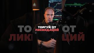
00:30[00:00] Торгуешь криптой? Как увидеть крупный капитал на графике и использовать это в своей торговле? Обычный свечной график это никогда не покажет, поэтому мы с вами открываем тепловую карту ликвидности. На ней видно, на каких уровнях размещены китовые лимитные заявки на покупку или продажу, которые реально влияют на рынок.
[00:16] Многие они, конечно, скрывают, но даже эти данные — это уже отлично. Вот эти ярко-желтые линии — это лимитные заявки на покупку на много миллионов долларов. Они настолько крупные, что толкают цену вверх и выступают мощной поддержкой.
[00:30] А вот другой пример, где огромные лимитные заявки уже на продажу выступают с сопротивлением и разворачивают цену. Видите, как эту заявку опускают, и она, можно сказать, как пресс давит цену ниже. Согласитесь, такого рода данные имеют намного больше смысла, чем нарисованный треугольничек или полосочка на графике.
[00:47] Название сервиса указал в комментариях. Пользуйтесь и заходите ко мне на канал, у меня еще больше полезной информации по трейдингу.



⚡ Saved you 0h 00m reading this? Transcribe any YouTube video for free — no signup needed.