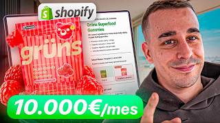

Why Your Store Is Failing
43sStarts with a controversial student story and calls out common mistakes, creating immediate tension and curiosity.
▶ Play Clip"Title promises to reveal why stores are structured a certain way, and the video delivers a detailed breakdown with examples."
The video explains why e-commerce stores must follow a specific structure to maximize conversions, using examples from top brands. The creator criticizes students who ignore this proven layout, emphasizing that it's based on psychology and testing, not personal preference.
A student ignored the recommended store structure because he thought it was 'too weak' and built it his own way. This is a common mistake that hurts conversions.
A store using the recommended structure achieves a 3.22% conversion rate, which is considered excellent (above 3%).
The structure includes: ad bar, clean logo, product photo, infographics, reviews, title with offer, add to cart, dropdown rows, description attacking pain points, guarantee, social proof, and sticky add-to-cart button.
The ad bar is the first thing customers see; it creates urgency with offers like free shipping or limited-time discounts.
Big brands use logos with lettering (text) to build trust. Using only an icon (isotype) makes the brand look like a small, untrustworthy store.
Use photos that show the product in use (e.g., a model wearing clothes) rather than just displaying the item. This helps customers visualize the benefit.
Infographics (photos with text overlays) give key information quickly. People don't read; they scan visuals. Amazon uses this heavily.
Place star ratings and review counts near the product name to reassure customers immediately. This is psychology, not aesthetics.
For smaller brands, the title should describe what the product is and its benefits (e.g., '4K Projector for Home'). Big brands can use abstract names because they already have recognition.
Use emoji bullet points to list key benefits before the add-to-cart button. This gives quick, visual information that increases conversion.
A strong offer (e.g., bundle deals, discounts) changes the customer's question from 'Should I buy?' to 'Which option should I choose?' This increases order value.
A large, round button is more clickable due to human psychology. It should be prominent and easy to tap.
After showing the price and button, include more reviews to reassure hesitant buyers. This leverages social proof to overcome last-minute doubts.
Time-limited offers (e.g., 'ends in 4 minutes') create urgency. The fear of losing a deal is stronger than the desire to gain something.
If customers scroll further, they have doubts. Use dropdown rows to answer FAQs about shipping, warranty, and what's included. This addresses objections without overwhelming the page.
Customers care about the transformation the product brings, not its features. Describe how it solves their problem or improves their life.
Include reviews and testimonials within the description to continuously reduce friction. This reinforces that others are happy with the purchase.
A sticky button that follows the user as they scroll ensures they can always add to cart without scrolling back up, reducing abandonment.
The video concludes that following this proven store structure is essential for high conversion rates. The creator urges viewers to set aside ego and trust the data, as big brands have already tested and validated these elements.
What is the recommended conversion rate range for a good Shopify store?
2-3% is good; above 3% is excellent.
01:13
Why should the ad bar be the first element on a store page?
It's the first thing customers see and creates urgency with offers like free shipping or limited-time discounts.
03:01
What type of logo do big brands typically use?
Logos with lettering (text) rather than just an icon (isotype).
04:23
What is the difference between 'showing' and 'displaying' a product in photos?
Showing means using a model or context to demonstrate the product in use; displaying just shows the item alone.
06:20
Why are infographics important on a product page?
They provide visual information quickly because people scan rather than read.
08:13
Where should reviews be placed on the product page?
Near the product name, between the name and the main photo, to reduce friction early.
09:44
What should a product title include for a small brand?
A description of what the product is and its benefits (e.g., '4K Projector for Home').
11:50
What is the purpose of emoji benefits before the add-to-cart button?
To give quick, visual information about key benefits, increasing conversion.
13:13
How does a strong offer change the customer's decision process?
It shifts the question from 'Should I buy?' to 'Which option should I choose?', increasing order value.
15:46
Why should the add-to-cart button be large and round?
Because humans are drawn to round, large objects and want to click them.
18:33
What is the purpose of dropdown rows below the add-to-cart button?
To answer common objections like shipping, warranty, and what's included, without overwhelming the page.
21:28
Should the product description focus on features or benefits?
Benefits, because customers care about the transformation the product brings.
23:11
What is the role of social proof within the description?
To continuously reduce friction by showing that others are happy with the purchase.
25:50
Why is a sticky add-to-cart button important?
It allows customers to add to cart without scrolling back up, reducing abandonment.
27:38
3.22% Conversion Rate Example
Provides a concrete benchmark for what an excellent conversion rate looks like.
01:01Ad Bar Creates Urgency
Explains the psychological principle of using the first visual element to create urgency.
03:01Offer Changes the Question
Reveals a key psychological shift: a good offer makes customers choose between options rather than deciding to buy.
15:46Fear of Missing Out Stronger Than Desire to Gain
Cites a behavioral economics principle that loss aversion drives purchases more than potential gains.
20:25Sell Benefits, Not Features
Emphasizes a classic marketing tenet that resonates with customer selfishness.
23:11[00:02] still surprise me a lot to this day, and this video is a bit of hate, a little bit of backstabbing. Today, the mentors and I received this message from a student who said that he hadn't made the website the way
[00:15] we suggested, as he felt it was too weak, and that he had made it the way he considered necessary or the way he liked it. And this is a mistake I see in all your stores because it keeps popping up on TikTok, Banner, etc.
[00:30] a tent, since you have this video to learn how to make them. Today I'm going to tell you why stores are structured the way they are. As I say, I don't make those stores because they are prettier or uglier. I make them this way, I make them
[00:46] this way, understand me, because that's how they convert the most, like the big brands do. And you don't know more than the big brands, so stay tuned, we're big brands, so stay tuned, we're starting.
[01:01] opinion. What you see on the screen is a store that uses the structure that we use and that I am going to show you. It's an active store that's selling this product, making millions a month,
[01:13] I think 3.2% conversion, I don't have it in front of me . What does that mean? If you the experts say is a good conversion rate for a Shopify dropshipping or e-commerce website, they'll tell you less than 1% is a
[01:27] problem, between 1 and 2% is acceptable, 2-3% is good, and more than 3% is excellent. 3.22% means that my stores, our stores, are excellent. They're great,
[01:39] and for you to come here and try to refute something is pointless, unless you're already 's begin because this is a tell you. So don't miss out on anything because this will not only help you sell more,
[01:52] but it will also help you learn and earn much more money with your store. So let's get websites have to have this structure. Ad bar, clean logo, product photo, infographics, reviews, title with
[02:04] see everything. A good offer, add to cart, reviews, drop-down rows with information, a description that attacks the pain point, a guarantee and social proof, i.e., more reviews, final reviews for the undecided, and a stick and tap
[02:17] people don't have to scroll to hit the buy button again. This is a teach in all my videos. in training and that I recommend to everyone. And you'll say, "Mark, why are you teaching this?" Okay, I'm going to
[02:31] break it down point by point because it's important, but not only that, I'm also using this structure, that are making millions in revenue. For example, Jim Shark has a turnover of millions and has that structure. Dei makes millions and has that structure.
[02:46] structure. But you might say, "Hey, Mar, maybe you've made yourself look good with those brands you know, but no, because I'm here at Trentrack, it's not even a promo. I'm here at Shops, the best-selling brands, I'll click on this one, for example, I'll click on this one, and
[03:01] let's see what they're doing. So let's start point by point. Ad bar. Why is it important? It's the first thing the customer sees, the very first thing they urgency, valuable information, it could be free shipping for 24 hours, an
[03:14] offer that ends today. Why? Because it's the first information they used to reading from top to bottom, from left to right, unless we're in an Arab country. So, what does that mean? That here we're already making an impact with something
[03:27] positive. For example, free standard shipping on orders, that is, free shipping, for example. Let's see, here, here, final price nover. Another offer, look here, things keep popping up. Another offer, a timer, it's Say,
[03:41] a discount. Look here, a discount, look here. Uh, new flavor because it's saying? We give them that information. So, I see a lot of websites without an ad bar, just the logo. Why? What's the point? I mean,
[03:55] brands that make millions do it, but you think it's nicer than not that information, it doesn't make any sense. So, what do we use give information so that the customer is
[04:08] free shipping offer. If you've launched something new for your brand, then repeat etc., it makes sense. Let's move on to the next thing. The logo. Here you mess up. 85%, I'm making up that number, because of people's opinions. Why? Because you
[04:23] like Nike's, you know? Like this one you're seeing. You put this on your web and I say, "But why are you putting an isotype?" "What the hell is the point?" No, Marques, it's super cool. Okay, I come to these brands and I find
[04:35] simple lettering. I come to this brand and I find a logo with lettering. I come to lettering. I come to this brand and I find a logo with lettering. Yes, it has an icon, but it's still a logo with lettering. I come to this brand, a logo
[04:47] with lettering, and then you go and give me this. Why? I mean, my question is, why? The logo is super important because it gives trust and a real brand, as you
[05:00] 're seeing here. What does that mean? Well, people who are used to who advertise and do it very well, like these brands, are used to seeing that banner ad structure, then with lettering that lets you
[05:12] understand the brand, gives you that identity. If you put an isotype, you're brand like you're Nike, and you're not Nike. If you were Nike, you wouldn't be watching this [ __ ] video of [ __ ], you understand? So, don't reinvent the wheel. Give
[05:25] seeing. Don't try to do different things. Try things when stop complicating things. And a lot of people tell me, "No, Marc, it tell me, "No, Marc, it already looks so beautiful." And this is super beautiful to
[05:37] look at, and it's [ __ ] raw tuna with chocolate and strawberries, and it's super beautiful to if they paid me. What a [ __ ] disgusting thing . Oh, Mar, well, I've eaten it, and it's it's super beautiful, it's a super aesthetic dish. You see it and you say, "Damn, how
[05:52] Why? Because that's not how it's cooked. The ingredients aren't properly mixed . So, don't focus on whether it looks pretty or not, or whether you think it looks works and what people are going to eat. You get the reference, but it's
[06:06] this example. Next, a clean product photo. A clean product photo using the product, it can be a photo with gifts to convey a greater sense of urgency to buy. For example, if we look at Jim Shark,
[06:20] we find that, being a clothing brand, what they do is not show you the product, they show it to you. And this is super important. What does " super important. What does " show it to you" mean? If I say, "a phone," I
[06:33] 'm showing you a phone. A phone. On the other hand, if I show you a phone and use it on my face, what are you doing? Showing. Therefore, what this is doing is showing the clothes. Why? Because there's a model. If I just showed the t-shirt, it
[06:46] would be showing the t-shirt. It's showing it to you, so for niches like clothing, jewelry—yes, clothing or jewelry, let's say—or accessories like watches, bracelets, things like that. So you have to show, not just display,
[07:01] this. So look, a clean photo showing you the product. Let's go here, showing you the product. Let's go here, we come to the UDI catalog, we click to that comes up, and you'll see it's the same thing. Oh, what a coincidence, it's showing me the
[07:15] product. And not only that, look at the emotion the girl conveys. Happy, happy, happy. Do you understand? I mean, they're showing you what you're going to you say, "Wow, this girl is like me."
[07:30] . Wow, this guy looks scared. You see? They n't be able to identify it. Then here, look, just a product with an offer. A hand, what for? So you can see the size. They're showing you the product.
[07:44] Okay, if we look at these brands, we can see that we come here and it's a clean photo with benefits and a model next to it so you understand who it's for. If we come here and click "buy," notice that it's a clean photo with the
[07:58] all the brands use the same psychology behind it? Good. Well, you guys come along and put a dog, or I don't know what, a box behind it, I mean, you do really weird things. So, a clean photo that gives
[08:13] information or has gifts or shows, doesn't show, doesn't make sense . Very important. Then, infographics. What are infographics? The whole thing What comes next, for example, is this clothing, which is just photos. But look, this is an infographic. You can
[08:25] absolutely everything, you can see the label. It's giving information without the need to read infographics. Photos that provide information. This gives me information, this gives me information, maybe this doesn't. Okay, but look here, information
[08:40] about it being cotton, etc., etc. If I come here, information, information. If I come here, information, information.
[08:52] you don't have infographics, you only have photos. I mean, you sell these gummy bears, and in the next photo you put a picture of the gummy bear straight, right, left. It doesn't make any sense. So it's super important that you put
[09:05] the product photo, the main one, and then put infographics that provide information. Amazon is the king of this. People don't read, people see, they don't want to waste time reading. So, the more visual information you give them, the higher the
[09:18] probability of conversion. You have to. And this isn't my [ __ ] opinion. This is a fact. Even Amazon does it. Why? Because the product commands a . If the photo is bad, they won't sell anything, it doesn't matter what's below it, the
[09:31] infographics, everything I've told you. Moving on. Then, after they've seen your brand, and they see good photos and infographics, what you have to include is [music] reviews. Why? Because people don't want to buy something
[09:44] are happy to have bought. Therefore, you have to tell them as soon as possible . And an aggressive way to do it is to put some little stars with the rating, the number of customers, or say it however you want, right between the name or
[09:56] below the name or between the name and the main photo. And this is psychology to reduce friction. It's not because I like it more or less. And look, if I come here I find that here it has the... 4.3, I didn't see it, sorry.
[10:09] If I come here, I find this under the name. If I come here, I find the reviews above the name . If I come here, I find what I 'm telling you about below the name. And if I come here, I find what I'm telling you above the name
[10:21] . And you go and don't use it because you don't like how it looks. Or you put it below this. Do you see how illogical it is? Well, everything has an explanation. These brands generate millions, tens
[10:34] of millions. Everything is tested. There are people behind this doing tests every day, spending millions and millions on investment to find out what works best. You don't have more information than they do, even if it does
[10:46] n't look pretty. Remember the tuna dish with chocolate and strawberry? It's pretty disgusting, to be honest. So, logically, so you understand and don't reduces friction. The offer suited you , the product is working for you,
[10:59] but you don't want to buy it because you don't know if other people They've bought it. So, you imply that they shouldn't worry, that they need to is fine. Then, that makes them keep
[11:11] 's what it generates there, and it's been tested extensively. And if you go to Amazon, you'll see that even Amazon does it. Look, I'll show you. I go to an Amazon product page and I see the name and below it the reviews. So, uh, hello.
[11:24] Uh, I think, well, I think that's enough, right? Let's continue. true that different brands do different things. For example, some brands use their name
[11:37] to create brand identity because their website is already good enough that they don't the product is because they already know, because they saw it in the ad, etc., etc. But normally, for brands that aren't very big, it's important to
[11:50] give the product a name that Convey or explain what it is, what it's for, offers. Why? Because that way 're buying what they want to buy. For example, if I come here, it's Jim Shark
[12:03] by Zebum Essential Shift. It's a brand name, it doesn't convey anything. If I come here, it's Pink Rosa. Screw it. Why? Because it's a huge brand. But if I come here, it says Blim Crystal Hair Easer. I don't know what it means, okay?
[12:17] including the brand name, but then it's also including a product description. If I come here, it says Dryan Lymphatic. This is something about French, and I don't know French at the moment. If I come here, it says Superfood Gummies, it's
[12:32] telling you what it is, so try to give an explanation. For example, if you're selling a projector, a simple projector, what you have to simple projector, what you have to do is say "4K projector for
[12:44] home" or "4K projector without," meaning... You provide information. Don't use "hm" if your store is called Projector; don't use "Projector" because people don't know you everything else to not be able to explain the product. So, use a title that includes
[12:59] should buy it, or more information. Then, use emoji benefits. This isn't about making it look prettier; it's about giving them information to pique their interest and make them want to I mean? Have you seen the ad bar? You've given them a brief offer, they've
[13:13] infographics, okay, they've seen some reviews, they've seen the title, but they haven't explanation, a description, whether it works, whether it doesn't , whether it's suitable for them. They haven't seen any description; everything they
[13:26] explained anything yet. So, emoji benefits are used to explain something before they and the checkout button. Now, there are different brands—excuse me, there are brands that do it differently. Different. For example, here they give you a description,
[13:41] but that's because Jimshar doesn't have to explain anything anymore. But if you look include anything here either—but if you look here, they include a bunch of emoji benefits. They 're giving you information and presenting it visually. It's quite nice to look at. It
[13:54] shows "bikinias," "silky smooth," "eliminate." It gives you benefits, explaining why this the first time I've seen this store, notice that these emoji benefits are different; it's not the same as this. This is with icons, but notice that it's
[14:08] giving information before the cart, and if we come here, notice that it also gives you looks nice or not; it's that this is absolutely necessary to give the customer information about the benefits without them having to read the
[14:23] best points, the problems your product solves, the benefits it provides, or the transformation it generates in people, and you put it there so that with all the... What is ABub default? The ABub default is what the customer sees when they
[14:37] enter the site: the ad bar, then photos, reviews, and the text, title, and emoji benefits, usually depending on the So, when they see it in the default homepage, just by scrolling, bam, it's an
[14:52] conversion rate increases because they don't need to see anything fast, but it's not because I want to finish, it's because I have a an hour long. I speak very quickly. That's just how I am , not just
[15:05] in videos. So, if you don't know me, that's a mistake on your part a comment telling me what you think of this video. And many of you ask me, "Hey, Mark, how can I train with you?" Because I don't know, you don't have a
[15:18] set up my own website. Shop, help me make money. And I always has helped thousands of people set up their own shops and make a living from it. Now, I do can help you improve your shop, I can help you sell, I
[15:34] can help you leave your job without any guarantees, but you have the link in the description, and if you're on TV, click this QR code, information. Let's continue. So, as I said, the emoji benefits are: try to
[15:46] important things about your product so the customer knows them. Next, the offer, the most important thing on your website, and the one you all pay zero attention to. Zero. It's big brand, you don't have to make offers. Look here, 33 euros, it used to be 55.
[16:02] Well, that's a pretty vague offer, nothing more, but these people don't care, right? But if I come here, this... Because I don't know if it says so. Anyway, it has an offer, it was 99, now it's 49. Okay, it's a discount, but these
[16:14] pay attention to. Wait, it won't go down here, okay? One pack for 26, two packs for 53, cream. This is a great offer, it doesn't make any sense for someone to buy one because they're going to pay 26 plus shipping. It's going to cost them 30-something, 40, and for 53, that is
[16:30] , for about $1 more, they get another free shipping and the cream. Anyone end up spending it on the others. So, you've increased the order value. People aren't thinking about whether to buy or not , they're already thinking about which one to
[16:44] theory as why McDonald's and Burger King are always close together. The offer is very important for two reasons: one, because if you have a good offer, you don't make the customer think about whether to buy or not . You make the customer think about which one to
[16:57] McDonald's does it for a different reason with Burger King. Haven't you noticed that there's always a McDonald's? Why is that? Because if there were only one Burger King or only one McDonald's, people would think, "Do I want a burger or not
[17:11] ?" Should I stop or not ?" On the other hand, if there's Burger King want a burger, it's which one I want. They've already spent money. people say, "It doesn't make sense." Why don't they move farther away and lose their
[17:24] customers." So yes, they are competing, but if they were because people would be thinking about whether to buy or not . On the other hand, being together, they think about which one to buy. They both win. So, this is the power of
[17:38] to help you understand, we change the question in people's minds. If you have this for 49 and it used to be 99, people say, "Hmm, I don't know whether to buy it or not." but I have doubts. On the other hand, I come here and say, "Wow, a pack for 26 and 253 and they're
[17:54] giving me a free cream." Damn, I think it makes more sense to buy the two-pack. Did you sense to buy the two-pack. You've convinced yourself, you're just super lazy and it's what you don't pay attention to. And if we go here, look, you might... It
[18:08] offers different bundles, and if we go here, it's true that it shows you how you save, which is also an offer . So, the offer is the most important thing. Now, it depends on each product. I always recommend a
[18:20] shipping on the first and second items, right? To encourage people to spend more offer comes the "add to cart" button , quite visible, simple, okay? Ideally, it should be big. The most important thing, look, notice that they're all
[18:33] big, okay? Why? Because we humans have this tendency to want to something round and big, and you want to touch it because we're just silly like that, okay? So, a big button. Then, reviews. Why? Because I
[18:47] like them, right? Because it's very necessary to reduce friction again. Good, after seeing the initial reviews, but now you've added features, benefits, the price, and a buy button. It's detecting crap, crap that I'm going to
[19:01] spend money, and nobody wants to spend money. So what do you do with the reviews? You reduce friction by making them understand that if they don't buy, they're missing out on something amazing. For example, if you look, okay? There are
[19:13] do, but look, here they do it , okay? And here, let's see, this one hasn't Well, and there are more stores, okay? cart to further reduce friction. You can add the
[19:27] always show, you can add a slider like this, you can add a section, want, but put reviews below the cart. And this is especially Recognition is key, because it doesn't matter if Jim Shark doesn't post reviews.
[19:43] Shark, even from UDI, but for a brand like this, which is now very well-known but isn't a Jim Shark brand, it's very important that it has that feeling or those reviews. For example, here are reviews. "Look at Who Others Loving Blim"
[19:57] is telling you, and you get a ton of reviews that are n't even reviews, but stories, people who have bought it and And this isn't because I like it more or less; this is to reduce
[20:09] do, so the customer doesn't get scared and think, "Oh, but I really don't something I forgot about with the offer, part two, which I forgot—I'm getting old—is that if the customer comes here and says, "Can I come back tomorrow and
[20:25] buy again at this price?" If the answer is yes, you're losing customers because your offer isn't entirely competitive. Good. On the other hand, if I come here and you tell me this and say it ends in 4 minutes, if I leave
[20:38] find this pack. Obviously, we all know it's a lie, but I won't find it. So, what does it do? It creates a sense of urgency to want to buy. changes people's thinking, making them spend more money, but it also makes them
[20:51] afraid to leave and lose it. It activates the fear of missing out, since we all want to get something, but the desire to lose is stronger. Because you, for example, want to earn a lot of money, but you're afraid to train with me
[21:03] in case you lose it. That is, the fear of losing is stronger than the satisfaction of achieving it. We're all like that , so don't be afraid to train with me, since you can pay €80 a month in installments and it's
[21:16] e-commerce training. There's a promo for you. Moving on. After the review, the to go on about this because The video is dragging on too long. Once people are convinced, once they've seen absolutely everything and the price,
[21:28] if they keep scrolling, if they keep going down, it's because they still have doubts. What seen the price, what it offers, the benefits, and that there's a sale? "I'm going to get ripped off." "When will it arrive?" "What's included in the package?" This
[21:40] people don't care about the product at all; otherwise, they would have left already . So, what are we doing here? "Where can I use it?" It's explaining how the shipping works, the warranty—in other words, it answers the
[21:52] most common questions: shipping, warranty, what's included in the package, and whether it's really worth it . That's all you have to do. That's why these a list of frequently asked questions, okay? So, look, it's not because it's
[22:05] the customer's objection, because if the customer were... If they were convinced to buy, they would n't have scrolled down any further; they would have clicked " get offer." But if they keep told them? Because you've already told them the offer is ending, you've told them about the
[22:19] infographics, you've explained what the product does, that you have a special offer, you've told them shipping is free or not , that you're giving them the product's functionality for free—you've told them everything. But what haven't you mentioned yet? How long does it take?
[22:31] have a warranty? You haven't told them that. So, bam, you just throw it in there. And if don't do this because they're too big, but if I come here, it says, look, "delivery and returns," that's all they do. If I come here, it shows you all this information without
[22:45] drop-down menus, but it shows it here in emojis, and look, it shows drop-down menus, rows. Dropdowns. I come here, it gives you this information that's here and it throws in the emoji benefits and all the dropdown rows. So
[22:59] all the big brands do it and you do n't. Why? And besides, this is go with the description. Here you all make the mistake of writing a description that talks about the product's features. People couldn't care
[23:11] less about the product. People want to know why they should transformation it will bring, and how it will help them. In other words, what benefits do I get? training, and no matter how much I tell you that you have a class every day from Monday to
[23:26] helps you via WhatsApp for 3 months to review your products, stores, and so on, no matter how update the training for free, that you'll always have it, that you have access to thousands of people selling, look, it does sound great to you, but I'm
[23:40] buy because I haven't identified what you were looking for. However, if I tell you that students like you, who started from scratch, have completely changed their lives thanks to my training, that they've been able to leave their jobs, live from
[23:54] enjoy quality time with their families, not have to depend on a boss, and are earning three or four salaries with the minimal effort it used to take just getting up to go to work, then you might
[24:09] all that, maybe it's worth taking the risk." Look how things change. If , because we're selfish by nature. However, if I talk about the is all true, you can find the link in the description or the QR code here. That's it
[24:23] , that's it. It's that simple. And this applies to everything, absolutely everything. So, So, don't talk about the product, talk about the features. So, if we come here, you'll find that here it is talking about the
[24:36] product in terms of quality, it's showing you the benefits you'll get, it's super lightweight, it warms you up , I mean, something you've never worn, something you've product, no, no, no, you've never used it. Then, if we go here, we see that it
[24:53] tells you what you're going to get. For example, here Social Proof tells you in action, don't worry about the terrain, it adapts to your curves, to your curves, right? any surface, right? It doesn't adapt to your curves, don't worry. Then it
[25:07] tells you what you're going to get, it doesn't explain that it removes hair. Attack the benefit they get, because we are selfish by nature. So, the description has to be title, text, photo, Infographic or video gift. Tell me
[25:21] Title, text, photo, infographic, gift. Title, text, photo, infographic, gift, and so on. And in between, we add a guarantee or more social proof. Look here, Social Proof, okay? It's almost over. Here it adds title, text, photo,
[25:37] gift, infographic, title, text, emoji benefits, more social proof, more social proof, more information, plus the guarantee and reviews. Why? Because you don't just but you have to remind them again that they
[25:50] other people are happy, because that way you gradually reduce friction. And this isn't a matter of whether you like it or not , this is pure psychology, it 's neuromarketing. So, stop doing what you want. Let's continue. You
[26:02] within the description to further reduce friction while they're reading, Because this way you show them how many people have bought it and that everything... What you removes hair, that it adapts to your curves—all the hype you're
[26:17] selling is so that when people get to the end they say, "Oh, damn, look, I have a video of someone, look, check this out, someone showing their skin." Wow, it's true, it does everything it says it does, you know? [music]
[26:31] So, that's what the reviews at the end are for, for the four undecided people who make it everything it says it does is true, it's really happening. It's not the same as me telling you I have 1,000 success stories, that I have 1,000 people—excuse me,
[26:44] dropshipping, who bought my training and are now 100% dedicated to it telling you that, but how do you know it's same as me coming here to my YouTube channel, clicking on Lists, give it a look at
[26:58] student success stories, and here you have 93 or 94 interviews that I upload every Tuesday. You have Stephanie from Mexico, you have Joseph from Colombia, you have Mark from Spain, you have Beto from Mexico, you have Paula from Spain, uh,
[27:12] Philip from Spain, Alexis, you have Pilar, 52 years old and a mother, you have Mir from Peru, you have these guys who were university students, they studied for a degree, dropped out, and are now making a living from dropshipping, you have... uh, you
[27:24] telling you, you're seeing it, you can go and see it just like what I'm training does, it does because you have success stories that prove it. This is the same. So this is the structure of the store and a sticky to-cart that's always visible
[27:38] so that if the customer decides to buy, they don't have to scroll all the way to the top, not loading or something, and you lose them because you didn't have that feature. There are I understand that many of you have too much ego to admit you're
[27:53] come out and explain why I do what I do, how I make the websites—it's fine because it's If I'm learning from someone and that person tells me, "Do things this way," I'll person has the results I want . So, you know more than me."
[28:06] So, I have websites with 3%, 2%, and 5% conversion rates, and you haven't even made website, and you have a 0.20% conversion rate, or that the description isn't right, or that you're going to put a black background, or that you're not going to
[28:20] put the logo, you're going to put an icon because it looks nicer. It's like, you're just swallowing this crap. It doesn't make sense. So, do whatever you want. doubts, I've just cleared them up. And if you still believe that what I'm
[28:33] you do it, or that you've seen that it's better another way, or that it looks but your ego is holding you back and you 're destined to fail until promotion for the training, and if you've gotten this far and you're still not decided to
[28:46] train with me, you have a problem. I'll tell you why. And I'm going to be 100% understand why anyone wouldn't train with me. I mean that sincerely. I know there are a lot of with me. I mean that sincerely. I know there are a lot of
[28:59] whether I really do what I say I do. Okay, man, let's be do. Okay, man, let's be clear, shall we? I've been uploading shares the most information, I'm the only one talking about organic dropshipping until
[29:11] trying to compete with me. Lucky them. So, what am I doing, who the hell is going to teach me? I'm the only one talking about this in on YouTube don't talk about, not even in training courses. I'm constantly
[29:24] updating everything. So, really, why do I say I don't understand why training costs €800. This is [ __ ]. Holy [ __ ], Mar, €800? I don't have that kind of money, man. You Mar, €800? I don't have that kind of money, man. You can pay €80 a month. €80 a month,
[29:38] huh? Seriously, €80 a month. If you're screwed and can't afford €80 a month, I YouTube channel is for, but listen to me and do what I say and start taking action to make money. Now, you can afford €80 a month. Not joining, I'm
[29:51] telling you from the bottom of my heart, is a [ __ ] mistake. And it's not because I want to sell you more hot air. training program for good and dedicate myself to my stores and stop selling training courses because I'm fed up. I'd really like to be at home
[30:03] close down. I'm serious. So, I don't understand how anyone today wouldn't want to train with me. I'm the biggest name in Hispanic Apple, the one with the most success stories and I can prove it, and the one with the most
[30:15] So, look, if you don't want to get involved, don't , but you're going to get burned. Then you'll buy into some snake oil salesman who showed you Lamborghinis, who promises you things, making the decision when you should have and starting to change your
[30:27] life. You have the link in the description; you have the QR code here. And if you don't less. I don't make a living from this crap. I don't give a damn about the training. What I do give a damn about is you messing around change your life. So subscribe,
[30:39] change your life. So subscribe, take my advice, and I'll see you in the next one.
⚡ Saved you 0h 30m reading this? Transcribe any YouTube video for free — no signup needed.