
AI Art Commission: Real or Fake?
41sEngages viewers in the art of over AI-generated ghost in commissions.
▶ Play Clip"The title promises a layer reveal, and the video delivers a thorough analysis, but it's padded with repetitive observations and a lengthy outro."
The video analyzes a commissioned artwork titled 'The Three Knights' that was suspected of being AI-generated. The creator examines the piece in detail, pointing out inconsistencies in belts, armor, chainmail, lighting, and perspective that suggest AI involvement. The artist's layer video proof is also scrutinized, leading to the conclusion that AI assistance was likely used.
A commissioner posted an artwork of three knights, noting that a friend thought the colors and lighting looked 'fake.' They sought help to determine if they wasted their money.
The belts show multiple buckles, wobbly holes, and a lack of continuity, with the belt reappearing far below where it should be. These are common AI errors.
Belt buckles appear to melt into straps, and the sword hilt looks crushed in the hand, both indicative of AI generation rather than human error.
The knights have inconsistent armor designs, and even within the same knight, leg armor differs (one leg has straps, the other is fully encased). This asymmetry is odd.
Characters look off into the distance instead of at what they're doing, a common AI trait. The knight writing with a quill is not looking at the book.
The chest logo appears different on one knight (smooshed), and the sword disappears behind the hip without reappearing, showing AI's poor continuity handling.
The chainmail looks like a generative AI texture, with chains melting into each other, especially at the neck area, which is a major giveaway.
The background has perspective problems: a pillar appears too high, a door is set too far in, and floor tiles are perfectly even in front but distorted beyond the knights.
Top comments point out melting buckles, copy-pasted characters with white pixelation edges, inconsistent lighting, and the use of AI-generated characters pasted onto a background.
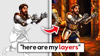
The artist sent a video toggling layers, but it starts at layer 114, which is suspicious. The layers are split into tiny sections, and the line art is on a white layer, which is unusual.
The commissioner paid $600 for the artwork and is trying to get a refund. The creator concludes that AI assistance was likely used based on the many odd elements.
The video concludes that the artwork was likely AI-assisted, given the numerous telltale signs such as melting chainmail, inconsistent lighting, and perspective errors. The creator advises viewers to be cautious when commissioning art and to request progress files to verify authenticity.
What are common signs of AI-generated art mentioned in the video?
Melting chainmail, inconsistent belts, dead stares, perspective errors, and copy-paste artifacts with white pixelation.
06:13
Why is the layer video starting at layer 114 suspicious?
It suggests many hidden layers, which is unusual for a typical Photoshop workflow.
13:34
What did the commissioner pay for the artwork?
$600.
16:07
What is a common AI trait regarding character eye contact?
AI characters often look off into the distance instead of at what they are doing.
04:30
What did the top commentator suggest about the artwork?
They said it was 100% AI, with characters generated separately and pasted onto a background.
08:59
Chainmail as AI Giveaway
The melting chainmail texture is a clear, objective indicator of AI generation, not human error.
06:13Layer 114 Suspicion
Starting at layer 114 implies hidden work, undermining the artist's proof.
13:34Financial Impact
The $600 loss highlights the real-world consequences of AI art fraud.
16:07Dead Stares as AI Trait
Recognizing this pattern helps identify AI art across different pieces.
04:30[00:01] got it back until they noticed some things looked a little bit off. They asked the artist for some proof, and the artist sent the proof over, and it confused them even more. So, let's delve
[00:13] into the situation of the commission of the three knights. And again, please don't send hate to any parties involved. So, it starts out with this post on and it features an artwork featuring three knights titled The Three Knights
[00:27] middle with his hand outstretched towards a floating page, one kneeling on one knee writing with a quill in a book, and there's one chasing a whole bunch of "Hi, I'm new to all of this. I recently commissioned an art piece for a project
[00:42] I'm working on and was excited to see the progress the artist would send me. Once they sent me the fully rendered colorized finished product, I loved it. But when I showed a friend, they said it looked a bit off, and the colors and
[00:54] lighting seem fake. Just looking to see if I wasted my money or if I am supposed to be looking for. Please help." So, this is the art piece in question, and we only have this art piece to go off of. So, again, like I
[01:08] say in a lot of my videos, when it comes to determining is this AI-generated, is this real, I like to look at the artist's whole portfolio in its entirety rather than just one piece. A lot of times it gets a little difficult to
[01:21] there's a lot of elements that you can't see or determine, etc., unless it is extremely glaringly obvious. Well, look, look, the bar is kind of low sometimes, you know? But everybody's got
[01:35] a bit promising compared to some other stuff that I've seen in the past. There are some things that I tend to notice with some possible AI-generated works
[01:47] that uh raises suspicion. And again, maybe this is me being a little maybe this is me being a little nitpicky. We once again have the doomed belts, okay? Like this could be somebody who's just not great at drawing belts.
[02:00] That's definitely possible. But what I see here is that we once again have a belt buckle and that little bar, right, that goes through the hole in the belt. And then we have what looks like a second one. And not to mention the holes
[02:13] in the belt are all wobbly. It's all kind of warped. Like there's a hole over here for instance. You know, it looks a bit odd for the belt. Now, the second issue is the lack of continuity with the belt. This level of rendering is high.
[02:27] Everything is fully rendered, the quality is up there, right? So we have a double belt situation going on with this belt under it. And where does this belt reappear exactly? Way below where it should be. The belt should reappear up
[02:40] here, but instead up here is this blank spot and the belt actually reappears down here. For this high of a rendering quality, I'm going to assume you can draw the belt straight, you know? But humans make mistakes all the time, so
[02:53] that could be human error. But then we get down to here. All these other belt buckles. This is a belt buckle that's actually melting into the strap. And here we have another one, and it looks like these two should be symmetrical,
[03:06] but they're not. They're close, but they're cousins, they're not twins. happening here. Doesn't make me really confident about the work when I start seeing melting dots and stuff because these are things that are not human
[03:19] error, but rather things that are more indicative of AI-generated imagery that is being passed off as legitimate. We then have the sword situation where it looks like the hilt of the sword is getting crushed in the hand as if it's a
[03:33] aluminum can the hand is like gripping really hard. And that doesn't make me feel very confident about the piece as well. And then the next up is the inconsistencies in the armor because all three of these knights have slightly
[03:46] different armor. Now, that could be a character design thing, so maybe it's not the end of the world, but we also have inconsistencies in the armor in the same night. So, this knight has a leg piece they're wearing, and the leg piece
[04:01] has two straps back here. There's strap one, strap two. And then on the other leg, we we don't have that. We suddenly have the shin fully encased in armor, which is not the same as the other leg. Maybe there's a lore reason as to why we
[04:15] have this asymmetry going on in the armor, but that also reads to me odd. Now, this guy got going on, okay? This guy is writing in a book with a quill and is looking off into God knows where.
[04:30] He's like, "Mhm, yeah. Let me look at your armor and why your armor strapped to your legs properly." Where is he looking exactly? And this is something that AI will do because human artists can make their characters, and they
[04:42] normally do, make their characters look at the thing they're doing. If they're they're drinking something, they'll maybe look at the drink. If they're the person they're talking to. But AI tends to do a thing where everybody just
[04:55] wistfully looks off into the distance, which is interesting. And then now we have the logo on the chest. Now, this is a very specific logo, and somehow it looks different on this guy. The crown is smooshing by the neck area, but it is
[05:09] drawn completely correct on the the main guy in the middle. We have a microphone with a book here. Maybe it looks like a podcasting type of logo or something like that, which I think is cute. It's a really cute concept. That to me is odd.
[05:22] And then now we have this guy, our guy chasing the monarch butterflies. And once again, we have some oddities where he's again got that dead stare. He's he's not quite. He's he's just missing
[05:34] to the waist where, you know, if it's anything like the sword the guy in the middle has, it's big and it's long, and where we should see that sword coming I'm drawing with my mouth, so forgive me for being wobbly. But we should have
[05:48] some visibility of the sword behind the hip and we just see nothing. It goes behind the hip and it disappears. And again, this is something that AI does. Generative AI sucks at continuity, so when things go behind other things, they
[06:00] disappear. And this guy has some pretty notable looking chainmail and I think the chainmail is the biggest giveaway that this is something nefarious because what is this? This is not a brush, this is not somebody drawing chainmail. This
[06:13] looks like some generative AI texture. And the notable thing is the chainmail looks more correct down here. So it's still not like quite there. We've got chains melting into each other. But the chainmail looks more normal here. So we
[06:26] for some reason at the neck area, it just looks really off for some reason. Not to mention we have stitching in the armor, which to me is just odd because why would that be there? And it's just interesting. And the final element that
[06:41] makes me suspicious about this piece. First off, the perspective of the background because AI mucks up perspective all of the time, okay? supposed to line up properly and then you take a closer look and it doesn't.
[06:54] And this is kind of what looks like a tomb dungeon type situation with some open doors. And to me, what is odd is that this door, this one right here, is
[07:06] set really far in. Like if you look at where this door is, it's like all the some sort of cutout that comes out and then we get the rest of the room. Maybe that's part of the room design. It's odd. And then we have this pillar. And
[07:18] this pillar here is somehow sitting on a raised platform that we can't see. It looks like it's supposed to be on the floor, but this pillar is up too high. doesn't match where the floor of the room is supposed to be. And then the
[07:33] reason why I'm pointing out the fact that this pillar looks weird is because correctly like onto the ground. So potentially inside the weeds, maybe there is like an elevated platform the pillar is on that could explain why it
[07:47] is so high. But then, we have this other thing that This is the thing that to me is the most odd about the background is we have this box here, this pillar of sorts in the middle of the room that lines up with this pillar on the back.
[08:00] It looks like almost that this pillar on the back is actually sitting on this middle platform. That can't be correct perspective-wise because that would middle of the room that like supports the ceiling of the middle of the room.
[08:14] goes, the top actually lines up to the corner of the room. And then it goes up this pillar middle of the room stick situation? And then the final part that is to me a bit suspicious is like the detailing on the floor. I'm just seeing
[08:29] because like the floor tiles under the knights all line up perfectly evenly, like even squares. And then once you go beyond the knight, they suddenly turn is supposed to be some sort of distressed ancient tomb floor floor and
[08:44] floor be like that? But we've got perfect squares up in the front. But day. So, let's see what commentators had to say. The top commentator says, "You melting here." And they're circling those little buckles on the bottom part
[08:59] first character. What they did was they created an AI-generated version of each of these characters separately and then generated the background. Blurred it AI-generated characters onto the background by removing the white
[09:12] background. The details are inconsistent, blurry, low quality, not sharp with each other. They just copy and pasted the In Liberal Confidimus logo in a pathetic way. Looks too sharp compared to their body or armor. A real
[09:25] little bit with 40% opacity to make it look natural and blend in with the inconsistent. They added the characters then shaded with an airbrush on add blending to amateurishly give light to them. The light source doesn't make
[09:38] sense. And yeah, we can look a little closer for this piece because a big one And some artists, you know, they do like adding a lot of ambient lighting, that's one light source. It is this lamp right here, which means this character, the
[09:52] one in the middle, should be back-lit on both sides evenly. Their legs are lit from this way, but their shoulder is lit from this way. And this arm is lit this way. So, where is the light source? This guy is correctly back-lit, but he's also
[10:05] don't have a light source coming this way. And this character is lit from both sides, this way, this way, and like this way onto the legs, which is again, where from? And speaking of the copy and paste, this is one other thing too that
[10:18] I noticed with this piece. If you zoom all the way in, you can see very, very white pixelation alongside the edge of the lines. You can see that most notably here around the belts. You can see some of that here again, which really to me
[10:30] lot more of it here. They cut and paste these characters off a white background. If you drew the characters yourself, you would have access to the working file with the line art, all the other layers, the shading, whatever. So, when you add
[10:43] the background in later, it would blend a lot more seamlessly than this. They also add the chains are literally melting. Typical AI-generated chains. Also, look at their eyes, the dead eyes. Line arts are also inconsistent. Another
[10:55] person says, "In my opinion, 100% AI. Ask them to send you all the progress photos." So, these were the progress sketches I'm confused about because it's the same image, but wide. So, what happened exactly? Like did they somehow
[11:09] just like compress this inwards, move the character closer, I guess? This progress photo to me is odd because like why is half the chain mail drawn on this is drawn on the arm, and we have nothing else? But in the other two characters to
[11:23] represent chain mail, they drew it in as a grid, which is interesting. And then OP added like the squared version of this, which to me looks even worse. Here, their guy chasing butterflies has the deadest eyes known to man, and they
[11:36] actually have what I was talking about. The sword actually intersects behind the leg. We can see the sword visible here. So, where did the sword go in the fully And again, we have the random pillar with another like half missing pillar
[11:49] behind it. Where's the other half of this pillar? And another commenter says, "Yes, those images were generated by AI. Besides the obvious fact the textures there's the fact that the figures appearing to have been added later on
[12:01] the background. The borders look strange because they were probably generated on a white background, then cut out." And OP says, "Dang, that's really local artist, and we wanted to be sure we weren't using AI with this project
[12:14] Thank you for the help." And another person adds, "The sheath should be on the opposite side of the sword arm. Not necessarily an AI pick, but a nitpick nonetheless." And OP says, "That literally was our first red flag. Wait,
[12:27] I didn't even notice that, but yeah, wait, that makes so much sense. This guy is the dominant one, but the sheath is also on the left side." So, they came back with another post 4 days ago that reads, "Artist proof. Hi y'all, I posted
[12:40] determined some of the artwork I commissioned was AI. When I confronted the artist, they doubled down and sent me a video as proof they did the art. I show me that would be able to show if they did the work themselves, and not be
[12:53] able to show if it was generated, if that makes sense. Because currently, it into layers that don't entirely make sense. But I'm not an artist, and really just in the dark on how to approach this. Any tips are appreciated." So,
[13:06] here we have the layer video where they're toggling layers on so we can see the layers for each individual piece of the artwork, and everything is separated other characters added into the
[13:21] background. And the resolution for this is pretty low, so it's pretty hard to see or read anything to kind of like gauge what is being written. There are individual layers that we can see. What I'm confused about is why we start at a
[13:34] layer like 114. Because when you open up Photoshop, the first layer you open is and then layer one, right? So, why do we start at a layer 114? Just just wondering. Because that means there's like 113 layers that we don't see. Maybe
[13:50] the thing is with showing layers, it doesn't necessarily dis- prove AI usage. It just shows me that you have layers and can cut things up. A speed paint can also be fake. So, speed paints also aren't the most name clearing of
[14:05] evidence that can be provided, but it can help to show the art process because The top comment says, "Artist here, it's still 100% AI. The drawing process here is not how a human would draw. They have just split it into layers. I'm not
[14:19] saying human artists don't do this, but I'm uncertain if every single piece would be rendered individually. At least that's not how I would do it. But blatant AI." Another user responds, "Yeah, it seems a bit extreme to me. I
[14:32] each shade, but not for each tiny section of the piece. Plus, why is the versus being transparent?" Which I do agree, that part for the line art is really odd. When you open it, the line art and the sketch are all on one layer,
[14:46] all on one white layer with black line art. And all the color is applied on top of that, which is just odd because it just makes your life harder. But yeah, everything is separated. So, every chunk of the armor is on its own layer. Like
[15:00] armor is split into like four or five pieces, every like chunk of it is split into its own section. There can be reasons why you would render that way. Like this is something that I'm working on, it's not done by any means obviously
[15:15] like the way I like to split it up is I split it typically by color. So, all the skin is on one layer, but if it would make sense for shading purposes to put Yeah, so even though the hand is the same skin tone, it's on a different
[15:28] then like when you put like a shadow for the hand for instance, you know, or the shadow for the the body, it doesn't overlap with the hand. Like the cutouts make sense. But, you know, all of the all of the bows are on one layer cuz
[15:41] make sense to put basically like right ribbon on one layer, left ribbon on one layer, bottom right ribbon on one layer, bottom left ribbon on one layer unless if they're all the same color, it kind of just makes your life harder and uses
[15:54] up more memory. But, again, every artist works differently. So, for some artists as it works for you, that makes sense. The reason we're questioning this person specifically is they have melting chainmail amongst other things. And also
[16:07] for even more context, OP says, "I paid this artist like $600 expecting original artwork. Trying to get my money back now, obviously." Which freaking sucks. So, after looking at all of that, the sketch, the final artwork, and the layer
[16:21] piece? Do you think it's AI generated? Do you think it's legitimate? Again, involved, right? But, personally, after looking at that, I have my own personal suspicions that there was AI assistance used. Just too many of the elements look
[16:37] odd, and the layer starting at layer 114 just has me a little bit confused. And I money back in the event that this is something nefarious. So, with that, if
[16:49] like and subscribe. And check me out on Etsy. I have digital art there for streamers and creators. I also have a coffee with free resources like a free sponsorship guide. And I'm trying to grow my Instagram to 100K. We're a
[17:01] off. But, you want to follow my stuff over there. So, check me out there. Yeah. @KalliArtsy.TTV. Or, I out there. Or, in another one of my videos. Peace.
⚡ Saved you 0h 17m reading this? Transcribe any YouTube video for free — no signup needed.