Zero Addon UI That Looks Like ElvUI
40sShows players how to achieve a clean, modded-looking UI without any addons, saving time and hassle.
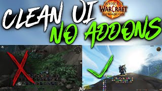
▶ Play ClipThis video presents a clean, zero-addon UI layout for World of Warcraft patch 11.1 (The War Within). It offers two profiles—one for healers with centered group frames and one for tanks/DPS with frames anchored to the side—and explains how to set up action bars, handle overlaps, and optionally add lightweight add-ons for convenience.
The layout mimics a fully modded UI like ElvUI in terms of element placement, making future add-on transitions easier.
Healers get centered group frames; tanks/DPS get frames anchored to the left side of their health bar.
Main spells are always visible in the center; three smaller hidden bars for mounts/pets/toys; a vertical bar near chat auto-hides in combat for teleports/consumables.
The stance bar overlaps with class resources, but personal resource display is already shown in the center, so it's not an issue.
BlizzMove and NoAutoClose are recommended for managing multiple UI windows and resizing.
"The title accurately promises a clean UI layout with zero add-ons, and the video delivers exactly that—a detailed walkthrough of a built-in Edit Mode setup."
What are the two UI profiles mentioned, and how do they differ?
Healers have group frames centered; tanks/DPS have them anchored to the left side of their own health bar.
00:42
What should you put in the three smaller hidden action bars?
Mounts, pets, toys, and other clickable items that don't need to be seen constantly.
01:21
What is the vertical bar near the chat window reserved for, and why?
Teleports, hearthstones, consumables, and toys—items you use out of combat.
01:36
What overlapping element is mentioned, and why is it acceptable?
The stance bar overlaps with class resources, but personal resource display is already shown in the center, so it's not a problem.
02:16
Which two add-ons are recommended even for a no-addon setup?
BlizzMove and NoAutoClose—they let you open multiple UI windows and move/resize them freely.
02:59
Two UI Profiles for Different Roles
Provides role-specific layouts (healer vs. DPS/tank) that optimize screen real estate and click-casting efficiency.
00:42Hidden Bars for Non-Essential Items
Keeps the screen clean by hiding mounts, pets, and toys until needed, reducing visual clutter.
01:21Combat-Aware Bar Disappearance
The vertical bar auto-hides in combat, ensuring only combat-relevant elements are visible during fights.
01:36Intentional Overlap for Class Resources
Leverages default personal resource display to avoid needing extra UI elements, keeping the layout simple.
02:16Lightweight Add-Ons for Quality of Life
Recommends BlizzMove and NoAutoClose as minimal add-ons that greatly improve UI management without overhauling the layout.
02:59[00:00] Welcome to a cool UI layout that looks really clean in combat and requires zero add-on. Since it seems a lot of people are returning to the game for patch 11.1, season 2 of The War Within, I wanted to make a simple video sharing a nice UI layout that does not require any add-ons up front,
[00:15] but sets the path for you to add add-ons later without having to change too much. Now if you haven't adjusted or know what to change with your base game settings, I have a long video explaining each setting in detail and a much faster TLDR if you just want to know what to change.
[00:29] I'd recommend watching those first if you're not confident that your settings are ready to go. Okay, when I was making the layout, I wanted it to look in combat very similar to how a fully modded UI, such as now UI looks, at least in terms of the logic of where things are.
[00:42] That'll make it so that if you ever decide to swap to a fully modded UI, regardless of which one it is, everything will mostly be in a familiar location. I've also split this layout into two profiles, one is for healers and has the group frame centered in the middle,
[00:55] and the other is for tanks and DPS players who would rather have it off to the side. Note that with the healer frames, they are aligned to the center of your display, so they'll grow outwards while remaining centered, but the DPS and tank profile has the frame sticky to the side of your own health,
[01:09] and it'll grow out to the edge of the screen as the group grows, so it's never going to be intruding your vision no matter the raid size. After you import the profile, if you can't see any of the bars, make sure you have all the action bars enabled in your settings.
[01:21] The ones for your main spells are always visible in the center. I put three smaller ones hidden for clickable things that you don't need to visually see all the time, where you can put maybe mounts and pets or toys, then the vertical bar near the chat window I have reserved for strictly out-of-combat things,
[01:36] as this bar will disappear in combat, so I'd put teleports, hardstones, consumables, or even more toys here. Now this is what the UI looks like in a dungeon for healers, the spells are near the center so you can see everything while keeping your character in your vision,
[01:49] and the player frames are also near the center, so it's more convenient to use clickcasting for healing your allies. In raid, this will look exactly the same, except each player's health will be smaller and they'll be more of them. For tanks and DPS, again, it looks identical,
[02:01] it's just that the frames are going to be off to the left side. Note that when I was making the layout, I didn't want to mess up my own keybinds, so just ignore the fact that half of my spells have crazy binds or are not bounded all. Now eagle-eyed viewers probably already saw that I have overlapping elements here,
[02:16] namely the stance bar overlaps with your class resources that's hidden behind it. Now this shouldn't matter as you should have personal resource displayed on with default UI, so that you can see your health, resources, and active cooldowns at a glance in the center of your screen.
[02:29] This area that's hidden behind the stance bar will be where your class totems for shaman and monk are. However, shaman and monk don't have the stance bar, so in that case nothing will be hidden or overlapped at all, but if it's a problem for you, you can always move the stance bar down a couple centimeters.
[02:43] Finally, note that when you open edit mode to move things, a lot of the elements near each other are sticky together, so for example, you can grab this bar to move the entire cluster at once, but if you grab anything else, you can still move it individually. Even if you don't want add-ons, I strongly recommend installing BlizzMove and a no-auto close.
[02:59] These add-ons let you open as many UI interfaces at once, and let's you move or resize them just like if you're using your desktop. But that's basically it. Now if there's any interest at all, I want to make a video showing which add-ons I would recommend to enhance this basic layout,
[03:12] without overhauling it entirely or going crazy, but I've already considered that most people will already install common add-ons like details damage meter or bigwig's boss mods, and I've left empty space in the UI, that's pretty obvious for you to put these windows.
[03:25] I just wanted to share this and quickly explain a UI layout I think that will tremendously improve your gameplay if you're just wanting to run the base game without any add-ons, and we'll save you a ton of time not having to enable and look for all these UI elements and then set it all up. That's
[03:38] going to be all for now though, later.
⚡ Saved you 0h 03m reading this? Transcribe any YouTube video for free — no signup needed.