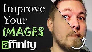

Transform Your RAW Photos Fast!
45sThe dramatic before-and-after of a raw photo grabs attention and promises a valuable skill.
▶ Play Clip"Delivers a solid beginner tutorial on adjustment layers, though the '3' in the title is misleading as it's not about Affinity 3."
This video is a beginner-friendly tutorial on using adjustment layers in Affinity Photo to enhance raw photos. The creator demonstrates how to fix color balance, adjust levels, apply a high-pass filter for clarity, and use HSL adjustments, all while explaining the importance of layer ordering and non-destructive editing.
The video starts by explaining that adjustment layers are used to transform a raw photo into a more polished image, suitable for YouTube thumbnails or restoring old portraits.
Affinity Photo works with layers. The photo is a single layer, and adjustments can be added from the 'Adjustments' option at the bottom of the Layers panel.
The creator uses the White Balance adjustment to correct a greenish tint in the photo. He adjusts the tint slider towards purple (14%) and uses the scroll wheel for fine-tuning.
To make the photo 'pop', the creator adds a Levels adjustment layer. He darkens the blacks, adjusts gamma, and increases white levels, while monitoring the histogram to avoid overexposure.
A tip from his marketing days: using the High Pass filter with a Soft Light blend mode to add clarity and make details pop, instead of using the sharpen or clarity filters.
Adjustment layers and filters can be clipped to a specific layer by dragging them inside the layer, ensuring they only affect that layer, not the entire composition.
The HSL adjustment layer allows for targeted color changes. The creator demonstrates reducing red saturation to minimize blemishes and adjusting yellows for a cleaner look.
The order of adjustment layers affects the final result. The creator rearranges them so white balance is applied first and high pass last, showing that ordering is not random.
Adding blend modes like Soft Light to adjustment layers can create different effects. The creator suggests experimenting with opacity to fine-tune the look.
Affinity Photo has a Color Grading studio and a Develop mode for quick adjustments. The creator shows how to use these for sharpness, clarity, and overall color grading.
The best way to learn adjustment layers is to experiment with each one, see what it does, and combine them with blend modes and opacity to achieve the desired effect.
The video concludes that adjustment layers are a powerful, non-destructive way to enhance photos in Affinity Photo. The key takeaway is to experiment with different adjustments, blend modes, and layer ordering to achieve the desired look.
What is the purpose of adjustment layers in Affinity Photo?
To non-destructively adjust the color, lighting, and contrast of a photo.
00:01
How do you add an adjustment layer in Affinity Photo?
Click 'Adjustments' at the bottom of the Layers panel and select the desired adjustment.
00:43
What is the shortcut to fine-tune adjustment values using the mouse?
Use the scroll wheel on the mouse while hovering over the number.
02:16
What is the 'High Pass' filter used for in photo editing?
To add clarity and make details pop out in a photo.
04:28
What blend mode is recommended for the High Pass filter to add clarity?
Soft Light.
05:27
How can you make an adjustment layer affect only one specific layer?
Drag the adjustment layer inside the target layer in the Layers panel.
06:40
What does HSL stand for?
Hue, Saturation, and Luminosity.
07:16
Why does the order of adjustment layers matter?
Because adjustments are applied from top to bottom, and the order can affect the final result.
09:29
What is the 'Color Grading' studio in Affinity Photo used for?
It provides quick adjustments for hue, saturation, color balance, sharpness, and clarity.
13:50
High Pass Filter Trick
Provides a professional technique for adding clarity without over-sharpening, a common issue in photo editing.
04:28Clipping Adjustments to Layers
Explains a key non-destructive editing concept that allows for targeted adjustments, essential for complex compositions.
06:40Layer Ordering Matters
Highlights a subtle but critical aspect of adjustment layers that can significantly change the final image.
09:29Experiment to Learn
Encourages hands-on exploration as the best way to master adjustment layers, a practical and effective learning approach.
15:13[00:01] inside Affinity is to take a raw photo like the one I have here and turn it into something looks a lot better than what it is right now. Essentially, you what it is right now. Essentially, you could say you're adjusting the photo,
[00:13] little bit about adjustment layers inside Affinity. kind of want to show you how you can take that, you know, turning a raw photo
[00:29] like this, which doesn't really look too good, into something that you could present on a YouTube thumbnail or maybe have an old family portrait that you it look a little bit better when it comes to colors or lighting or whatever.
[00:43] So, now, if you know a little bit about a program like Affinity, you'll know that we work inside something called layers. And you'll notice that inside my photo here, I right now just have one layer, which is the photo that I'm using
[00:56] for this example here. So, you can see I'm toggling it on and off. And you just anything besides the photo. But now, something you can also do is you can go down at the bottom of your layers and see something called adjustments. Now,
[01:10] for now because there are other things that are very interesting to use down here. But when it comes to adjustments, essentially when you click it, you can see we have many different options to touch up on the photo that we have in
[01:22] here. You can essentially change the coloring. You can change the depthness of the photo. You can change basically the brightness and contrast, you know, better than the default one. So if I
[01:34] balance this photo because this is not white balance. You can see the background is actually a white wall. And what I can essentially do is click on the white balance adjustment and go in and tweak these settings a little bit
[01:47] trying to figure out how the photo should look because the photo wasn't taken in optimal lighting when I when I took the photo. So I can take these adjustments down here. And right now I can see it is kind of greenish looking.
[02:02] green. So therefore, I need to go down to where I have the green and purple tint and just go a little bit towards the purple one. Now, when I do that, the purple one. Now, when I do that, let's say I go 14% towards purple. I'm
[02:16] also going to take the top one and go 14% in the opposite direction just to kind of make it look a little bit less green. There is also a shortcut that I you take your mouse and go on top of the number down here and use your scrolling
[02:29] wheel, you can actually go up and down in small adjustments at a time. So you can actually just use your scroll wheel on your mouse in order to change those numbers. There's also something called a picker down here. So if I take this one,
[02:41] you can see it's trying to adjust the color grading just to make things look changing the color balance inside the photo might be, you know, fine, but we want to add a little bit more um popping
[02:55] to the photo. Essentially, we don't want things to look flat. So, right now you have something that I like to describe as a white filter on top of your photo, Now, you can't quite tell what I'm
[03:08] talking about until we actually apply the filter. So, what I'll do is I'll go inside adjustment layers and I can use many different adjustments for this. I could use levels, brightness and contrast. I could use exposure. I could
[03:21] use curves. But in this case, let's go ahead and pick levels. Now, this is inside the photo and the gamma if you want to change that. So, what I'm going blacks a little bit so you can see that things get a little bit darker in the
[03:36] black areas. And then we can also adjust the gamma a little bit to make things a when I turn up and down. So, I'm just going to turn it down just a little bit and maybe turn up the blacks a little bit more. Like so. We can also turn up
[03:49] the white levels a little bit to make the white areas look a little bit better. So, in this sort of way, you can also see we have this graph up here that just kind of shows that when I get past this point here, I'm going to start
[04:01] overexposing certain things. So, you know, some of the I don't know the areas can't see the details here in my cheek because I do already have some lights on sure we overexpose things. So, just a little bit like maybe something like
[04:15] this here might look quite good. So, if we go inside and actually untoggle this, you can see the before and after. You can see things just kind of pop a little bit more. And the next thing I want to do here is actually a small trick that I
[04:28] learned from my time during the I was working in a marketing department back many years ago. And this is not really a adjustment layer. I know this is an adjustment layer video, but this is just kind of a neat how-to tip that I think a
[04:43] lot of people should know about, which is using something called highpass. Now, in order to add clarity and make details pop out inside a photo, some people might go inside and say, well, we have to sharpen the image because we have to
[04:57] bring out some of the sharper details. Or maybe if you go inside filter down here, there's also something called clarity. And that isn't quite the the right effect that I like to use inside my photos. Instead, I'm going to use
[05:12] want to make sure you do here is you have the actual photo selected, then you go inside filter, pick highass, and then you're going to get this. And radius a little bit. So, if we turn it up, you can see, oh, now we start to
[05:27] bring out some details, but it still looks gray. So, we're going to go inside blend mode, and we want to make sure we pick the one called soft light. So, if I zoom into the face, you can see that this is after, and this is before. So,
[05:42] this kind of looks like a a phone photo, so to speak. And then I just kind of increase some of the details a little bit on the face. And again, you can copy paste this if you want to turn it up again by just clicking high pass. You
[05:55] can see it pops up again here. You can just kind of adjust this on the go, which is actually a issue I had with Photoshop back in the day because Photoshop when you add highass just kind of like applies the highpass and then if
[06:10] undo. You can't just go in and tweak it again. Um, but in this one inside Affinity, we can actually just go back in and just kind of adjust it again if you want to. So if I go back out again, you can just kind of see here that, you
[06:24] know, things look much clearer. Right now you can see that high pass the filter that we just added has been added inside my layer. I can actually go ahead can see it closes up again. Now this essentially means that the highpass is
[06:40] essentially means that the highpass is only being applied to this particular layer. So, if I add other photos inside this particular um you know, this composition I have here, they're not going to get affected by the highass.
[06:52] It's only this portrait of me. And we can actually do the exact same thing when it comes to our adjustment layer. So, I can actually go ahead and click on the top one, hold down shift, and then click on the one at the bottom here, and
[07:04] just kind of drag it inside my layer. And then you can see, oh, they disappear, but we still have them applied. And that's because when I click drop down arrow, we now have them inside the actual layer. Now, let's go ahead
[07:16] and change the coloring a little bit of this photo here. So, if I go down to adjustments again, I can sort of pick the one called HSL, which stands for hue shift, saturation shift, and luminosity shift. So, if I go in here, you can see
[07:29] we can add some different hue by just kind of moving the color schema, is that what you call it? Around, you know, the the the colors inside the portrait. We make things look a little bit more saturated, you know, bring out the
[07:43] colors a little bit more. Or we can change the lighting inside the photo it up and down. Uh but what you can also do is pick a particular color. So let's say I have let's say I have some uh some red blemishes inside my face here. What
[07:58] I can actually do is I can pick the red color and now it's only going to apply all the redness inside the photo. And I can just kind of turn down maybe the saturation. So, I'm just going to turn it down. And we can actually tweak how
[08:11] going to say, "Oh, don't affect the yellows. Don't affect the purples, but only the reds." Now, this is going to look weird cuz, you know, right now it we're just sort of like taking away all the coloring from all the red spots. Um,
[08:24] but if we don't do it too much, you can just kind of turn down the redness just a little bit to make things just look a little bit less red if you wanted to. also do the same thing to the yellows. just kind of bring them down a little
[08:38] bit just to make things a little bit a little bit different. So if I turn this on, you can see oh now there's more color. Turn it off or turn it on again. I guess it's it's the opposite way. All the blemishes like all the redness and
[08:51] stuff goes away. So it it comes a little bit more I guess if you had to take a corporate photo. Uh we don't want too much colors, you know, just make things look a little bit more whitish. Is that something you do for like corporate
[09:05] things look a little bit more clean, uh, you could do something like this. But, you know, before, after. I just kind of like the before because I like to have a little bit of color inside my face so I don't look like I lost all the blood
[09:17] inside my skin. And again, as you can see, this actually got added outside my actual layer. So, I can just sort of drag it in here and just have it inside drag it in here and just have it inside the layer itself. Now, the different
[09:29] matter as well. So, if I actually move around these, uh, it's going to apply going to apply them from top to bottom, which means that it is going to do high pass first, and then it's going to add in the, in this case here, the color
[09:45] adjustment if I toggle it back on again, and then it's going to add some different levels to the photo, and then it's going to white balance. That might not be a very good thing to have white balance as the last thing. So, let's go
[09:58] and drag that up as the very top thing cuz I think that will make things just a white balance first and then make adjustments. Um, maybe add a highpass at the very bottom here just to make sure it only sharpens the details after we
[10:12] change the colors the way we wanted to. So, essentially, we just sort of adjust what applies first. In some cases, like if I move around uh levels and I don't going to really make a noticeable difference because that isn't really
[10:28] something that in that sort of great way affects each other. Um, but in some cases, you can see a clear difference when you move these around. So, the ordering does matter. It's not random. So, maybe again, we can go inside here
[10:40] adjustments, maybe I want to add some brightness and contrast to this. I'm bottom. Um, I'm going to add a little bit of contrast just to make things a little bit more difference when it comes to lights and shadows and colors, you
[10:55] know, to to give a little bit more to make things less flat essentially. Like just making sure that the differences between lights and shadows are there. And the same thing when it goes for, you know, um, colors. So, really my advice
[11:10] here is to go through all of these one by one and just kind of like experiment a little bit with what exactly they do. For example, I can try and take normals down here, which adds this sort of filter or adjustment layer. It's it's
[11:23] not called a filter. That's something else. But adjustment layer. And I can essentially go in and maybe add another blend mode to it. Let's say we want to again maybe add soft light. And as you can see, it's going to give it some
[11:36] different effects here. You know, can adjustments adjust it just a little bit just to kind of get some different effects here. just to kind of see how that like that might look a little bit cool. We can also flip it if I want to
[11:48] cool. We can also flip it if I want to do that. Um, turn down the opacity for it so it's not 100% but just so we get a little bit of that effect. Might be a little bit cool. Um, so let's say 25%. So if I were to go in and untoggle it.
[12:01] go. Toggle it back on again. It's just going to give something to the photo guess you know when you have a filter applied on your phone when you take a photo you know for Instagram or something. So now if I want to see the
[12:15] I can just sort of click the top adjustment layer, go all the way down and shiftclick on the bottom one. And then you can see we select all of them. Then toggle the invisibility or visibility it's called. I toggle it. You
[12:28] can see this is oh this is before it looks very green. The original raw image when I toggle it back on again, you can see oh okay so now things look quite a bit better than it used to. And again, we can always adjust this and tweak the
[12:44] normals here was a little bit too much. I can always just turn it down just a little bit. Maybe something like 10% is a little bit better. Maybe I want to add some exposure to it. So, I'm just going to go in here, going to add exposure.
[12:58] I'm going to hold down control and then mouse scroll because it is going to If I just scroll, you can see, oh, that's way too bright. So if I hold down control, it's going to do it in slightly less increments just to make things, you
[13:12] less increments just to make things, you know, not overexpose itself. Um, so you can see before after. So again, we just sort of go in and play around with this to just kind of get a different effect. So essentially, whenever you see someone
[13:24] take a raw photo and turn it from a raw photo into something that looks like photo into something that looks like this. So essentially, again, before after is essentially to just use adjustment layers to do so. This kind of
[13:36] or something because it has this green filter on top of it like the movie has. Um, so good thing we went in and adjusted things a little bit. Now, there is one last thing I want to show here because this is how you work with things
[13:50] inside pixel mode, which is one of the studios that you work with inside Affinity. Now, Affinity does have another studio inside Studio Manager up here that you can toggle on called color grading. And this one essentially is
[14:04] more or less a studio mode where you can do all the stuff we just did but with one, you can see that now oh we have all these um you know quick adjustments we can do. We change the hue, the
[14:18] saturation, the color balance, sharpness and clarity. So I could maybe turn up my sharpness a little bit. Turn it up too much. It's going to look very like um photo. up. But we can always tweak this a little bit just to make things a
[14:31] little bit sharper. Maybe like 13% or so, you know. Go inside adjustments up different tools that we also have inside our layers panel over here. So we have all these different adjustments but inside another tool. And once you're
[14:45] we can click something called develop. So if I do that, you can see oh now we have this version and we get some more options over here in the side, you know, white balancing, vibrance, saturation, clarity, contrast. And then we can just
[14:59] sort of click develop. And now we have this develop version that you can see that just, you know, looks better. And again, this was more or less just me different adjustment layers that you can use inside your photos to enhance them a
[15:13] use inside your photos to enhance them a little bit. Um, but again, using the really do learn how to use them is just to kind of go in and say, well, okay, what does uh what does recolor do? And then you pick it. Oh, okay. So it
[15:26] changes the coloring of the whole composition. So you can, you know, just turn down the uh what do you call the saturation. You can change the colors. So maybe your whole composition looks like this right now. Maybe can add a
[15:39] blend mode to make things just like look like there is a uh a little bit of a filter on top of the original photo. So you can turn down the opacity of it. So you still have the original colors popping out, but now we kind of get this
[15:51] uh yellowish filter, orange filter I guess you can call it. So really, it's all about just kind of testing them out. I'm just going to drag this inside just so we can have it in there. And again, just see before, after, just to kind of
[16:05] learned something when it came to using adjustment layers inside Affinity. Play around with it, see what works for you. So, with that said, I hope you enjoyed So, with that said, I hope you enjoyed and I'll see you guys next time.




⚡ Saved you 0h 16m reading this? Transcribe any YouTube video for free — no signup needed.