
The Scary Truth About S&P 500 PE Ratio
45sReveals a shocking correlation between PE ratio and future returns, sparking curiosity and concern among investors.
▶ Play Clip"The title 'This Stock Data is Terrifying' is somewhat sensational, but the content delivers a clear, data-driven warning about expensive valuations, making it mostly accurate."
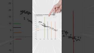
The video presents a scatter plot showing the correlation between the S&P 500's price (measured by the PE ratio) and expected 10-year annualized returns. It highlights that when the PE ratio exceeds 23, historical returns have always been negative, and the current PE ratio of 29 suggests stocks are expensive, though not necessarily poised for an imminent crash.
The chart shows the correlation between the price paid for the S&P 500 and expected average returns over the next 10 years. Higher prices correlate with lower future returns.
When the S&P 500 is more expensive (higher PE ratio), the likelihood of losing money over a 10-year span increases, making logical sense.
When the PE ratio reaches 23, there were no exceptions: the annualized return over the next 10 years was always negative, indicating you are essentially buying at the top.
The current PE ratio of the S&P 500 is 29, which is above the critical threshold of 23, suggesting stocks are expensive.
The data does not imply an imminent crash or that it's time to sell. There is still room for the market to go up, but investors should position accordingly given the expensive valuation.
The video concludes that while the S&P 500 is historically expensive (PE ratio of 29 vs. the 23 threshold), this does not predict an immediate crash. Instead, it serves as a warning for investors to adjust their positioning based on the likelihood of lower future returns.
What does the scatter plot show?
The correlation between the price paid for the S&P 500 and expected average returns over the next 10 years.
00:02
What happens when the PE ratio reaches 23?
There were no exceptions: the annualized return over the next 10 years was always negative.
00:29
What is the current PE ratio of the S&P 500?
29.
00:43
Does a high PE ratio guarantee a market crash?
No, it does not mean the market will crash tomorrow or that it's time to sell; there is still room to go up.
00:58
PE Ratio Threshold of 23
This is a critical historical data point showing that above this level, 10-year returns are always negative, which is a powerful warning for investors.
00:29Current PE Ratio is 29
This directly applies the historical threshold to the current market, making the information actionable for viewers.
00:43Not a Crash Prediction
It clarifies that the data is not a timing tool but a positioning guide, preventing panic selling.
00:58[00:02] the internet and the data is absolutely terrifying. Now, this is a scatter plot. >> Scatter plot. What this chart shows is the correlation between the price you pay for the S&P 500 and the expected average returns you're likely to get
[00:16] over the next 10 years. And it just so turns out that if things are more expensive, your returns have a negative correlation, meaning the more expensive the S&P 500 is or the higher the PE
[00:29] ratio, the more likely you are to lose over a 10-year span, which makes a lot of sense. But this is when things start to get a little bit eye-opening. If you look closely at the chart, the moment the PE ratio gets to 23, there were no
[00:43] exceptions, your annualized return over the next 10 years was always negative, meaning you're basically buying the top. And what's the current PE ratio of the S&P 500? 29. Does this mean that the stock market is going to crash tomorrow?
[00:58] Does this mean it's time to sell? No, we still have plenty of room to go up, but what it does show us is that currently stocks are expensive and with that information, you should be positioning accordingly.
⚡ Saved you 0h 01m reading this? Transcribe any YouTube video for free — no signup needed.


![BEST MACD Trading Strategy [86% Win Rate]](https://img.youtube.com/vi/rf_EQvubKlk/mqdefault.jpg)