
10 Days to Better Design: How It Works
46sClear, actionable overview of a design course that promises quick improvement, likely to attract aspiring designers.
▶ Play Clip"The title promises a walkthrough and delivers exactly that, though it's brief and lacks depth."
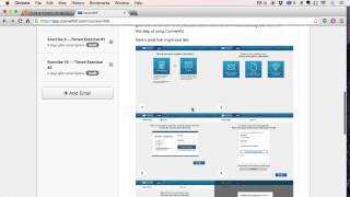
This video provides a quick walkthrough of the '10 Days to Better Design' email course, explaining the structure and a few of the exercises included. The course delivers text-based lessons one at a time, each introducing a design concept and a practical exercise. The examples shown include designing a filtering interface, gradual engagement, and redesigning a poorly designed Twitter app.
The video introduces the '10 Days to Better Design' series of exercises, acknowledging that some titles are vague and need explanation.
The course is delivered via email, one text-based lesson at a time, introducing a concept and an exercise.
Participants sketch three different ways to accomplish a single interface goal (e.g., filtering) using pen and paper, suitable for any skill level.
A lesson on the UX concept of gradual engagement, where participants convert an existing app to use this approach.
Participants redesign a provided Twitter app with spacing and contrast issues, only adjusting spacing and alignment (no color changes).
There are seven more lessons in the course beyond the examples shown.
The '10 Days to Better Design' course offers practical, hands-on design exercises delivered via email, suitable for all skill levels. The examples shown focus on core UX concepts like filtering interfaces, gradual engagement, and attention to design details.
What is the format of the '10 Days to Better Design' course?
It's an email course sent one text-based lesson at a time.
00:14
What is the exercise for the 'Designing a Filtering Interface' lesson?
Sketch three different ways to accomplish one interface goal using pen and paper.
00:26
What is 'gradual engagement' in UX?
A UX concept where users are gradually introduced to features or content.
01:16
What are the constraints for redesigning the poorly designed Twitter app?
Only change spacing and alignment; no color additions.
01:47
How many lessons are in the course?
Ten lessons total.
01:59
Pen and Paper Sketching
Emphasizes low-fidelity prototyping as a core design skill.
00:26Gradual Engagement Concept
Introduces a key UX principle that improves user onboarding.
01:16Design Constraints
Shows how limiting changes to spacing and alignment can dramatically improve a design.
01:47[00:00] This is a quick walkthrough of what's in the 10 Days to Better Design series of exercises. So I listed out here, but some of these are obviously kind of vague and it's hard to explain. It's just a title, so I want to walk you through it.
[00:14] So what you'll get is an email course sent out to you one lesson at a time. They're all text-based, and I'll introduce a concept. So this is one I call Designing a Filtering Interface.
[00:26] And basically what I have you do is I explain a particular interface, what it should accomplish, and then the exercise that you do is go through and, with pen and paper, sketch out three different ways to accomplish that one goal with an interface.
[00:48] And so that could be using select boxes, adding and removing a bunch of rules, a bunch of different things. and you do that in pen and paper just at a small size and that how that one works It can be accomplished by someone of any skill level it just a matter of how good your solution is going to be The next lesson is on gradual engagement And so I teach a little lesson on what that means It also a user experience concept Provide an example and then
[01:16] have you go off and convert another app to gradual engagement. The third option or the third lesson I'll show you is an interface example. And so we teach a little bit about how design is in the details and what to focus on.
[01:32] And then further on, I provide a poorly designed Twitter app that I made that has a bunch of spacing contrast issues. And then you go through and redesign it only slightly.
[01:47] You're not allowed to add color or anything like that. You're only allowed to change the spacing, fix the alignment. but you go through and and redesign it to make it a lot better so this exercise is something you'll
[01:59] use a ton of different times hopefully that gives you a quick idea of what's in the course there's seven more lessons after that but that should get you started




⚡ Saved you 0h 02m reading this? Transcribe any YouTube video for free — no signup needed.