
Fibonacci Retracement: The Secret to Reversals
43sThis segment explains a popular trading tool with a clear, actionable entry strategy, making it highly educational and shareable for beginners.
▶ Play Clip"Title accurately reflects content: 18 strategies explained concisely in 12 minutes."
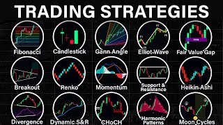
This video provides a comprehensive overview of 18 different trading strategies and concepts used in financial markets, ranging from basic support and resistance to advanced harmonic patterns and market structure analysis. Each strategy is briefly explained with its key characteristics and how traders can apply it.
Uses horizontal lines based on Fibonacci numbers to identify key support and resistance levels. Traders identify a swing low and swing high, then drag the tool from low to high. The 0.382 level is the most common reversal point.
Occurs when price makes a sudden significant movement after a consolidation period. Notable patterns include wedges, triangles, and rectangles.
Patterns that signal a trend reversal. Notable patterns include double tops/bottoms, triple tops/bottoms, head and shoulders, and cups and handles.
Market moves in a series of five waves before reversing. Rules: wave 2 cannot be longer than wave 1 and retraces to 0.618; wave 3 must be longest; wave 4 must stay above wave 1 peak and retraces to 0.382.
Occurs when a candle forms a significant gap due to imbalance. Draw a rectangle at the gap between previous and next candle wicks; price may revisit this level.
Notable patterns include engulfing, hammer, shooting star (rejection), and doji (neutrality).
Indicator that replaces traditional candlestick chart to reduce noise. Green candle signals uptrend, red signals downtrend. Larger body indicates stronger trend. Does not display real market price.
Uses moon cycles to time market. New moon = bullish, full moon = bearish. Used as a confirmation tool.
Forms blocks based on price change (e.g., 1% change per block) instead of time. Green block = uptrend, red = downtrend. Filters noise, does not display real price.
Advanced patterns based on Fibonacci numbers. Example: bullish bat pattern (M-shaped) with specific guidelines for each point (X, A, B, C, D). Notable patterns: butterfly, bat, crab.
Horizontal levels where price has bounced. Support below price (buy), resistance above (sell).
Uses indicators like moving averages as key levels instead of static horizontal lines.
Diagonal lines during a trend. Upward = bullish, downward = bearish. Price retracement to trend line can be an entry opportunity.
Tool displaying multiple lines at different angles. Steep angles = strong trend, shallow = weak. Apply by locking price-to-bar ratio, identifying range, drawing 45° line, then using Gann fan tool.
Measure direction and strength of trend. Notable: MACD (crossover signals), moving averages (price above = bullish), parabolic SAR (dot below = bullish), supertrend (green = bullish).
Display relative strength, effective in choppy markets. Notable: RSI (oversold/overbought), stochastic (oversold/overbought and crossovers).
When indicator shows opposite signal to price movement, often signaling reversal. Example: price makes higher highs but MACD makes lower highs (bearish divergence).
Show strength behind price movement. Notable: price volume (bar length = volume), VWAP (ratio of price to volume), volume profiles (horizontal bars as key levels).
Zones where significant price movements started. Demand zone (upward), supply zone (downward). Treated as key levels for entries.
Analysis of market behavior. Uptrend: higher highs and higher lows. Downtrend: lower highs and lower lows.
When price breaks previous peak during a trend. In uptrend, breaking previous high is break of structure.
When price breaks previous structure, often signaling reversal. Example: from higher highs/lows to lower lows.
The video covers a wide range of trading strategies from basic to advanced, emphasizing that each tool can be used alone or combined with others for better entry signals. It encourages viewers to practice and find what works best for their trading style.
What is the most common Fibonacci retracement level where price tends to reverse?
0.382
00:16
Name three notable breakout patterns.
Wedges, triangles, and rectangles.
00:58
What are the three rules for a valid Elliott wave?
1. Wave 2 cannot be longer than wave 1 and retraces to 0.618. 2. Wave 3 must be the longest. 3. Wave 4 must remain above wave 1 peak and retraces to 0.382.
01:50
What does a green Heikin Ashi candle indicate?
An uptrend.
03:43
According to moon phase trading, what does a new moon indicate?
The market tends to be bullish.
04:20
How does a Renko chart form its blocks?
Based on price change (e.g., every 1% change in price), not time.
04:34
What is the shape of a bullish bat harmonic pattern?
The letter M.
05:28
What does a steep angle in Gann angles indicate?
A strong trend.
07:33
What does a MACD upward crossover indicate?
A bullish trend.
08:15
What is a bearish divergence?
When price makes higher highs but the indicator makes lower highs, signaling a possible reversal to the downside.
09:40
What does VWAP stand for?
Volume Weighted Average Price.
10:06
What characterizes an uptrend market structure?
Higher highs and higher lows.
10:59
What is a change of character?
When price breaks the previous structure during a trend, often signaling a reversal.
11:25
Fibonacci Retracement Basics
Introduces the most widely used retracement tool and its key level (0.382).
00:03Elliott Wave Rules
Provides specific, testable rules for wave counting, a core concept in technical analysis.
01:38Harmonic Patterns Complexity
Highlights advanced pattern recognition with precise Fibonacci ratios, showing depth of analysis.
05:16Divergence as Reversal Signal
Explains a powerful concept where indicator and price disagree, often leading to trend changes.
09:25Market Structure Fundamentals
Defines the building blocks of trend analysis (higher highs/lows) essential for all traders.
10:59[00:03] displays horizontal lines based on the Fibonacci numbers these lines can then be used as key support and resistance levels to use the Fibonacci retracement tool you first start by identifying a swing low and swing high on a chart then
[00:16] drag the tool from the swing low to the swing High next wait for the price to make a pull back to one of these levels ideally the 0.382 Fibonacci level because that's the most common level where price tends to reverse from so if
[00:30] price touches that level that could be a good buy entry keep in mind that price could also reverse from other Fibonacci levels combine it with other confirmation signals to get a better entry breakout patterns it is when price
[00:44] makes a sudden and significant movement towards One Direction This usually forms after the market makes a consolidation period for example here we can see that the price is consolidating then it suddenly moves sharply to the downside
[00:58] this is called a Breakout to take advantage of this Traders could use specific patterns as a guide to identify breakouts before they happen most notable breakout patterns includes wedges triangles and the rectangle
[01:11] wedges triangles and the rectangle pattern reversal patterns it is when the current Trend and forms a counter Trend specific patterns could be identified in a chart which could help Traders predict reversals before they
[01:24] happen most notable reversal patterns are double top and bottoms triple top and bottoms Head and Shoulders cups and handles aliot wave it is a theory that suggests that market tends to move in a
[01:38] series of five waves before reversing and forming another set of waves in the opposite direction by understanding the Elliot wave sequence Traders could predict where the price is Heading by following the pattern in a chart we can
[01:50] label each point of the Waves as 1 2 3 4 5 and ABC now there are specific rules to ensure that a movement is considered as a valid Elliot wave first wave 2
[02:02] cannot be longer than wave 1 and usually pulls back to the 0.618 Fibonacci level second wave three must be the longest wave amongst Wave 1 3 and five third
[02:16] Wave 4 must remain above the peak of wave 1 and usually pulls back to the 0.382 Fibonacci level so here's an example of the Elliot wave in action in this chart we can see that the price resembles a possible one 23 Elliot wave
[02:31] and So based on the theory of wave 4 which is that price tends to pull back to the 0.382 Fibonacci level before continuing upwards we can use this as a continuing upwards we can use this as a potential buy entry when price makes a
[02:44] pullback fair value gaps a fair value Gap occurs when a candle forms a significant Gap due to an imbalance of buying or selling to find a fair value Gap you first need to find a candle with a large body then draw a rectangle at
[02:58] the Gap place between the previous candles swick and the next candles swick this level now acts as a potential magnet where price May revisit before continuing its movement Candlestick patterns it is a
[03:13] future price movements by looking at specific Candlestick shapes notable Candlestick patterns include engulfing towards the direction of the engulfing candle hammer and shooting star patterns
[03:27] which indicates rejection as shown by the long Wick on one side DOI patterns which signals neutrality in the market ha kanashi it is an indicator that fully replaces a traditional Candlestick chart to a hinachi chart when applied it tends
[03:43] to give less noise than a traditional Candlestick a green hinachi candle signals that the price is on an uptrend and a red HK kanashi candle signals that the price is on a downtrend the size of the candle's body also indicates how
[03:56] strong a trend is the larger the candle the stronger the trend keep in mind that the ha kanashi only acts as an indicator it does not display the real market it does not display the real market price moon phases it is a concept that
[04:08] utilizes moon cycles to time the market moon face Traders believe that Moon cycles are correlated with human emotions and behavior which could have an influence on the market specific Moon phases are believed to be favorable
[04:20] towards a certain Trend a new moon means the market tends to be bullish and a full moon means the market tends to be bearish today it is used mostly As as a confirmation tool ranko it replaces a traditional
[04:34] Candlestick chart to a ranco chart so unlike a traditional Candlestick which forms a new candle based on a certain period of time a ranco chart forms its block based on the change of price for example every 1% change in price a
[04:49] wrinkle block appears this means that each wrinkle block represents a 1% change in price of course you can change the parameters of this through the indicator settings Traders could utilize ranco Tarts to filter out noise and
[05:01] identify Trends a Green rankle Block signals an uptrend and a red rankle block signals a downtrend and keep in mind that Rano charts only acts as an indicator it does not display the real market price harmonic patterns these are
[05:16] Advanced price patterns that follows a specific shape based on Fibonacci numbers Traders can then use these specific shapes to predict future price movements for example a bullish bad pattern is formed when price makes a
[05:28] series of four movements ments that is shaped like the letter M each point can be labeled as x a b c and d and each of these points has a specific guideline for example point x to point B needs to have a value between 0.382 and 0.5 point
[05:43] a to c needs to have a value between 0.382 and 0.886 and the same thing works for the other points next these specific guidelines can then be applied onto a real chart so if you see a price forming
[05:57] the har monic pattern tool to check if the price that formed matches a patterns guideline if it does then you can take a position based on the pattern that
[06:09] formed there are multiple harmonic patterns that exist most notable are patterns that exist most notable are butterfly bat crab and each have their butterfly bat crab and each have their own unique values support and resistance
[06:21] horizontally where the price has bounced off in the past and could possibly bounce again in the future if the level is below the Price It's called support where you can take a buy position if the price approaches it and if the level is
[06:35] where you can take a sell position if the price approaches it Dynamic support and resistance similar to support and resistance Dynamic support and resistance also acts as key levels but instead of using static horizontal lines
[06:50] it uses indicators like the moving average to act as our key level trend lines trend lines are key levels that form diagonally during a trend Market you can use trend lines to identify the overall direction of the price upwards
[07:04] trend line means bullish downwards trend line means bearish and similar to support and resistance you can also use the trend line to identify possible entry scenarios for example if price retraces back to a trend line it can be
[07:17] a good opportunity to take a buy position gone angles it is a tool that displays multiple lines that spread continuously on different angles these levels and could also help you measure the strength of a trend price moving
[07:33] within the Steep angles of the tool indicates a strong Trend and price moving within the shallow angles of the tool indicates a weak Trend to apply the Gan angles first you go to settings then make sure to check the lock price to Bar
[07:47] make sure to check the lock price to Bar ratio next identify a market range and mark the swing low and the swing highs of that range then draw a straight vertical line at the start of the range after that select the trend angle tool
[08:00] and measure 45° then use the gun fan tool and place it at the 45° angle momentum indicators these are the types of indicator that measures the direction and strength of a trend it is
[08:15] markets some of the most notable momentum indicators are macd an upwards crossover indicates a bullish Trend while a downwards crossover indicates a bearish trend moving averages price being above the moving average signals a
[08:30] bullish Trend and price being below signals a bearish trend parabolic are a DOT below the price indicates a bullish Trend and a DOT above the price indicates a bearish trend super Trend green signal indicates a bullish Trend
[08:44] and a red signal indicates a bearish trend indicator that displays the relative strength of a price it is most effective when used on choppy or sideways markets most notable oscillators include RSI
[08:59] when the line is in the oversold region it indicates a possible reversal to the upside if it's in the overbought region it indicates a possible reversal to the downside stochastic if both lines are at oversold it signals a possible reversal
[09:13] to the upside and if both lines are at overbought it signals a possible reversal to the downside these two lines can also cross over each other to predict future price movements divergences divergences occur when an
[09:25] indicator displays an opposite signal of the real price movement when this happens it is usually a sign that the trend might reverse divergences could occur in many indicators such as the macd stochastic and the RSI for example
[09:40] here using the macd indicator you can see that the price is forming higher highs which is bullish but the indicator shows the opposite a lower highs which is bearish in this case this is a bearish Divergence which signals that
[09:53] the price may form a reversal and so you can take a sell position indicator that shows the strength behind a price Movement by tracking the trading
[10:06] volume notable volume indicators include price volume which displays the volume for each candle the longer the bar the higher the volume volume weighted average price which shows the ratio of an asset's price to its total volume it
[10:20] can be traded like a moving average or as a dynamic support and resistance volume profiles it displays a volume bar horizontally which can be treated as key levels for potential entry positions supply and demand also
[10:34] referred to as order blocks these are zones where significant price movements significantly upwards from a level it is considered a demand Zone and if price moves significantly downwards from a
[10:47] level it is considered a supply Zone just like support and resistance these zones can be treated as key levels for potential entry positions Market structure Market structure is when Trader anal izes the
[10:59] behavior condition and flow of the market an uptrend structure is characterized by Price forming higher highs and higher lows while downtrend structure is characterized by Price forming lower highs and lower
[11:12] forming lower highs and lower lows break of structure it is when price breaks the previous price Peak during a trend for example if the price forms a higher highs and higher lows this break of the previous highs is called Break of
[11:25] structure change of character it occurs when price breaks the previous structure during a trend often signaling a reversal from that current trend for example if the price is forming higher highs and higher lows then it breaks the
[11:39] previous lows forming lower lows this is called a change of character so did I miss any strategy let me know in the comments below and if you find this enjoyable kindly do a small favor by liking the video and subscribe to the
[11:52] means so much to me you can also check for watching and I'll see you see you in the next video
⚡ Saved you 0h 12m reading this? Transcribe any YouTube video for free — no signup needed.