

Heikin Ashi vs Candlestick: Noise Removed
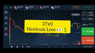
46sThe contrast between Heikin Ashi and traditional candlesticks is visually striking and immediately useful for traders seeking cleaner trend signals.
▶ Play Clip"Title promises profit but video delivers educational content on Heikin Ashi usage; slightly exaggerated but mostly accurate."
This video explains how to use the Heikin Ashi chart for day trading, particularly in binary options and Forex. The presenter demonstrates how this chart type filters market noise and emphasizes trend strength, offering strategies for identifying trend reversals and continuations.
The Heikin Ashi chart is a powerful tool that filters noise from candlestick charts, giving more emphasis to the trend.
Heikin Ashi eliminates small correction candles, making trends clearer. Red candles in candlestick charts may appear as corrections within an uptrend in Heikin Ashi.
Heikin Ashi helps identify trend strength and weakening. A green candle without a lower wick indicates strong bullish momentum; a red candle without an upper wick indicates strong bearish momentum.
A candle with a wick at the high but no wick at the low (in an uptrend) or vice versa (in a downtrend) can signal a potential trend reversal.
The presenter shows how Heikin Ashi candles at a support level (560) indicated weakening selling pressure and a potential reversal.
In an uptrend, each candle's high should be higher than the previous. When highs stop breaking, the trend weakens.
Use a 200-period moving average. When price touches the average and shows a trigger candle (e.g., rejection), trade in the direction of the trend.
Heikin Ashi charts are effective for filtering noise and identifying trend strength. Combining them with moving averages or support/resistance levels can improve trading decisions.
What does a green Heikin Ashi candle without a lower wick indicate?
Strong bullish momentum.
02:31
What does a red Heikin Ashi candle without an upper wick indicate?
Strong bearish momentum.
04:28
What is a 'trigger candle' in Heikin Ashi?
A candle that shows a wick at the high but no wick at the low (bullish reversal) or vice versa (bearish reversal).
03:31
How does Heikin Ashi differ from candlestick charts?
Heikin Ashi filters noise and emphasizes trend, eliminating small correction candles.
00:55
What is the 'staircase movement' in an uptrend?
Each candle's high should be higher than the previous candle's high.
08:33
What simple strategy uses a 200-period moving average with Heikin Ashi?
Wait for price to touch the moving average and form a trigger candle, then trade in the direction of the trend.
10:01
Noise Reduction
Heikin Ashi eliminates small correction candles, making trends clearer than candlestick charts.
00:55Candle Without Lower Wick
A green candle without a lower wick signals strong buying pressure and trend strength.
02:31Trigger Candle Concept
A specific candle pattern can indicate a potential trend reversal, useful for entry timing.
03:31Staircase Movement
Monitoring highs breaking in an uptrend helps identify trend continuation or weakening.
08:33[00:02] a little about the Rakh chart. This chart, which few people use, but if you know how to use it correctly, you'll have a very powerful tool at your disposal.
[00:27] those famous candlestick charts, right? Those Japanese charts, but there are use for your analysis, such as the Rakh chart. This chart looks a lot like a candlestick chart, but
[00:41] I'm going to show you a simple and quick way to have some strategies based on this chart. So let's go! Look, you can see I'm here with the Rakh chart. It gives much more emphasis to the
[00:55] trend than, for example, the Kand XIC chart. It eliminates the noise, those small correction candles that appear. For example, I circled this upward trend now, and now I'm going to put it on the candlestick chart so you can
[01:09] difference here? For example, we had a red candle, showing a trend. Here's another chart. Red kendo here, another red kendo Red kendo here, another red kendo here, another red kendo. Anyway, if I
[01:23] bring this to the Rake Ash chart, you can see that these red candles that appeared within the candlestick chart were correction candles. They will naturally appear as red, but the Rake Ash chart
[01:38] will give a little more emphasis to the trend, suggesting that that correction candle, for example, was within an upward trend and it will probably follow that upward movement, representing a correction,
[01:50] a small correction, right? Well, there are several ways you can use this Rake Ash chart, for example. You see I have this one, I'll call it a candlestick so you understand, but I have this candlestick here from the Rake Ash chart, right? And
[02:04] this other one here, the Rake Ash chart, it's good for you to understand the strength of the trend, firstly, secondly, where it's starting to weaken because it's a good point to take, for example, price reversal, right? And where you can
[02:18] make the continuation of that price. But how are we going to understand this? candle here, you can see that it's a green candle, representing a a green candle, representing a bullish candle, but it doesn't have a wick at the
[02:31] low. What does that mean? This means that this trend is likely to start with some force, so looking more closely at buying opportunities based on this signal from the RH (Return on Higher Threshold) is very valid. So, what I need in a
[02:47] strong uptrend, for example, using RH, is to have candles without using RH, is to have candles without wicks at the low. Okay, at the high it's natural there will be some, but at the low I want there not to be, because the wick at the low
[03:02] trade a little lower, that is, it shows a selling action, even if weak, but there is selling action here. For example, when I have this candle here, for example, which has a wick at the high and at the
[03:16] low, it doesn't show such a strong upward force yet, but it already shows that the market is already wanting to get out of this downtrend to enter an uptrend, for example, a price reversal. So, from the moment
[03:31] I have this candle, which is what we call a trigger candle, showing a strong candle with a wick at the high but no wick at the low, we can already start, for example,
[03:44] through some confluences, to take risks in buying because look what the market did immediately afterwards, right? Look how interesting, I'll show the context. For you here, we have a red candle without a price point (PR) at the high,
[03:58] representing a strong downward trend. The market is falling and falling, reaching exact, at 560. The price starts to accumulate, as if it were, for example, a support region.
[04:12] starts to accumulate, and at a certain point, it already shows that in this candle, for example, in this one here, the high is already being broken. So, if I'm in a downward trend, it's the opposite of an
[04:28] upward trend. So I want strong red candles with a wick at the low and no wick at the high. That's what I want, a strong downward trend. Now, if I want to look at a strong upward trend, I want a green candle without a wick
[04:40] at the low and with a wick at the high. Okay, so here we were coming with this characteristic of a strong downward trend, then the market reached 560. Here it started to stalled here, this candle appeared, showing us a
[04:54] weakening downward trend, so much so that the candle at the high here, the wick at the high, has already been shown to us. So, at what point... People start, for example, looking at buying. So, does that mean the selling isn't
[05:07] as strong in that region anymore? If we have support at 560, can I wait, or can I take a risk on buying if I want, for example, setting a low on that wick, a stop loss on that wick if you work with Forex,
[05:20] looking a little more closely at the buy price from here, or can you wait for the trigger candle to appear to take a slightly better risk? For example, this one that's been appearing shows a change in character, right? A change from a
[05:35] downtrend to an uptrend. So, this uptrend. So, this moment at 560 was super important for us to see through the HH realignment that this trend would probably change. So,
[05:49] for example, the market started moving, moving, moving, moving, moving, moving, moving, and it It was going up, up, up, up, up. You can see that this candle already started showing us the wick at the low. So it's already deviating a bit
[06:05] from the previous character of this trend, showing a slight weakening, right? So from here you could keep an eye on it, but the... What would trigger the reversal of that price? A red candle, for
[06:18] example, appearing there, right? Then the market continued the trend, showing that strong candle again without a wick at the low. Okay, so starting again, right? In this uptrend, it reached a certain point, but to be more precise,
[06:31] in the 700 region, the market started to stall, accumulating. Okay, then a wick at the high, a wick at the low, and then this candle appeared. But this red candle that appeared...
[06:44] It's a candle that had a wick at the high, so I don't want to take that as an example, sells here, for example, you can see that the market has already accumulated here.
[06:56] And this candle already suggested that if you were in binary options, for example, you could start selling the next candles of about 5 minutes, anyway. But looking more at the sells there, it would already make sense through the
[07:09] analysis of the... for example, if you wanted to take a stronger risk. Look, we need to see that after this candle, the trend was already taken over again by buying. So, despite the accumulation and the resistance being here, there was
[07:22] n't a strong downtrend signaling this rise, rise, rise, rise. Oops, here you can see that there has already been a weakening of the upward trend. Here we
[07:37] in binary options, for example, and think about selling. It makes a confluence with the resistance region. Great, it made a confluence there. Oops, this one is already red. So you can see that from here I can already consider this
[07:53] 760 region, which is this resistance, as strong resistance for a possible price reversal. Remember, when we technical and chart analysis tools, we use these
[08:07] tools to assist our reading. It's not really a rule reading. It's not really a rule that it will fall, but from the context and the HiH tool, we can predict that if it's a
[08:20] resistance region, the price should probably start to fall from there. Well, another way you can observe if this trend is characteristic is the following: the famous staircase movement. So, if
[08:33] I want an upward trend, I need the candles to keep breaking the high. Pay attention, I want this candle at the high to be higher than this one, which is higher than this one, which is
[08:47] higher than... That this is higher than that. This is a good characteristic of an upward trend, that is, the highs shown by the rest indicator are being broken. From the longer have these upward breakouts, these staircase movements, it means
[09:05] that this trend is already starting to weaken. So let's go, look. Look, I had this characteristic, you see? Here I didn't have this breakout of the high, so if you were buying, you wouldn't look at the PRs anymore, the buys, right?
[09:19] But look, here the market started to break the highs again until it reached a point where it became linear and couldn't break the highs anymore. So here we already have a possible price resistance, a possible
[09:33] price resistance, right? Look, here, broken high, broken high. So it follows an upward trend, it follows an upward trend until this red indicator comes, representing this possible price drop. Okay, now folks,
[09:48] you understood how you can look at this rest indicator chart with a little more care. Now I'm going to give you a very simple strategy for you to start applying and developing. See it there through the chart. From HR: Remember
[10:01] strategize within this chart, but I'm going to teach you a very simple one. For example, let's put a 200-period moving average here, which is this black average. What you can do is, every time the market touches this
[10:17] average, testing this average, for example, we were in a downtrend, yes or no? Yes, right? So the market came, tested the average, correct? Rejected this average, you can see V, that it didn't break the highs anymore
[10:31] we can consider as a trigger candle in an average, it can, so, the market corrected, right? Tested the averages, didn't break, okay? Give the trigger, sell,
[10:46] the market will probably fall. You can wait for two trigger candles, such as this first one that shows the weakening of the sell signal, or this T candle, a wick at the low, which also represents a weakness of the
[10:59] start with a trigger and sell, or you can wait for a trigger where this strong candle appears here, demonstrating a slightly more robust sell signal. Of slightly more refined reading and you can... Anticipating this sale is even better because
[11:14] you can position yourself at a better rate, right? But okay, let's go then, wait for it to test the average and return to the trend. Just to finish the last example here, we were in an uptrend. Okay, the market came and
[11:28] tested this average. The moment it tests the average, it already gives me a tests the average, it already gives me a trigger candle for the uptrend. From this candle, I start looking more at buying, yes or no, yes,
[11:44] looking more at buying, yes or no, yes, market accumulated a little and then started to rise very strongly, right? So here would already be a trigger candle, for example, if you didn't want to take this one, you did
[11:58] n't take this one for some reason, you didn't take this one, right? The time possibility of another trigger candle, right? And a third trigger candle. So we had here, after touching the average, it's important that
[12:12] the average touch happens, you wait for the trigger candle to be able to follow your trend, okay? Logically, I 'm showing you a very simple strategy to use with this HR chart, but there are
[12:26] countless possibilities. This way of looking at what I... I'm teaching you today that you can also use it in support and resistance areas, trend lines, so it's a really cool way. It depends a lot on your
[12:38] repertoire of strategies, and using this chart within your portfolio will make a lot of sense too. Okay, if you liked this video, don't forget to leave your like. Remember that I trade live with the VIP group every single day.
[12:52] VIP community. The link is below. Subscribe to our channel because every YouTube also trading live with the group, and it will be a pleasure to have you there in our group so we can analyze together. Okay, a big hug and we're in this together.



⚡ Saved you 0h 13m reading this? Transcribe any YouTube video for free — no signup needed.