
The Cheesecake Pattern That Predicts Markets
60sUses a relatable analogy to explain a complex concept, making it shareable and easy to understand.
▶ Play Clip"Delivers on the promise of showing eight charts, but the 'meaning' is a subjective technical analysis conclusion, not a guaranteed forecast."
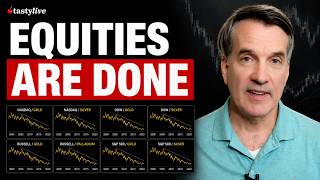
This video analyzes eight different ratio charts—each comparing a major equity index to a precious metal—to argue that equities will drastically underperform precious metals over the next few years. The presenter, Tim Knight, explains the concepts of ratio charts and analogs, then walks through each chart to show a consistent topping pattern followed by a bearish descent.
A ratio chart divides one financial instrument by another to reveal insights not visible in individual charts. Analogs are patterns that are expected to repeat if the same components reappear.
Shows a steady climb, a large rounded top, followed by a couple of years of bear market. The pattern suggests equities will underperform precious metals over the long term.
A falling ratio could mean Nasdaq falls, silver rises, or both. It's like a pairs trade: short the Nasdaq, go long silver, and the trade should work out if the ratio declines.
The same pattern appears across Russell 2000, Dow Jones, and S&P 500 when divided by gold, silver, or palladium. This consistency suggests it's not a fluke.
Shows a break, a push back to the pattern, a harder break, and another push back just below the pattern. As long as it doesn't push deeply into the pattern, the bearish signal remains intact.
Unlike the rectangular patterns, this forms a diamond. It falls away, pushes up, then falls again—similar to the other charts.
This chart has two prior instances, providing more data. The retrace goes deep into the pattern, but the conclusion remains the same: a likely decline.
Shows a pink topping pattern and a green area where price keeps pushing higher but fails after the third attempt, then falls away. This is the eighth and final example.
All eight charts point to the same conclusion: over the next two to three years, equities are likely to head much lower relative to metals. The presenter believes metals will be the place to be.
The video concludes that the consistent pattern across multiple ratio charts strongly suggests equities will underperform precious metals in the coming years, making metals a likely safe haven.
What is a ratio chart?
A chart that divides one financial instrument by another to reveal insights not visible in individual charts.
00:01
What is an analog in technical analysis?
A pattern made of certain components that is expected to repeat in the future if those components reappear.
00:14
What does a falling Nasdaq/Silver ratio indicate?
It could mean Nasdaq falls, silver rises, or both—arithmetically yielding the same downward line.
02:04
What is a pairs trade in this context?
Shorting the Nasdaq Composite and going long silver, based on the expectation that the ratio will decline.
03:00
What is the overall conclusion from the eight ratio charts?
Equities are likely to drastically underperform precious metals over the next two to three years.
06:57
Nasdaq/Silver Ratio Shows Bearish Pattern
This is the first and most detailed example, establishing the pattern that repeats across all charts.
01:35Consistency Across Multiple Indices
The same pattern appears in Russell 2000, Dow Jones, and S&P 500, strengthening the argument.
03:43Two Prior Instances for Russell/Palladium
Having two historical instances provides more statistical weight to the analog.
05:43Metals as the Place to Be
The presenter's final takeaway is a clear investment thesis: precious metals will outperform equities.
06:57[00:01] update us on ratio charts, and particularly with respect to some analogs that I'm seeing. And for those unacquainted with these, just let me very briefly explain. When I speak of ratio chart, it's simply
[00:14] one financial instrument divided by another. another. And the idea is that a combination of symbols can often yield insights that aren't possible with just individual
[00:26] And by analog, I'm speaking of seeing a pattern made of certain components, which the supposition is in the future will repeat itself if those components reappear. So, just as a silly example,
[00:40] if every single morning a neighbor across the street open their door, turn the porch lights on and off three times, and put a cheesecake on the porch, and you saw this 10 times in a row, if on the 11th day you saw them open the
[00:53] door, turn the porch lights on and off three times, you would correctly assume that there's a cheesecake on its way to the porch, cuz that's what the pattern seems to be. And so, let's explore this. And to
[01:06] one more bit about the whole ratio charts thing, here for example is just the chart of silver, one symbol. There's a chart, and you can make of it what you will. And here likewise is the chart of the Nasdaq Composite.
[01:20] It's an index all by itself, you can analyze it on its own. What we do is we can combine these things and see if anything interesting comes about when we the relationship between them, when we look at the ratio between the two of
[01:35] And it turns out, and I'm going to show you eight very similar charts that all have kind of the same conclusion, but we'll start off with that one. This is the Nasdaq Composite divided by silver.
[01:48] And as you can see here, um we have an instance where we had a steady substantial climb, a very large rounded top, which was followed by a couple of years of a bear market for this ratio chart. An important thing to
[02:04] they're made of two things, you don't necessarily know what's going on below the surface. So, for example, if we looked at this and said it appears that the pattern and we're going to fall away again, what does that mean? Well, it
[02:19] could mean the Nasdaq Composite's going to go down. Or if the Nasdaq doesn't budge, maybe it means silver is just going to go up a means silver is just going to go up a lot because it's a ratio or maybe both.
[02:31] Any of those arithmetically would yield the same thing, which is a line that goes down. Nasdaq down, silver up, or both. where the Nasdaq went up but the silver went up a lot more. It's just a ratio.
[02:47] you can think of it as sort of a pairs trade. And in a perfect world, even if you didn't know what's going to go on be below the surface of this, you could relationship's going to be exactly, but I do think this ratio's going to go
[03:00] down. Therefore, I'm going to short the Nasdaq Composite and go long silver and eventually it'll work out." That would be a pairs trade. So, the idea here in the conclusion, and I'm spending time on this one chart um
[03:13] because it'll be very similar for the others, is that it seems to indicate that over the long term, the next couple of years, let's say, or even more, that equities are going to drastically underperform precious metals.
[03:28] And I say that cognizant of the fact that silver over the past 6 months has gotten just killed as has gold, but maybe we're due for a change considering the relative position of the price to the chart. Now, I won't spend
[03:43] charts cuz they all have roughly the same idea, but I like to show these to show that this isn't some fluke. It shows up whether you're looking at the Russell 2000 or the Dow Jones composite or gold instead of silver,
[03:56] what have you. I here for example is the Dow Jones composite divided by gold. Um this doesn't go back as far in ti- as far back in time, but here was the break here and was followed by years and years of a descent. And once again,
[04:11] we've got a beautifully formed pattern and very importantly, and this is just a perfect behavior for a chart, we had a break, a push back precisely to the pattern, a much harder break, and then another push
[04:24] back again just below the pattern. So long as it doesn't push its way deeply into that, things are still intact. Here we have the Dow Jones composite divided by silver instead of gold. Same conclusion.
[04:37] Here is the Dow Jones Industrial Average, which hit a lifetime high as I'm recording this, uh divided by silver. So once again, this long bull market, topping pattern, failure, a retrace, and then a long
[04:50] slide down. Here we've got the pattern, failure, retrace. failure, retrace. Now, this is only a data set of one. in a row, but the shape and behavior of the price
[05:04] action is fairly compelling. Uh here we have the Russell 2000 divided by gold. This is more of a diamond pattern. And what's interesting about this is that unlike the other, it's not a
[05:16] flat kind of rectangular area. It's uh the the phenomenon is that it falls away from the pattern, it pushes up to about here, then falls. Same deal. Here's the completed pattern, it falls away in kind of multiple steps as before, and it
[05:31] pushes higher, and the position of this retrace is just about exactly like we were back here. Here's the Russell divided by palladium instead, a completely different metal. And this is uh this is an instance where
[05:43] I actually have two prior instances because we've got more data on this. So here we have a top. Here's the top of the retrace which goes deep, deep into the pattern, unlike the others. Top and a retrace all the way up about halfway
[05:56] Same deal here. This one's pushed way higher like so. So, you can see I've tried to use colors to to highlight the nature of the analog in each case. Couple more. Uh here's the Russell 2000 divided by
[06:08] silver. Same idea. Diamond patterns in each case. A push somewhat up, but not quite halfway into the pattern. And in this case, a hard tumble, which may well
[06:20] And the eighth and final example, the S&P 500 divided by gold. And this has uh these two shaded areas. We've been pink here at the top and this green area
[06:33] where we sort of keep banging up against it, but can't seem to find enough energy until it finally falls away after the third attempt. Here, likewise, here's the pink pattern. Here's that green area where it keeps pushing higher. And what
[06:45] there. So, those are the ratio charts. And just as you can see, they they broadly point to the same conclusion. Not something necessarily, but something that if we were looking at the next two or three
[06:57] were looking at the next two or three years, where is it most likely to go? And in all these instances, it looks like it's going to head much lower. conclusion you like. But in my estimation, it simply means metals are
[07:11] estimation, it simply means metals are going to be the place to be.




⚡ Saved you 0h 07m reading this? Transcribe any YouTube video for free — no signup needed.