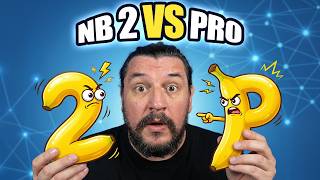

Nano Banana 2 vs Pro: The Speed Test
45sThe direct comparison of generation speed and cost creates immediate tension and practical value for viewers deciding between the two models.
▶ Play Clip"Delivers on the promise of comparing the two models with multiple tests, but the 'GPT GIFT' is only mentioned at the end and requires visiting a blog."
This video compares two AI image generation models, Nano Banana 2 and Nano Banana Pro, across various tests including technical drawings, product packaging, logical consistency, and portraits. The creator provides a detailed analysis of their strengths and weaknesses, offering guidance on which model to use based on speed, cost, and output quality.
Nano Banana 2 generates an image in under 6 seconds at $0.10 per image, while Nano Banana Pro takes 15-25 seconds. Nano Banana 2 is ideal for daily interaction and fast workflow; Nano Banana Pro is for premium editorial delivery.
Nano Banana 2 produces a massive amount of numerical dimensions and material labels, making it more technical. Nano Banana Pro creates a cleaner, more readable drawing with visual hierarchy, suitable for professional presentations.
Nano Banana 2 creates packaging with realistic cut-out windows and shadows. Nano Banana Pro produces more artistic, complex packaging designs that resemble luxury brand sketches.
Both models handle reflections and color separation well. Nano Banana 2 showed a blue cat reflected on a glass table with a red cup. Nano Banana Pro required multiple attempts to get the red cup correct.
Nano Banana 2 rendered aged hands with realistic veins, pores, and dirt. Nano Banana Pro added cinematic lighting but was less realistic in hand positioning.
Both models maintained character consistency in a Pixar-style story. Nano Banana Pro had more pronounced details and better consistency across frames.
Both models produced high-quality portraits with realistic skin texture and hair. Nano Banana Pro had a more cinematic, less retouched look, while Nano Banana 2 appeared more natural in some cases.
Nano Banana 2 is best for speed, daily interaction, and budget-conscious users, while Nano Banana Pro excels in premium, cinematic, and high-end finishes. The choice depends on the specific needs of the project.
How long does Nano Banana 2 take to generate an image?
Less than 6 seconds.
00:48
What is the cost per image for Nano Banana Pro?
$0.10 per image.
01:03
Which model is better for technical drawings with numerical dimensions?
Nano Banana 2.
02:39
Which model creates packaging with more artistic and complex designs?
Nano Banana Pro.
06:50
In the logical consistency test, which model had trouble getting the red cup correct on the first try?
Nano Banana Pro.
10:21
Which model is recommended for premium editorial delivery?
Nano Banana Pro.
01:18
What is the name of the internal function in Hitfield that is superb for character consistency?
Soul 2.0.
01:46
Speed vs. Quality Trade-off
Clearly quantifies the performance difference between the two models, helping users decide based on their priority.
00:48Technical Drawing Capabilities
Demonstrates that Nano Banana 2 excels in metric precision while Nano Banana Pro offers better readability.
02:39Logical Consistency Test
Highlights the models' ability to handle complex spatial relationships and reflections without color mixing.
09:22Portrait Realism
Shows that both models produce high-quality portraits but with different aesthetic finishes (cinematic vs. natural).
15:22[00:03] Nano Banana Pro worth the price? What is the difference between the two? models to various tests, because if what you're looking for is technical precision, speed, realism, stick around. Also, during the video I'm going to be
[00:17] giving away a GPT and I'll tell you how you can get it. If this is your 'm Lorwi Enrique, captain of the artificial ark, a channel specializing in artificial intelligence, focused on images or videos. Let's begin.
[00:35] obtained and why I obtained them, I want to talk about performance and costs, because this is where the difference between Nano Banana Pro and Nano Banana 2 really lies. I made this comparison table to explain it to you in an
[00:48] real efficiency, Nano Banana 2 generates an image in less than 6 seconds, while an image in less than 6 seconds, while the Pro takes between 15 and 25 seconds. The cost per image, if we consider it as a cost per image, is $0.10 for the Nano Banana
[01:03] cost per image, is $0.10 for the Nano Banana the Nano Banana Pro. The extreme level of detail in the Nano Banana 2 is very good. However, the nano banana pro has a 5% final polish. What is
[01:18] Nano Banana 2 ideal for in terms of daily interaction and fast flow? And the Nano Banana Pro for premium editorial delivery. Lorwin, but what if I use nano banana through tools like Freepack, Fitfeld, Artlist? What's happening with
[01:33] these tools? It's not just the model that matters, but where you use it. For graphic design, integration with stock and moepick using nano banana is unbeatable in speed, but if you need the same character to appear in 20
[01:46] different scenes with the same face, the same clothes, and the same lighting, Hitfield clothes, and the same lighting, Hitfield has a Pro called Soul 2.0, which is a tool or internal function that is truly superbly made. That's why I
[01:59] always recommend Freepick and Hitfield, because each one works for something very different. That doesn't mean you ca n't do something cinematic in Freepik , because I've done it and I still do. And in Hitfield you can't do something
[02:12] with products, but each one has its pros. And I already talked about that in this video, where I even give you several tool stacks per budget. And if you want to see that video, you'll have it here so you can go and watch it anytime
[02:26] . Let's get down to business. This was the first test I did. The first test I did was at the level of blueprints or technical drawings. The promo I used for this test was the
[02:39] used for this test was the following. Banana 2 interprets the PROM as a real working document. It generates a massive amount of numerical dimensions, as you can see, from the height, from the
[02:53] width, from how long the guitar body is, how long the frets are, how long many things are besides specifying the parts of the guitar. In contrast, Nano Banana 2 only showed me something I had
[03:07] asked for, which was the guitar from the front, side, and I also asked for it from the back, but he didn't show it. Instead of just numbers, add material labels like mast is mahogany, top is spruce, you know? This shows
[03:21] that he knows what a guitar is. The drawing is more balanced and easier for a human to read, although it has less metric precision than Nano Banana 2. We could say that this is more of a textbook result than an
[03:35] advertising infographic, or much less technical than what Nano Banana 2 did. In fact, I did a test on the original Nano Banana , the first one that came out and is still being
[03:47] done. In fact, it shows you the dimensions, measured in millimeters, although you can see that the text isn't very good, because there are numbers that are still not understandable and you can see that there has been a
[04:02] nano-banana level improvement since it came out until now. Then I wanted to do something much more demanding. I wanted to push the nano banana 2 and nano banana pro a little harder, and this is the result. For this case I used the
[04:16] following Pro. Nanovanana 2 opts to saturate the image. In what sense? It breaks down so much that sometimes it can be too much. However, I think it's
[04:28] superbly done. He takes out all the parts of the camera. I like that he portrayed me as a legend. If I zoom in, it's not very clear, but it seems to be intended to draw out a legend from everything you have here. In contrast,
[04:43] Nanobanana Pro chooses to divide the plane into sections clearly delimited by a box, you know? Because I asked him if there was a front view, top view, side view, and this visual hierarchy is superior for professional presentations. If you
[04:58] look closely, the arrows and the words that specify what they are are not superimposed on the image, and that makes the plan look much cleaner. Because? Because you can see the drawing and also read and understand what you're
[05:13] pointing to, which in comparison to Nano Banana 2 does everything, I don't know, Banana 2 does everything, I don't know, super-dumb, it's even difficult to read. And this is where I've always said less is more. To make sure you don't miss the
[05:29] regular nanobanana option, here it is . I mean, look, the difference and . I mean, look, the difference and evolution of the nano banana is amazing, and that's why I did it so you could see the evolution from what we thought
[05:42] was amazing a few months ago, almost a year ago, to what the nano banana is now. The second test was based on products. I wanted to create packaging for a random product that the AI
[05:56] could interpret, and this was the result. For this test, the promo I used is from this one For this test, the promo I used is from this one . The ninth 2nd achieves a cut-out window that follows the contour of the
[06:08] object, like the helmet, like this is covered as if by plastic, maybe. And by the way, the lighting of the product, which is black, preserves the colors, giving it perfect shadows here, like the clarity that
[06:21] shows you that it's a plastic that 's there. The shadows of the packaging, which is like a relief, are superimposed on that plastic. Lyrics, high sound fidelity, noise cancellation, active. I love this. The
[06:36] cardboard rendering, you know? Like new , it's absolutely immaculate. However, Nano Banana Pro. takes the term "prom box structure" to another level, creating packaging with a more geometric, unique shape that
[06:50] fully envelops the product. The product is inside, it's still in its plastic wrapping, okay? The product is inside, you can see the product, I love that you can see the product and outside it's like , hey, these are some
[07:03] headphones. It's like it tells you it's a pair of headphones. This game where I draw the helmet, but what you see is the helmet's rubber inside and it's transparent, well, I really like the box design. These patterns that he creates in the
[07:15] lines are much more artistic, much more complex. What you're looking for are sketches for boxes from real, luxury brands. This is much better. I didn't want to leave it there. I wanted to test this with real product consistency.
[07:28] I looked for what are, for me, my favorite headphones: the Astros H50. I found three images so you can see some of the details these headphones have. In the case of the nanobanana 2, it shows a rendering of the headphones and the
[07:42] charging base, and the reference to the real image is there. Why did I choose the stars? Because the geometry, the shape of the helmets is super-clinic, it is super-clinic. And here he succeeds and nails it perfectly. Notice that it uses the
[07:58] same theory as here, which is that the helmets have the plastic, although here it interpretation, as if the helmets come out, the box comes out and you put its case
[08:10] on the outside as if it were a pad. It's a really cute box. Yes. However, Nano Banana Pro integrates colors better . The orange color of the box . The orange color of the box is super awesome. It still has the
[08:24] Astro A50 wireless logo, okay? The Logitech one is a bit odd there, and they're including McLaren because these headsets, if you didn't know, are a collaboration or something like that with Logitech and McLaren. In this case, the packaging looks much more professional; it looks more
[08:40] sealed. It's like, hey, even though it's not shown here like the other thing which is the actual helmet, it's like an impression of the actual helmet at the level of the actual product box that this could be. I like it much more than the Nano Banana 2.
[08:57] What do you think of the Nano Banana 2 and Nano Banana Pro so far? If you want to join the free Telegram community of the artificial ark, I'll leave the link artificial ark, I'll leave the link in the description of this video. Join us,
[09:09] in the description of this video. Join us, join us, we are growing every day. He conducted another test where the objective was to subject the two models to logical and physical objectives, which are the ones that usually break AI when generating. The
[09:22] following. Why did I do it that way? Because I wanted to assess whether I could reason about positional relationships and do all of this simultaneously without mixing the colors of one thing into another. And this is the result . Nano banana 2 shows you the
[09:38] blue cat. It looks super dyed, that is, the fur looks very well done. The blue cat is already reflected on the glass table , that is, it can be seen in this aspect
[09:50] , that is, it can be seen in this aspect here. The red cup doesn't mix. And here you can see this, I love it so much, which is the reflection of the cup. And below you can still see the carpet. It maintains the same pattern it has and this Nano
[10:06] same pattern it has and this Nano Banana 2 is superb. In the case of Nano Banana Pro, the cat seems a little more mounted, it keeps the reflection the same and the red cup, in the reflection the red cup is a little more visible and it does the same. What's
[10:21] happening? That nano banana on the first try brought this out of me. I had to do the red cup twice to see if I could get it right. The first time she brought this up. The cat wasn't blue, the cup was red, the table was glass, everything was perfect. However, it was on
[10:35] the second occasion that he took the cup from me. I did the same with this other example where it was a red glove, okay?, that was reflected in a mirror, the perfume, I mean, I think it's really well done by Nano Banana 2. It
[10:49] also works in Nano Banana Pro. This one has a much better result. I like that the glove is torn here and it shows you how it's torn here. You know? Uh, the reflection, I really love this reflection thing and
[11:03] and they both look great here. Another test I did was on my hands carving on wood. Those errors like them coming out without fingers and such, that's already happened. Now the technical pressure is
[11:17] much greater, that's why I wanted to do this test. The promo I used is the following. In the case of Nano Banana 2, I achieved a rendering of aged human hands with veins and pores in the skin, which looks very realistic, you know? The dirt on the
[11:32] hands, on the nails, this issue of the nails, how the skin looks broken and there is reminds me a lot of him; he had veins in his hands like my dad. I
[11:46] in his hands like my dad. I think this image is really well done. Notice the pressure the finger is putting on the hand, because he's kind of pecking, he's kind of scratching the wood because he's carving it, there's a
[11:59] little pressure here and the shadow shows it to you and I think this is very well done. In the case of Nano Banana Pro, the side light that enters highlights the chips and the contents of the hands, because of the pronematographic.
[12:14] There's a thing about cinematography that every time you ask someone with that word they act like, "Wow, this is cinema." We need to get rid of this habit of adding a cinematic touch to things because it adds too much drama to an
[12:27] image that perhaps doesn't need it. Although the hands are positioned as if they're holding the bear and he's carving something of the bear, it's not carving something of the bear, it's not that realistic, Nano Banana 2. In this case, I
[12:39] like the detail of Nano Banana 2's fur better than this one. And I think it's because of how Nano Banana Pro interprets the cinematics. Hey! And you're already subscribed to the artificial ark. Go ahead, hit that button, subscribe if you're
[12:54] enjoying this video, comment, like, and hit the up button to reach more people who can see this video and learn about Nano Banana 2 and Nano Banana Pro, and above all, get to know the channel. Hey! But hit the bell icon and
[13:09] turn on notifications so you'll be notified when I upload a new video. visual consistency, because it's something I use quite a lot. I've given prom about I want to show you what I've done. In this case I made one, in the Pixar style, the
[13:26] consistency of the character is well achieved. He tells me the story, I think the character is very well done, the details he has, for example, the sand on the poncho and on his hands, I really like
[13:41] the drops here. The thing is, obviously we're not going to see it in very good quality here because the idea is that I'll be taking them out one by one later, but notice that it has the drops on the leaf, I think it's very well done. The details
[13:55] on the Nano Banana Pro are much more pronounced. Look at the wet patches in the background, the drops here, you know? The sand, I think , look, the sand here, the consistency is really well achieved. Obviously, it tells the same story, they have
[14:09] the same frames because the prom is the same in both. I also wanted to try it with a photo of myself to see what the consistency was like, while Nano Banana 2 takes me out, I mean, I always have my AI self and I think it's
[14:23] super well done, I mean, every day I look a little more like myself. It's not that it's me, but here I look like Nodal, but a burnt-out Nodal, but it's superb. Here the character doesn't resemble what's there as much.
[14:39] Here it is again. Here, things get a little lost. And the ending, in contrast, in Nano Banana Pro is much more cinematic. Notice that it gives it much more effect than
[14:52] if you were to polish the glass and all that. Here I'm more like Jon Snow. The consistency of this character is much greater than in this one. In this one I think it varies in several frames, and here the consistency of the character is maintained in all
[15:07] frames. In these two frames, which are wider shots, the character wider shots, the character looks the same. I think that in this aspect, Nanobanana Pro, with regard to cinematography, performs much better.
[15:22] And the last piece of evidence I want to show you are the portraits. The first test in portraits was with this girl, skin where you can see a super realistic texture that I really like how the eye looks down here , okay? The little hairs in the mouth
[15:37] are something supernal in humans. I really like how it looks here, like I'm kind of smiling. And this one has the same thing. Look, notice the little hairs. In other words, in terms of quality, both images are fine.
[15:52] However, what you can see here is that one is much more cinematic, which is Nano Banana Pro. In other words, if you're looking for a professional, aesthetic, cinematic finish, so to speak, Nano Banana Pro is the
[16:07] winner, because it looks a bit more realistic, less retouched, but in terms of quality, both look very, very good. In this case, in my opinion, the opposite is true. We have this first photo of the gentleman. Look at the beautiful things, the
[16:23] texture, the beautiful things. The hairs here look a bit fake. I think the wrinkles look great. The eye, I love how the reflection of the eye looks, love how the reflection of the eye looks, as if my eyes were watery. I
[16:38] think it's absolutely amazing. And this one seems the same to me, I think it's super well done. Both are very good, but what happens to me with this image is that I feel like someone took the photo, put
[16:53] some filter on it and oversaturated it in terms of color, you know? It was as if her shadow rose, it lightened a little more. This one looks a bit more like, "Hey, I took the picture and this is what came out, you know?" It's like it's much less retouched. Look,
[17:07] look at your eye here. I really like the detail of the eyelashes, uh, I mean, I love it. And finally, I took these two, as I said, Nano Banana 2 is leaving me because I asked it to be artistic, an artistic picture frame, it takes this
[17:22] image where it looks super real. I really like the girl, she looks very well done, you know? The hair, it's going to. But here she brings out a more artistic side, which is what I was looking for. Notice how he adds the colors. She still sees it as real,
[17:38] okay? This is the texture, the little hairs on the skin. I love how the little hairs look here, you know? The result is very well done, okay? Something I didn't like in some of the photos . Note something important: I'm
[17:52] not saying it's cinematic, but Nano Banana Pro is already more cinematic than Nano Banana 2. But I want to know what you think. Leave me a comment. What do you think of
[18:06] these portraits? Which one do you like more? The nano banana 2 or the nano banana pro? In summary, when should you use Nano Banana 2 and when should you use Nano Banana Pro? Let me put it this way . Nano banana 2 if you need speed and daily interaction. If
[18:19] physics and optics are your priority. If you need to create a creative workflow and run quick tests, then use Nano Banana 2. For products and MUPs on Freepik, for example, you can use Nano Banana 2. And if you're on a
[18:32] tight budget because you can't afford a Gemini plan, you can still use it because it's free on any plan. On the other hand, use Nano Banana Pro if the final price is negotiable. If you don't want to change that excellent result,
[18:46] use Nano Banana Pro. If the lighting is premium for an editorial submission, use it. If you want a high- end finish for a client, use it. And if scenes, anything cinematic, then Nano Banana Pro is for you. If
[19:00] you want an image that's meant to impress, then use Nano Banana Pro. And that's how I want to clear up any doubts you might have about where or when to use when to use Nano Banana 2 and Nano Banana Pro, or what the differences are.
[19:15] As promised, I've created a GPT with all these programs so you can create your own and try out Nano Banana, no matter which plan you choose, and get great results. In the description I'll leave you the link to
[19:30] the artificial arc blog and there you'll get the link for this GPT. I hope it works for you and I hope you like it, just like this video. And by the way, I want to tell you that if you have a project that you don't know how to
[19:45] manage with artificial intelligence, I offer one-on-one consulting where we can sit down for 75 minutes to work on your project, help you uncover its potential, and get on the right track so you can move forward with it. In the description you will
[20:00] find the link to the artificial ark website where you can read everything I offer and book your appointment for this consultation. Before I finish, I want to say that I hope you enjoyed this analysis of how to know
[20:13] when to use each of these tools, because both are useful and functional nowadays. Before I go, I want to tell you that if you don't know how much to charge for AI work, I've made this video for you
[20:27] to give you an idea of how you can charge and not lose money when doing work for a client. Here you'll find my face so you can subscribe to the channel more quickly. You know that, crew member.
⚡ Saved you 0h 20m reading this? Transcribe any YouTube video for free — no signup needed.