
This Week's Market Volatility Is Historic
59sStarts with a bold claim that this week's range is the largest since 2009, immediately grabbing attention with a shocking stat.
▶ Play Clip"Delivers a solid, data-driven market outlook, though the title's promise of a 'big picture' is somewhat diluted by short-term technical analysis."
In this week's Market Outlook, Jeff Bish of MarketGage.com analyzes the stock market's recent volatility and provides a framework for navigating the uncertain short-term and long-term outlook. He emphasizes the importance of key technical levels, such as the 10-day and 200-day moving averages, and introduces a bond spread indicator that may have signaled the recent sell-off.
Jeff Bish is filling in for Keith and outlines four main areas to assess whether the big picture market trend is up or down, while noting this isn't a short-term timing approach.
The 10-day moving average is a critical line on daily charts, especially in high-momentum markets. It helps define when momentum is breaking and often marks market reversal points.
Using a one-day average true range on weekly bars, this week's range of almost 17 SPY points is the largest since 2009, indicating an extraordinary and volatile week.
The volatility has changed the nature of the markets for the better, creating huge opportunities both long and short, though the order of which comes first is unknown.
The market is back up to the 10-day moving average. A close below a prior day's low while below the 10-day is a cautious signal. Key resistance levels include 204 (SPY) and the 200-day moving average at 207.5.
For the Q's, the 200-day moving average is around 107. A close above this level could signal the flush is over, but a rollover from the 10-day (105.50) leaves room for further downside.
The IWM has been in a prolonged correction. It's back at the 10-day moving average with room to the 200-day at 121.5, but may find resistance at 119.
TLTs did not rally as expected during the market panic, suggesting possible Chinese selling of long-term bonds to support their currency. This changes the typical SPY-TLT relationship and is a significant dynamic to monitor.
The McClellan oscillator dropped below -300 but is not as washed out as the price action suggests. It has bounced back to the middle of its range, indicating the market is no longer oversold.
The VIX spiked to 40, a level not seen since 2011. The 2011 pattern suggests a potential wide consolidation range before a move back above the 200-day moving average. VIX pullbacks are less reliable in a broken uptrend.
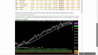
The sector summary on the website shows the six-month change in industry groups. Currently, zero groups are positive, indicating a bearish mode. The market needs to get back above the 200-day moving average before becoming aggressively bullish.
The new high/new low ratio needs to come back above 30 on both the NASDAQ and NYSE. This would indicate a healthy flush. The recent flush is more significant than previous attempts, which is a positive sign.
A chart from the FRED database shows the spread between AAA corporate bond yields and treasuries. This spread widened before the recent sell-off, indicating bond investors were losing confidence in corporations. A declining spread is supportive for stocks.
The sell-off has ended the year-long compression in the market, creating opportunities on both the long and short side. The tools discussed, including the bond spread, are now more powerful for navigating the new market environment.
Volatility Changes Market Nature
Highlights a shift from a year of compression to a period of opportunity, which is a key insight for traders.
03:40TLT Anomaly and Chinese Selling
Introduces a potential macro factor (Chinese bond selling) that could alter the typical flight-to-safety dynamic.
08:33Bond Spread as Leading Indicator
Provides a concrete, data-backed indicator that may have warned of the sell-off, offering a tool for future risk assessment.
23:24End of Market Compression
Summarizes the core thesis: the sell-off has ended the malaise, creating new trading opportunities.
28:52[00:00] Hello, and welcome to this week's Market Outlook. This is Jeff Bish, president of MarketGage.com, filling in for Keith, who is taking a well-deserved
[00:12] break this week. I'm sure he'd prefer to be doing this presentation this week, especially after last week's presentation in which he gave you a pretty firm warning that the markets were shaky and you should
[00:27] be really cautious going into this week. Nonetheless, I get the privilege of doing it, and so it'll probably be a little different. But as I probably alluded in my text, I've got basically four different main areas that I want to look at
[00:48] to try and figure out whether or not the big picture in the markets is one that's going to lead us down or lead us up. However, that big picture isn't necessarily a very short-term market timing approach.
[01:04] So first, let's just take a look at the shorter-term market timing situations that we're in right now because we're at a very interesting point right now in the markets. And that very interesting point happens to be a little green line that I keep on my chart almost every daily chart,
[01:21] And perhaps many of you do too, without even realizing how powerful this green line is. Now, that green line is a simple 10-day moving average. Now, this line becomes even more important in high-momentum markets.
[01:36] It's really important in defining whether or not momentum is starting to get broken and defining the point where markets often reverse. Now, if you're looking at the size here, no surprise at the size of the rally to get up to the decline because of the massive decline.
[01:59] Now, actually, before you do this, I wanted to show you a quick, interesting chart. So, if you're feeling a little rattled, or were feeling a little rattled as a result of this week,
[02:13] this chart is just an illustration of why that would be true. Right, and you can probably do this on your platform too. I just kind of altered the average true range. You could do it with average range as well, but average true range calculation, and I made it one day.
[02:28] So making it one day means that this yellow line is giving me the average range for the individual day, or I should say the individual bar. In this case, we're looking at weekly bars.
[02:40] So if you look at this chart down below, that is telling you the range for the week. So, this week's range at almost 17 SPY points is the largest. In fact, it's the largest since 2009.
[03:00] Now, it's not the largest on a percentage basis, but if we go back all the way to 2009, you can see that this was truly an extraordinary week. And if you were to do it in percentage terms, it would be right behind or even ahead of the hiccup in here in 2014.
[03:19] And it's just behind the sell-off that we saw in 2011 and in 2010. So this was really a volatile week. And if you've been reading any of my other emails that have gone out, I really believe that it's changed the nature of the markets that we've seen over the last year.
[03:40] For the better, because it means we're going to have huge opportunities, most likely long and short, which comes first, I honestly don't know. So getting back to where the markets currently are, and this is why the 10-day moving average is so important, we've really rattled the markets.
[04:00] You can see it in the candles. You can see it in the average range. We're now right back up to the 10-day moving average in all the major indexes. So what we want to look for from a cautious point of view this week is whether or not the markets can close below a prior day's low and back down and still be below the 10-day moving average.
[04:22] Now, the 10-day moving average is really sharply sloped down. So if we close above the 10-day moving average for a couple of days and then continue higher, that's the first sign that maybe we have flushed everybody out down here.
[04:35] I'm going to look at indicators as we normally do in this video to try and determine whether or not we did get flushed out. But regardless of what those indicators say, at the end of the day, it comes down to price action.
[04:47] And the first line of defense or the first line in the sand is this 10-day moving average. The next big one I'm going to focus on is the 200. Often we'll look at the 50 as well. But from a big picture point of view, which I'm going to cover in this week's Outlook,
[05:01] I'm going to focus on the 10 and the 200. We get quite a distance in the 5 to get up to the 200. So this 10 becomes really important. The other level that's going to be really important, you can see that this yellow line has been on my charts for probably months.
[05:17] and that is the 203, 204 level. It happens to line up with last Friday's close,
[05:29] but that 204 level is going to be a key level of resistance. So in both cases, if we roll over at the 10, it's very dangerous. If we roll over at the 204 level, very dangerous. If we roll over at the 200 day moving average,
[05:44] the 207.5 level, very dangerous. Right? That's basically the analysis you want to take and apply to every one of the indexes. The difference is that in the Q's, that 200 is right here at about 107.
[06:00] I apologize for the really small numbers on these charts. It's right around 107. If the Q's can get back over that 200, close over it, and then move higher,
[06:12] that could be a sign that we haven't fast-flushed everybody out, and you've got to watch out on the upside. That said, from where we are now, about the 105.50 at the 10, up to that 107 level,
[06:24] if we roll over, there's plenty of room for this market to drop on the downside. So you really do have to play both sides of this market. If you don't want to be short, then you want to be out of the way. Again, what's my trigger from a price action?
[06:38] Close below a prior day low. We haven't done that since the lows, and if we're going to get one of those markets where it just seems to creep higher and creep higher and you can't believe that it's not rolling over, it will almost always not close below the prior day's low.
[06:53] I know it sounds simple. Go back and look at the 10-day moving average, look at that simple pattern, and you'll see that it's remarkable how that holds. Now, the IWM has been different from the rest of the market for quite some time.
[07:09] It's been in much more of a prolonged, well, correction, I won call it a bear market prolonged correction but it basically right back at the 10 moving average with just like the SPYs plenty of room to get up to that 200 Now it might find some trouble before it gets there around the
[07:26] 119 level. We'll have to watch out for that. But first things first, 10-day moving average, does it break it? If it breaks it, look for a move up to the 119 level, and then the 121.5
[07:40] level is that 200. Right? So those are the key levels. Let's keep it really simple this week. That's what you have to watch out for. Now in this video, I'll go over some more things to try and
[07:53] figure out whether or not we're likely to roll over here or continue to go higher. But I'll give you a heads up. There isn't anything really compelling to know from the market internals
[08:06] whether or not we roll over at the 10 or we continue to go higher. So you really have to watch that price action. All right, before we leave, I don't know whether or not I'll mention this in my text
[08:21] because I haven't written the text yet, honestly. But there's an interesting thing that happened this week, and I wouldn't have noticed it had I not picked up on this in reading. And this is it.
[08:33] So the big up day in the TLTs expected on the same day when the markets are collapsing, right? Flight to safety.
[08:45] That's what you'd expect. In the end, the markets didn't continue to go lower, and the TLTs sold off. Now, they came all the way back, almost unchanged. You wouldn't have expected that with the markets still down whatever it was, 4%, 5%.
[09:03] an ugly day. Now, the next day, markets get higher and go lower, but when the markets go lower, TLTs didn't move higher, right? In a time of panic, or if not panic, certainly
[09:23] great unease in stocks, there is normally a flight to the TLT's quality. The complete opposite happens on this day. The reason I bring this up, and what's so interesting is,
[09:38] is that there's a belief that this is a result of the Chinese selling their long-term bond holdings in order to help finance their attempts to support their currency. So, I throw that
[09:54] out there because it's really interesting. I remember years and years ago, we haven't heard this story in a long time, or it hasn't been in the front of the media, but what happens is the Chinese start, really, in a major way, selling their massive quantities of U.S. bonds.
[10:14] It's certainly an interesting scenario that we see right here. This is not normal, and who's to say what will happen?
[10:26] And this is one of those situations that now is not a complete unknown. And so keep an eye on the TLPs. TLPs are not doing what they should be doing relative to any panic in the market.
[10:41] Don't be surprised. The Chinese may know. When you have huge positions, you have to sell them when there's demand. The biggest demand for TLPs is going to be when the markets are panicking.
[10:53] So if TLTs aren't going up and the market's panicking, normally I would be thinking, all right, maybe the market isn't as bad. If participants aren't running to TLTs, then maybe the stocks aren't as bad as they appear.
[11:09] However, if the Chinese are selling into that flight to safety, that dynamic is completely changed. So it's not an insignificant thing if it's happening. I don't have a way of knowing this in real time, but it certainly puts a different perspective on the relationship between the SPIs and the TLTs.
[11:28] Okay. With that, let's take a look at some of the indicators that we do try to check in with each week in this segment to figure out what the short-term, in some cases long-term,
[11:44] but in this case it would be short-term reaction to the 10-day drinking average might be. Just to put a little perspective on the McClellan oscillator, which is an overbought, oversold indicator, yeah, when the market got completely crushed, it got down to under 300, but I've got it all scrunched up here, so you can see that 300, let me see if I can get a pen here, you can see that the 300 level, it's low,
[12:17] but relative to that historic volatility that I showed you in the beginning of the video with the average range, not as washed out as that would suggest.
[12:31] Now, what does that really mean long term? It means, as I would interpret it, this might have hurt, it may have been a big number, but the level of washed out is not historic.
[12:45] The level of price action that we saw was much more dramatic relative to the overall damage from a completely washed out level. That said, this is definitely a level where we would expect to see a bounce.
[13:00] And in fact, we have seen a bounce. And now it's right back up to the middle of the range. Now, it's back up to the middle of the range, but it is up to a level that has in the recent past, let's say the last year,
[13:13] indicated somewhat of a ceiling before the market sold off. So is it overbought? Not completely, but it's definitely not oversold right now.
[13:25] So if the market were to sell off or turn lower, you could not look at the McClellan and say, this market is already oversold. It's not oversold anymore based on this.
[13:38] In fact, as I said earlier, there isn't any indicator here that we look at it would suggest that the market is still oversold. We've got the bounce came in, and it's no longer oversold.
[13:54] All right, so let's take a look at the VIX. All right, now I know Keith looks at a ratio of the VIX. I don't have that ratio handy right now for this week.
[14:07] Again, let's put some perspective on where the VIX went, scrunching it up. VIX got as high as 40. We haven't seen those levels since 2011, right? That said,
[14:21] look at how the action in 2011 transpired. So, 2011, we, whoa, sorry, 2011, 2011, we got a spike
[14:34] on the initial thrust down which wasn three days it was several days right It managed to stay up here as the market consolidated in a very wide range
[14:47] If I were to draw that range right here, and I'm sorry for the scrunching, but it's very similar. So if we just rallied up to the top of the range, we could easily see consolidation
[14:59] between roughly where we are now, and like I said, this is a spive, so even if the spives were to rally up a little bit more and start to roll over, at resistance levels coming back down to the levels, the lows of last week,
[15:15] certainly shouldn't be unexpected. In fact, I think 2011 is probably a good, I don't want to say model, but certainly an example of what could easily happen.
[15:29] Another leg down, establish a range that's very wide until it can get back up above the 200. So what does the VIX help us with here? Well, I would like to be able to say that the VIX has gotten completely oversold
[15:48] and now it's time for the markets to pop back up. But as you just saw in 2011, and if you go back and look at other scenarios in history, VIX I find to be really helpful when you're trying to figure out when the market is just too far stretched.
[16:03] But once the market bounces, right, and once the VIX pulls back, unless you are in an obvious uptrend, the continuation of the bounce based on where VIX is is not very reliable.
[16:19] So in other words, just because VIX has pulled back in, in the past, we would have said when VIX pulls back in, you're in an uptrend, look for the market to continue higher. But the uptrend is broken now. It's different.
[16:31] So, yes, we got the bounce because VIX hit 40, but just because VIX is back down at 20 doesn't mean that we should continue to rally. All right? So, the VIX isn't really much help right now in determining whether or not the market is done going up
[16:48] and ready to roll over or has been flushed. All right. So, let's take a look at some of the bigger picture items.
[17:00] I know that I went over the smaller items really quickly, but at the end of the day, when I look at the market internals, there really isn't any compelling evidence to tell me which way the markets are going to go this week based on the bounce.
[17:17] So, as I said, I want to give you really four, I believe, four different bigger picture things. And actually, the first one is the 200-day moving average, which we just went over. and the essence of the 200-day moving average is that if we're below it or if we're above it
[17:36] and whether or not when we get there, we're going to be able to know whether or not we should expect it to roll over or expect it to break out and move higher.
[17:48] Now, I could say the same thing about the 10-day moving average except that the 10-day moving average is such a smaller number. It's not as widely watched. It's not as significant.
[18:01] So the first area we'll take a look at is the sector summary. And I've spoken about this in the blog that I put out quite frequently, so I don't think I should have to go over it in too much detail.
[18:15] But to sum things up, the four things are, one, going to be sectors. Are the sectors, on a six-month basis, improving? So right now, if you look at our, and sorry I didn't say this,
[18:27] I demonstrated it. But if you go to our website and you go to Little Big View, this area is completely free. And here are three different charts, two different charts that you should pay attention to on this site,
[18:42] or at least I'm paying attention to for the long-term picture. And six-month change in the industry groups, we need to see that number turn positive when this market gets back up to the 200. Until we get over the 200, I don't see any reason to be aggressively bullish unless you want to take a position against the lows down here.
[19:06] So if we get down to those lows and we're oversold, great. Then we'll talk about trying to buy the low if everything looks good. All right. But in the middle, I think you've got to wait for the 200.
[19:18] You've got to wait for the lows. Use the 10-day to figure out which way we're going. All right. Right now, if we go from here back down to the lows, it's a 10% move. It's a great move. We've been waiting for a 10% move for years, and now we can get it if all we do is go to this week's low.
[19:35] We can get a 10% move if all we do is go back up to the consolidation. Great opportunities here. Here's the big picture. All right? We get to the 200. We want at least four of these to be positive.
[19:49] And that's reflected in this chart here. So the chart down below, as you can read here, is an aggregation of the number of positive groups as measured by the six-month change.
[20:01] Right now we have zero. So we're in a bearish mode. I would look at this, though, as I say here, when you get to the 200-day or the 40-week.
[20:13] So that is not for this week, but keep an eye on it. All right, so the next really telling big picture metric, even though we have it as a short-term metric as well, is in the market internal section of LittleBigView, and it's the new high, new low ratio.
[20:32] Now, I haven't updated this for Friday, but it doesn't really make a difference because what you want to look for here is both in the NASDAQ and in the New York.
[20:44] you want to see this ratio come back up over 30. Now, this could easily happen when the market's down and recovering from being near its lows.
[20:58] Or it could happen if the S&P comes back up and it's over the 200, which is going to be up around here. So when the market gets up to its 200, if this ratio is piercing the 30 level and trending higher,
[21:13] That would be an indication that the market has flushed out nicely. Now, the difference between looking forward and seeing this happen versus the last two attempts here
[21:25] is that we've now spent more time being completely flushed out. That's a good thing when we get back over the 30 level. So both on New York and on NASDAQ, that's what I would look for.
[21:37] It's going to take some time. Right. This is a 10-day average of the number of new highs Relative to the new highs and new lows so we need to see Basically, we need to see some new highs and right now we're not making any new highs
[21:53] So let's just take a quick look at the NASDAQ Alright so you can see this is just pushing down and you know didn even break through the 30 before the market completely fell apart
[22:08] So now we finally have got a decent flush, and if we come back over that 30, historically that's been a good indication. Now when you get over the 30, you want to see it continue to trend higher. One of the things you will notice with this indicator if you look at it over time is that
[22:23] when it's trending higher, the market will tend to have a bullish bias. You don't see it here, it was flat, but you will see it if you look at it over time. You don't want to be too bullish when you're going against the general trend, but the best
[22:40] time to use this is when it's breaking the 30 after being above it or breaking the 70 after being above it. So you'll notice after this last run up, we never got back above that high.
[22:53] We kept breaking down into the 70, and the market didn't make much progress. So we're looking for the opposite to happen now. Again, big picture. All right, so these are the ones you can easily follow.
[23:07] What are the new high and new lows doing? What are the sectors doing? And where am I relative to the 200-day moving average? Now I've got one you probably haven't seen. and this one really came about through looking at or reading and realizing
[23:24] that there was actually a part of the market that saw this collapse coming. Now maybe that's a little bit of a dramatization. I don't know that they knew it was a collapse,
[23:36] but there was a hint that the market was really weaker or participants were more concerned than the sideways action that we've been seeing. What you're looking at here is the chart that's created by the FRED database,
[23:51] which if you're not familiar with the FRED database and you like data, this is a great resource. It's completely free. St. Louis Fed has just rings and rings of data, and you can easily create these charts.
[24:03] Google FRED, and you will find the St. Louis Fed and find this. And if you want the specific URL for this chart, send me an email at info at monkeygauge.com. I'll send you the URL on this chart.
[24:16] We'll come right up for you. But here's what the chart's all about, okay? So let me change the color of my pen. So the blue line is the corporate bond yield relative to treasuries.
[24:37] Now, I don't want to make this too complicated. I don't want to make it an economics class because it's certainly not meant to do that. But the idea here is that AAA corporate bonds are one of the safest level of corporate bonds,
[24:51] but they're not considered as safe as treasuries. If the yield on those AAA bonds starts to get much higher than treasuries,
[25:03] it's telling you that bond investors, who are often viewed as smarter and ahead of the game relative to stock investors, are getting more and more concerned about the safety of U.S. corporations
[25:19] and their ability to generate earnings, pay their dividends, and support the interest payments on their bonds. So, again, in layman's terms, you want the spread between corporate bonds and treasury bonds to be coming down.
[25:34] If it's doing that, there's more confidence in corporations, which should lead to higher stock prices. The opposite is true. When the spread goes up, then you will often see pressure on stocks.
[25:49] So the S&P 500 is the green line. As you can see, in 2008, the spread exploded when stocks imploded. As you can also see, when the spread comes down, stocks go up.
[26:03] Now, in many instances, these are coincident, meaning it's happening at the same time. But sometimes it's leading, meaning the bonds will give you a heads up that something is not right.
[26:18] Right? And it's not always going to be perfect. But just take a look at how well this has tracked. Right? When stocks topped out here and started to roll over, bonds confirmed that the move would be weak.
[26:34] They got a little extended, but then when they pulled back, you could see that supportive effect that stocks continued to go higher. Look what happens here. Bonds really started to take off, or the spread started to take off.
[26:49] Remember, that's the negative. And ultimately, the stocks got hit. That's a 2011 hit we saw. So they remained choppy, but in small increments, this is a weekly chart,
[27:05] you can see how the relationship works. Now, look at the overall trend of the market and the overall trend of this spread. It begins to flatten out, but at some point it shouldn't go negative.
[27:20] begins to flatten out. This all represents confidence in the U.S. companies. It's not necessarily the U.S. stock market, but in the companies. But all of a sudden, right here, while stocks seemed complacent or indecisive,
[27:39] the spread really started to widen out. I wish I had seen this before last week. It was a major warning. And you can see the reaction continued this week. So this is all a very long description of a chart that, again, it's a big picture chart.
[27:59] But what should happen if stocks start to move higher? What should happen to this yield, right, this spread? This spread should come in. This spread should come back down to, let's call it, under 1.75.
[28:14] Now, this isn't necessarily going to tell you ahead of time that stocks are about to take off. But again, when stocks get to the 200, when stocks start to rally, whenever you think that perhaps a rally might actually be beginning or a rally might be getting legs, you can check this chart, see what the bondholders think.
[28:36] All right? I'm definitely going to have my eye on this. Again, big picture. and the reason for all this and looking at the big picture here is as I said here, as I said in other stuff that we're putting out, as I will continue to update in the blog during the week,
[28:52] the markets have changed. This sell-off is great. It's going to create opportunities on the long side, on the short side. The malaise, the compression that we've had for a year is now over.
[29:04] and having these tools, including this video we put out every week, is now even more powerful than ever. So I hope that helps and I will see you in the next video
[29:17] and best of luck this week.
⚡ Saved you 0h 29m reading this? Transcribe any YouTube video for free — no signup needed.