

The Smith Chart: Black Magic or Essential?
43sThe dramatic contrast between calling it 'black magic' and its widespread use creates immediate intrigue.
▶ Play Clip"Title promises a deep dive, but the transcript is just a teaser with no actual explanation."
The video explores the Smith chart, a tool that is both feared and widely used in electrical engineering. It highlights the chart's ability to solve paradoxical problems and its integration into modern software. The creator aims to explain the physics behind the chart, not just its usage, by tracing its origins back a hundred years.
The Smith chart is often described in terms of black magic and is feared by students, yet millions of copies have been printed and it's integrated into advanced software.
The chart solves paradoxical problems in electrical engineering, which is why it's so widely adopted despite its intimidating reputation.
Existing tutorials, like Zach Star's, explain how to use the chart but miss the underlying physics, which is essential for true understanding.
The core mystery is how the chart contains infinity within a finite circle, which requires going back a hundred years to its origins to understand.
The Smith chart is a powerful tool that solves complex impedance problems, but its true value lies in understanding the physics behind its geometric magic.
Paradoxical Problems
Highlights the chart's core value in solving complex engineering issues.
00:27Ubiquity of the Chart
Shows the chart's widespread use despite its intimidating reputation.
00:14Infinity in a Circle
The central mystery that drives deeper understanding of the chart.
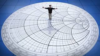
00:54[00:00] This is the scariest chart in electrical engineering. Puts the fear of God into all undergraduate students. First time that you ever laid eyes on this chart. What was your first impression? Holy s***. It's like terrifying. It looks almost like a wormhole in some sci-fi movie.
[00:15] I mean, on many versions, it literally says black magic. But for all the fear, it's everywhere. Millions of copies have been printed, and it's built into the most advanced software we have today.
[00:27] That's because this chart solves one of the most paradoxical problems in electrical engineering. So we put it to the test. This is crazy. We're getting way more power transfer, even though we've cut the line. How does that make any sense?
[00:40] There have been some great YouTube videos explaining how to use it, like one from my friend Zach Starr, but I always felt like they were missing something essential. You also, do you want to know why this chart looks the way it does? Yes, but then I need to know the physics.
[00:53] I would want to know what the circles are and what I'm looking at at first. Because even once you know how to use this chart, you're still left wondering how it pulls off its strangest bit of witchcraft, trapping infinity inside a finite circle.
[01:07] Well, to understand that, we have to go back a hundred years to the origins of this chart.



⚡ Saved you 0h 01m reading this? Transcribe any YouTube video for free — no signup needed.