
The U-Shape Secret: Why Stocks Reverse and Momentum Works
44sThe U-shaped autocorrelation pattern is a visually striking and counterintuitive finding that challenges market efficiency, sparking curiosity.
▶ Play Clip"The title promises a deep dive into a seminal finance paper, and the transcript delivers exactly that—no fluff, no bait-and-switch."
This video analyzes Jagadish's 1990 paper on the predictable behavior of security returns, which introduced the momentum factor to finance. The presenter explains the core regression methodology and the implications of autocorrelation for practitioners.
The paper's core regression regresses each stock's excess return over its own historical mean against lagged returns at lags 1 through 12 months plus lags 24 and 36.
If markets are efficient, all slope coefficients should be zero, meaning past returns do not predict future returns.
The autocorrelation at lag K indicates how much an above-average return K months ago predicts the return today.
This chart is the most informative for practitioners because it shows the predictive power of past returns at any point in time.
The paper launched the momentum factor literature, including Jegadeesh and Titman 1993, Carhart 1997, and the UMD factor.
Core Regression
The paper's core regression is deceptively simple yet powerful.
00:13Autocorrelation at Lag K
Explains the predictive power of past returns.
03:51Momentum Factor Launch
This paper launched the momentum factor literature.
13:28[00:00] Hello friends, today we are diving into Jagadish's 1990 paper on the predictable behavior of security returns.
[00:13] The paper that launched the momentum factor into mainstream finance. The core regression is deceptively simple. Each month regress each stock's excess return over its own historical mean against lag returns at lags 1 through 12 months plus lags 24 and 36.
[00:34] The average slope coefficients across monthly regressions, this Fama-Macbeth approach, reveal the autocorrelation structure of returns. If markets are efficient, all slope coefficients should be zero.
[00:48] Jaggedy found something entirely different, and we are going to replicate it with real data. We use our standard scientific Python stack, numpy, scipy, pandas, matplotlib,
[01:04] and yfinance for real market data, with a fixed random seed for reproducibility. The matplotlib style settings give us clean publication quality charts throughout the notebook.
[01:16] The original paper used Chris' monthly returns from 1926 to 1987, thousands of stocks over five decades.
[01:28] We approximate this with a broad cross-section of large-cap US stocks downloaded via Y-Finance. Monthly returns are computed from daily adjusted closing prices, dividing the end of month
[01:42] price by the previous end of month price minus 1. This is the standard total return including dividends, which is what Jigadish uses. The adjusted price automatically accounts for splits and dividends, exactly what we
[01:59] need. We download daily adjusted closing prices for 80 large cap US stocks via Y-Finance, spanning 2000 to 2024. After resampling to month end and computing simple returns, we have a monthly return matrix, months in rows, stocks in columns.
[02:20] The mean monthly return across all stocks and periods gives us a sanity check. We drop any ticker with less than 80% data availability to ensure our cross-sectional regression has clean inputs.
[02:34] This mirrors Jagadisha's data hygiene where stocks needed sufficient history to enter the sample. Chart 1 shows the distribution of all monthly stock returns in our sample.
[02:48] The distribution is roughly bell-shaped but with significant fat tails, ketosis well above 3, exactly what we expect for individual stock returns.
[03:03] returns. The mean monthly return is positive, consistent with the equity risk premium.
[03:16] The right panel shows the number of stocks available each month We have between 60 and 80 stocks throughout our sample giving us a reasonable cross for the Pharma Macbeth regressions
[03:32] The cross-sectional size drops slightly during the 2008-2009 crisis as data quality deteriorated. Before the full regression, let us directly visualize the autocorrelation structure.
[03:51] The auto-correlation at lag K tells us, if a stock had an above-average return K months ago, how much does that predict its return today?
[04:06] Jagadish found a striking U shape. The correlation at lag 1 is strongly negative, meaning last month's winner tends to lose this month.
[04:19] term reversal. But at lag 12, the correlation flips positive . Stocks that performed
[04:31] well over the past year tend to continue outperforming. This U-shaped pattern is the central empirical fact of the paper. And it persists even after controlling for cross-sectional differences
[04:49] in expected returns. Chart 2 is the autocorrelation bar chart, the visual signature of Jagadish's paper. Red bars are negative autocorrelation, blue bars are positive. The pattern is exactly
[05:07] what the paper predicted. Lag 1 is strongly negative, short-term reversal. And lag 12 turns clearly positive, momentum. The error bars show 95% confidence intervals.
[05:23] This U-shape confirms Jigadish's findings on our modern dataset. Stocks mean revert over 1 month but exhibit momentum over 12 months. The T-statistics confirm statistical significance at both key legs
[05:39] This is the foundational fact that the entire momentum literature is built on Now we implement the full Pharma Macbeth machinery Each month, we run a cross-sectional regression
[05:55] The dependent variable is each stock's return minus its trailing 36-month mean return and the independent variables are lagged returns at lags 1 through 12.
[06:08] This produces a time series of monthly slope coefficient estimates for each lag. The Farmer-McBath t-statistic then divides the average slope by its time series standard error divided by root t.
[06:23] This is the correct standard error when residues are correlated cross-sectionally which they are because all stocks share common macro shocks. The correction is critical for valid inference.
[06:37] This is the core computation. For each month in our sample, we run a cross-sectional regression of excess returns on 12 lagged return variables collecting the slope coefficient estimates After running all monthly regression we compute the time series average
[06:57] of each slope coefficient and divide by its time series standard error, the Pharma Macbeth T-statistic. Chart three shows the full Pharma Macbeth regression results,
[07:11] the replication of Jagadisha's table one. The left panel shows the average slope coefficient with 95% confidence interval. Red means negative, reversal.
[07:24] Blue means positive, momentum. The right panel shows the T-statistics with horizontal lines at the 95% and 99% significant threshold.
[07:37] The U-shaped pattern is clearly visible. Lag 1 is negative and highly significant Lags 3 through 12 are mostly positive and several are significant at the 1% level
[07:51] Lag 12 stands out as particularly strong Now we test economic significance We implement the simplest version of Jagadisha's portfolio sort
[08:05] Rank stocks by their 12-month prior return each month form 10 decile portfolios and measure the spread between the top and bottom decile in the following months.
[08:19] This is the raw momentum strategy. Decile 10, the path winners, should outperform decile 1, the path losers, if momentum is real.
[08:31] The spread, d10-d1, is the long-short momentum return. If Drigadish is right, this spread should be large, positive and statistically significant.
[08:46] Let us find out on real data. Chart 4 is the Decile Return Chart, the key portfolio formation result.
[08:58] Stocks are sorted into 10 Decile Portfolios each month based on their 12-month prior return. The bar chart shows average monthly returns for each decile.
[09:11] The colour gradient runs from red for past losers to green for past winners. What we see is a near monotonic increase from decile 1 to decile 10.
[09:25] Past winners continue to outperform past losers in the following months. The spread between DeFAL 10 and DeFAL 1 shown in the annotation tells us the monthly alpha of the long-short momentum strategy.
[09:42] Compare this to Jagadish's reported 2.49% per month from his CRISP sample. Our result on modern data will differ but should show the same directional pattern.
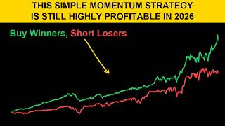
[09:56] Chart 5 shows the cumulative performance of the momentum strategy over time. The green line is the winner decile, red is the loser decile and the blue dashed line is the long short spread.
[10:11] The shaded region shows when the strategy was in the green versus in the red The bottom panel shows the rolling 12 average spread return
[10:23] This reveals when momentum was working and when it struggled. Momentum is well known to occasionally suffer sharp drawdowns, momentum crashes, typically occurring in sharp market reversals after crashes.
[10:39] The 2009 reversal is often cited as the most painful momentum crash in recent history. Despite these episodes, the long-run spread remains positive.
[10:54] Chart 6 addresses the critical January decomposition, one of the key robustness tests in the paper. Jagadish found that the momentum effect is present and statistically significant
[11:07] both in January and outside January, though January tends to be stronger This is crucial Many 1980s anomalies were found to be entirely January-driven
[11:21] which made them trivial to explain away Jagadish's pattern survived in all 11 non-January months The bar chart on the right directly mirrors Jigadisha's Table 2 decomposition, comparing the mean spread return in January, February through December and all months combined.
[11:46] The error bars show 95% confidence intervals. Chart 7 shows a rolling 3-year P-statistic of the momentum spread. This is the most informative chart for practitioners because it tells you at any point in time over
[12:05] the most recent 3 years was momentum statistically significant? When the purple shaded region rises above the orange dashed line at 1.96, the strategy
[12:19] was significantly profitable in that window. When it drops below negative 1.96, momentum was significantly reversing.
[12:33] The long stretches of positive significance confirm Jagadish's finding. Momentum is a persistent, exploitable phenomenon, not a one-time statistical artifact.
[12:45] To summarize, Jagadish's 1990 paper established three facts that reshaped empirical finance. First, individual stock returns exhibit significant negative serial correlation at 1 month, short-term reversal
[13:01] Second, returns exhibit significant positive serial correlation at 12 months, momentum Third, these patterns are economically large
[13:14] The top versus bottom decile portfolio spread was 2.49% per month over 5 decades of data Our replication on modern data confirms the qualitative patterns.
[13:28] This paper directly launched the momentum factor literature, Jigadish and Tittman 1993, Carhartt 1997, and ultimately the UMD factor that is now standard in multi-factor asset pricing models.
⚡ Saved you 0h 13m reading this? Transcribe any YouTube video for free — no signup needed.