
What Is a Fair Value Gap?
54sClear educational explanation of a core smart money concept that is highly searched and shared.
▶ Play Clip"The title promises easy steps to trade like smart money, and the video delivers a structured guide with real examples, though it includes a sponsor segment and some repetition."
This video presents a comprehensive smart money trading guide, breaking down the methodology into five simple steps: analyzing market structure, marking fair value gaps, identifying liquidity, spotting supply and demand zones, and executing trades with proper entry and management. It emphasizes combining these concepts to find high-probability setups and includes real chart examples to illustrate the process.
The video introduces a complete smart money trading guide covering market structure, imbalance, liquidity, supply and demand, and trade entry/management, aiming to combine these concepts for high-quality trades.
The strategy uses a main time frame for general analysis (market structure, key levels, imbalances, liquidity, supply/demand zones) and a lower time frame for confirmation and entry. It is applicable to any asset and time frame, with a recommendation for backtesting.
Market structure analysis defines direction and trading range. A 1-2-3 move breaking above previous high indicates a trend; higher highs and higher lows confirm bullish control. The trading range is defined from swing high to swing low, and as long as price stays above the swing low, the bias remains bullish.
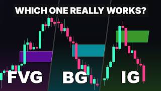
A fair value gap is a price gap from a three-candlestick formation, indicating an imbalance between buyers and sellers. It represents an inefficient price area where the market may return to fill, often acting as a strong reversal point. Bullish FVGs indicate strong buying momentum, while bearish FVGs signal selling pressure.
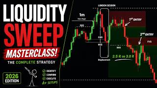
Liquidity levels are areas with high concentrations of stop-losses and pending orders, acting as magnets for price. Key types include swing highs/lows, equal highs/lows, turning points, and daily highs/lows. Smart money often targets these levels to trigger retail stop-losses before reversing.
Supply and demand zones are marked at the beginning of sharp moves, expecting price rejection on revisit. Key factors for validity include inefficiency (visible as FVGs), break of structure, and push distance. A larger push distance and break of structure increase zone strength.
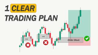
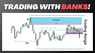
On the EUR/USD 1-hour chart, a bearish structure is identified, and the trading range is defined. A supply zone is marked near a fair value gap, and equal highs are noted as liquidity. The price retraces into the zone, and after a fight between supply and demand, supply wins, leading to a short entry on the 15-minute chart.
The example shows trailing profits by moving the stop-loss to protected highs after each downside break, securing profits and letting the trade run. This resulted in a nearly 1:4 risk-to-reward ratio.
The video demonstrates that combining multiple smart money concepts—market structure, fair value gaps, liquidity, and supply/demand—can lead to high-probability trades. The key is to apply these concepts systematically and manage trades with trailing stops to maximize gains.
What is a fair value gap (FVG)?
A price gap caused by a sudden imbalance between buyers and sellers, defined by a three-candlestick formation with a gap between the wicks.
03:00
What are the three key factors to consider when identifying valid supply and demand zones?
Inefficiency, break of structure, and push distance.
09:50
What is the difference between sellside and buyside liquidity?
Sellside liquidity is below swing lows, while buyside liquidity is above swing highs.
05:50
How is a swing high defined?
A swing high occurs when the middle candle makes a higher high than the candles on both sides, confirmed once the third candle closes.
06:59
What does a break of structure signal in supply/demand analysis?
It signals a shift in market sentiment and confirms the potential strength of the supply or demand zone.
10:17
What is the recommended approach to trade management in the example?
Trailing the stop-loss to protected highs after each downside break to secure profits and let the trade run.
14:31
Market Structure Defines Direction
Establishes the foundational step of determining trend direction and trading range, essential for all subsequent analysis.
01:24Fair Value Gaps as Reversal Points
Explains how FVGs indicate inefficiency and often act as strong reversal areas, a core smart money concept.
03:00Liquidity as Price Magnets
Highlights how liquidity levels attract price, often leading to stop-loss sweeps before major moves.
04:55Validating Supply/Demand Zones
Provides concrete criteria (inefficiency, break of structure, push distance) to filter high-probability zones.
09:24Combining Concepts for Trade Entry
Demonstrates the practical application of combining multiple concepts to identify and execute a trade.
11:29[00:02] together like pieces of a puzzle to enter highquality trades. We'll explain each concept step by step and show you how to apply them correctly to the chart. The concepts we're covering today include market structure, imbalance,
[00:17] liquidity, supply and demand, and additionally trade entry and management. So basically today's video is a complete smart money trading guide on its own. So, if that's something you're interested in, make sure to hit the like
[00:30] button for us to show your support and subscribe to our channel if you're new. two major time frames. First, we have the main time frame where we'll do most
[00:44] of our general analysis. This includes reading the market structure to find the direction, identifying key levels, imbalances, liquidity, and most importantly, spotting supply and demand zones that might offer highquality
[00:58] trading setups. In the second part, we'll zoom into a lower time frame to look for confirmation and enter the trade. Remember, this trading plan is not limited to any specific chart or time
[01:10] frame. Price action can be applied to any trading asset. However, we recommend doing proper back testing before trading with real money. You can also use any combination of time frames that works best for you. To make it easier, we've
[01:24] simplified this trading plan into five simple steps. So, let's start with the first one. Analyzing the market structure. In this general analysis, we apply the market structure concepts of smart money
[01:38] trading to the chart. Define the market direction and define the trading range. When the market forms a 1 2 3 move and breaks above the previous high, we have a trend. If it breaks above the recent high again, that confirms a trend
[01:53] This higher high and higher low formation shows that the bulls are in control and the price is more likely to rise again. As long as the price stays above the swing low, we remain bullish on this pair. So, the trading range
[02:07] we're looking at starts from this high to this low. If the price pulls back deep enough for traders to enter long positions, it will likely rise again and form another impulsive bullish move. Now, this was just a simple
[02:20] demonstration of how to apply market structure concepts. However, the problem is that the market rarely looks this clean. Most of the time, it looks more like this. But don't be confused. Let's apply the
[02:33] same market structure concept. Here is the latest break of market structure. So we'll mark the swing high, swing low and define the trading range. Every formation inside this range is considered an internal structure and the
[02:47] overall direction is bullish. This was the first step analyzing the market structure to find the direction in trading range. Now let's move on to the next step which is marking fair value gaps.
[03:00] What are fair value gaps? A fair value gap or FVG is a price gap caused by a sudden imbalance between the strength of buyers and sellers. It's defined by a three candlestick formation where we have a gap between the wicks of three
[03:14] consecutive candles like this. Now what does the fair value gap even mean in terms of price action? As the name suggests, it simply means that there is a gap between the fair value of the price. The massive buying pressure has
[03:28] caused this aggressive movement likely due to institutional activities and now the price is inefficient. As a smart money trader, marking fair value gaps is the first thing we do when we open the chart. But why mark fair value gaps on a
[03:43] chart? Fair value gaps are empty spaces on the chart where the price moved very quickly without much trading in between. The market often comes back to these gaps to fill them as the price looks for balance. Traders watch these gaps
[03:57] closely because the price may react when it returns to them. Additionally, a fair value gap is usually stronger than a zone without an imbalance. If the higher chance it will act as a strong reversal point. Now, back to the
[04:14] previous chart. Let's mark the fair value gaps. Here we have two FVGs near the current price. But what do they mean and what is the point of identifying them on the chart? The bullish FVG shows that this move had strong bullish
[04:28] momentum. The demand zone that created this gap provides a high probability trading opportunity to go long because the gap indicates that buyers were aggressive in this area. When price returns, those buyers may defend their
[04:40] positions, pushing the market back up and giving us a favorable entry with lower risk. The bearish FVG on the other hand shows the opposite. It signals that this small internal move has strong bearish momentum which can even push the
[04:55] price below the demand level and potentially cause a reversal. However, if the retracement ends and the price reverses back up to the point that created this FVG, it is a strong indication that the price may push
[05:08] higher. Now, let's move on to the next concept. Identifying liquidity. Liquidity levels are areas on the chart where a high concentration of orders such as stop- losses or pending trades are likely to exist. These levels act
[05:23] like magnets for price, often pulling it toward them before a major move occurs. Imagine this as our recent price action. We know that if the price pulls back to the demand area, many price action traders will go long and place their
[05:37] stop-loss orders just below it, hoping to benefit from a bullish move. If the price then continues to rise and approaches the swing high, traders may mark it as their target, take profits, or even open short positions at the
[05:50] resistance area. This means there is liquidity both below swing lows and above swing highs, which we refer to as sellside liquidity and buyside liquidity, respectively. Now, let's talk about the key liquidity
[06:03] types you should mark on the chart. But before we continue, if you want to get a funded account quickly, check out Funded Next's new Stellar Instant plan, which does not require a challenge phase. That's right. You get instant access to
[06:17] trading capital from day one. There is no daily draw down limit, no minimum trading days, and you can withdraw profits anytime. The best part, make just 10% and Funded Next doubles your account.
[06:30] They also offer plenty of other plans ranging from $5,000 to $200,000 And finally, some of the best offers if you are a futures trader. in, check out the link in the description.
[06:45] The first type is swing highs and swing lows. We've mentioned these terms many times, but what do they actually mean? Swings are price turning points where three candles form a specific pattern. A swing
[06:59] high occurs when the middle candle makes a higher high than the candles on both sides. A swing low occurs when the middle candle makes a lower low than the candles on both sides. The pattern is only confirmed once the third candle
[07:13] In this example, these are our identifiable swing highs and swing lows. Keep in mind that you can also use a five candle swing pattern which can make swings more reliable and give stronger signals.
[07:28] Now let's move on to the second type of liquidity. Equal highs and lows. As the name suggests, the price forms equal lows where the low points are around the same level. Similarly, the price forms equal highs where the highs
[07:42] are around the same level. So what does this signify in terms of price action? Double or triple bottoms created on the chart are great places to look for trading opportunities. Many retail
[07:55] traders expect a rejection to the upside once the price taps into this area again. So they enter long positions at these levels, placing their stop losses somewhere below. However, as we mentioned earlier, smart money aims to
[08:07] trigger these stop- losses. Therefore, it's important to wait for the liquidity to be collected before entering the market. If a demand area exists below the equal lows, there's a high chance the price will break below, sweep the
[08:20] liquidity, and then push higher. This is one of the key trading patterns in smart money concepts. Waiting for the price to collect retail traders stop- losses and then entering the market at the demand area.
[08:33] Next, let's talk about another key liquidity zone, turning points. Turning points are areas on the chart where the price changes direction after a long-term trend. These levels are often seen by the market as overbought
[08:47] or oversold which increases the likelihood of a reaction when the price revisits them. They hold significant liquidity because they attract attention from both retail and institutional traders.
[09:00] Daily highs and lows are also important liquidity levels. The daily high is the highest price reached during the trading day while the daily low is the lowest. These levels often draw a lot of trader activity with
[09:12] many placing their stop-loss orders or pending orders around them making them rich in liquidity. Now that we have discussed the important liquidity zones that need to be marked on the chart, let's move on to the next
[09:24] on the chart, let's move on to the next concept marking supply and demand zones. market with enough volume to cause the price to move sharply away from that
[09:37] level. Normally, we mark the beginning of this sharp move as the supply or demand area and expect the price to reject this zone when it revisits it due to the behavior of market participants. However, there are several key factors
[09:50] to consider when identifying valid supply and demand zones for trading. Inefficiency, break of structure, and push distance. Each of these serves as an important clue in confirming the strength and reliability of the zone.
[10:04] Inefficiency occurs when price leaves an area quickly, creating an imbalance between buying and selling orders. This imbalance is often visible as a fair value gap between consecutive candles. These gaps indicate a lack of supply or
[10:17] demand at that level, making it a potential turning point. A break of structure happens when the price moves past a key support or resistance level, signaling a shift in market sentiment and confirming the
[10:30] potential strength of the supply or demand zone. Each time the price breaks a structure level, it increases the likelihood of trend continuation. The push distance refers to how far the price travels away from the zone before
[10:44] returning. A larger push distance often signals a more significant rejection, making the zone stronger. By considering all these factors together, you can more effectively identify high probability supply and demand zones for your trades.
[11:00] For example, if we draw zigzag lines on the Euro Dollar 1 hour chart, we can clearly see the highs and lows marked. The latest impulsive movement meets all the criteria for a highquality demand zone. It has created a fair value gap,
[11:14] structure, and pushed the price higher by a significant distance compared to earlier moves. Once the price retraces back to this zone, there is a higher probability that it will reject the area and continue moving upward.
[11:29] Now, in this part of the video, let's see a couple of real chart examples to money concepts together like pieces of a puzzle to enter a highquality trade. Here on the Euro Dollar 1 hour chart, we have a bearish market structure
[11:44] formation. So, we are only interested in selling opportunities. The first step is to define the trading range. This is the latest breakout. So, we mark the trading range from the swing low to the swing high. This means we anticipate the
[11:58] correction to happen inside this range and the next impulse to follow downward. If the price breaks above this protected high, the entire bearish outlook changes. Now, where could our supply zone be for
[12:11] placing short entries? To answer this, let's first mark the imbalance in liquidity. There is no noticeable structure to mark as a liquidity level. But here we have a fair value gap area. Basically, the candle
[12:24] a supply zone to look for selling opportunities. momentum candle before the bearish impulsive move as another potential supply zone. It doesn't make much difference which one we choose because
[12:39] later we will zoom into the lower time frame to refine our entry. Now, let's play the price forward to see what happens here. The price has created equal highs which we will mark as a key liquidity
[12:52] area because these highs may attract stop-loss orders from sellers and buy stops from breakout traders. If the price breaks above these equal highs and zone, it could provide us with a great
[13:06] trading opportunity. Our plan is to wait for the price to enter our trading zone, then zoom into lower time frames to find an entry. Here the price has retraced all the way up to our trading zone. But there is
[13:19] another important price action formation. This bullish movement has created a bullish fair value gap which indicates strong buying momentum. This momentum might have enough power to push the price above the supply zone.
[13:33] So now there's a fight between supply and demand. If the demand is strong enough to break above the high, we are no longer bearish on this pair. If the supply is strong enough to break below the demand zone that created this gap,
[13:45] it will provide a great opportunity to go short. Now, let's see what happens. Supply has overcome demand and is now in control. To execute the trade, let's zoom into the 15-minute chart for more detail.
[14:02] On the 15-minute chart, all we need to do is identify a supply zone to go short. The candle that created the fair value gap will make a great supply area for entering a short trade. Now, let's play the price forward.
[14:16] Here we have our first successful trade. But let's continue to place more trades. Once again, we have a fair value gap area. So, we will mark the supply zone and place a sell limit. For this setup, we are going to trail our profits.
[14:31] Meaning that every time the price creates a break to the downside, we will move our stop-loss to the protected high. This way, even if the price reverses, we will secure our profits and let the trade run.
[14:45] let's move the stop loss to this protected high. Once more, we have another breakout. So, we move the stop loss again. This process continues until the price reverses and hits our stop.
[15:01] For this particular trade, we were able to catch almost a 1:4 risk-to-reward ratio. This is a quick example of how combining multiple smart money concepts can help us achieve great trades. So, that's it
[15:14] for this video. I hope it was valuable for you. If it was, please hit the like thoughts in the comments. See you in the next episode.
⚡ Saved you 0h 15m reading this? Transcribe any YouTube video for free — no signup needed.