
How I Predict Market Trends with Colors
45sThe visual color change makes complex market analysis simple and instantly understandable.
▶ Play Clip"The title promises to predict market direction, but the video actually explains a trend-following indicator, not a predictive tool."
This video presents a custom technical indicator designed for Renko charts that uses color-coded bands to visually identify market trends, consolidations, and momentum shifts. The indicator, built around a central moving average with standard deviation bands, changes color from yellow (consolidation) to green (uptrend) or red (downtrend) based on bandwidth expansion and contraction. The creator explains the underlying code and demonstrates how the indicator can also color the Renko boxes themselves for enhanced trend visualization.
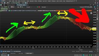
The indicator uses statistical bands built around an average to visually identify uptrends, sideways trends, and downtrends on Renko charts.
As the market exits consolidation and enters a trend, the indicator changes from yellow to green, showing upward momentum.
When bands narrow during consolidation, the indicator turns yellow. When bands expand and the market moves down, it shifts to red.
The indicator detects market reversals by changing colors as the trend direction changes, e.g., from green to red when a downtrend begins.
The indicator code is shown. It uses a central moving average (simple, exponential, or weighted) with a period of 20, and calculates standard deviation to create three upper and three lower bands.
A variable called 'force' represents the ratio of current bandwidth to the average bandwidth over 200 periods. This determines the color via a heatmap system.
The color-coding rule can be applied to the Renko boxes themselves, making trend identification even easier.
The indicator can be modified to color boxes green when price closes above the upper band and red when below the lower band, offering another trend identification method.
The custom indicator provides an intuitive, color-based way to interpret market trends and consolidations on Renko charts, with open-source code available for customization. It helps traders visually identify momentum shifts and potential entry or exit points.
What does the indicator's yellow color signify?
Consolidation phase (bands are narrow).
01:33
What does the indicator's green color signify?
Uptrend (bands expanding upward).
00:49
What does the indicator's red color signify?
Downtrend (bands expanding downward).
01:48
What is the central moving average period used in the example?
20.
04:58
What type of moving average is used in the example?
Weighted average.
04:44
How many standard deviation shifts are used above and below the central average?
Three shifts upward and three downward.
05:51
What does the 'force' variable represent?
The ratio of current bandwidth to the average bandwidth over 200 periods.
06:06
What is the purpose of the standard deviation calculation in the indicator?
To measure price dispersion (volatility) and shift the central mean to create bands.
05:24
How can the indicator be used to identify pullbacks?
By modifying the period or deviation settings, the indicator can be adapted to identify pullbacks within a trend.
08:49
What alternative coloring rule is mentioned for boxes?
Color boxes green if close is above the upper band, red if below the lower band.
09:32
Visual Trend Identification
Introduces a novel way to visually identify market phases using color-coded bands.
00:19Reversal Detection
Demonstrates the indicator's ability to detect trend reversals in real time.
02:43Open-Source Code
The creator shares the code, allowing traders to customize and use the indicator freely.
04:31Force Variable Logic
Explains the core logic behind the coloring system, based on bandwidth comparison.
06:06Box Coloring Enhancement
Extends the indicator's utility by applying color to the Renko boxes themselves.
07:01[00:19] developed to visually identify a set of statistical bands built around an average. this indicator works, because it can show us in a
[00:34] very visual way when the market is in an uptrend, a sideways trend, or do this very well here on the Renco chart as well, on the candlestick chart, but here on the Renco chart it becomes even more interesting. Look, as it exits
[00:49] the consolidation phase and enters the trend, you can clearly see how the indicator changed from yellow to green, showing the market Unlike a conditional indicator,
[01:04] upper and lower bands, right? This indicator here seeks to interpret the current state of the market. Look, in this case, he recognized the exact moment when the market was moving upwards and started changing the color
[01:19] of the indicator, turning green. So, it makes visually interpreting the graph much easier, right? Here, when it was in this consolidation phase, as the bands narrowed, he noticed this and changed the
[01:33] indicator's tone, painting the lines yellow, showing that it was in a consolidation phase. And when the market started to move in a downward direction, he identified this through the opening of the bands here, see. Then, he
[01:48] started changing the indicator's hue , going from yellow to reddish tone. And he keeps doing it. If the market continues to fall further and further, it will become even more of a red zone. The
[02:01] main idea behind this indicator is to intuitively show when the market is compressed and when it starts to gain momentum. And he does that through colors, right? Look here, look how interesting. Look here. It turned out to be
[02:15] a really cool situation. In the Reno chart. I'm here on the 20th. You can see that the indicator was able to identify the moment when the market gained momentum, and then it immediately started to move away from a more yellowish hue, right?
[02:30] It pulled towards a point of uncertainty here, and it started to move into a higher tone, you see? It started to take on a high-end tone, which is green. And it keeps getting a more intense green. And look what happened. The
[02:43] market has started to reverse. This candle arrived here, right, causing a reversal. So, the indicator immediately started to realize that this reversal was happening and that the market was moving in a downward trend, and
[02:56] it began to change the colors of the bands. What this indicator does is precisely detect the contraction of the bands. Notice here, the bands were further apart, and now, at this point, they started to come
[03:08] closer together. The indicator detects this as well. Every time the bands compress, this indicator that I created will start to turn yellow. It's going to start painting yellow. And when the bands start drifting apart again
[03:21] and the market is moving downwards, he starts painting it red. That's can see that very clearly from here. Look at these bands, so tightly compressed here, so squeezed in. Then the indicator noticed this, so it started changing
[03:35] color to yellow. And as the bands began to decompress, they started to move apart, indicating a selling force coming in, the indicator started to shift from that yellow hue to an orange hue, and then it started
[03:50] to look more reddish, you see? Look here. Let's take another look at the graph here. Just look. And it keeps doing the same thing, see? It's fading from the yellowish color. Then, when he realizes that
[04:04] the market is coming out of the upward trend, he starts entering a more yellowish color, leaning towards red, and he keeps doing that. Look here, several situations in the graph here. It's quite interesting how this indicator
[04:17] manages to capture the direction of the market, as was the case here. This is a low point in the situation. See? The indicator detected that the market had entered a color the lines red. So here I want to show you the code
[04:31] I wrote for this indicator. Look, this is the code, okay? You can pause the video and take a look at what I did. The calculation of this indicator begins by defining a central moving average . There can be three types of
[04:44] moving averages, because it can be here, look, simple average, exponential average, or weighted average. In this example, to show you, I'm using the weighted average, but it which is the arithmetic average, and also the exponential average. I then defined the weighted average here
[04:58] . So in the inputs I defined the period as 20 for this average, and it's being calculated based on the box closings. This central average acts as the axis around which all the bands will be constructed. Looking at
[05:11] the graph here, you can't even tell where the central average is, but it's right here in the middle. It's one of those here in the middle. All the other bands are being calculated based on this central average of 20, a weighted average, right? All
[05:24] other bands are being calculated based on it. And then this set of moving averages is formed here to define the trend. What I'm doing here with this average is calculating the standard deviation of the prices using a
[05:37] configurable period. The standard deviation represents the dispersion of prices relative to the mean, and is a classic measure of volatility used in statistics and various technical indicators. So, I'm calculating the
[05:51] standard deviation here in order to shift this central mean, right? So here I do three upward displacements and three downward displacements. That's what I'm doing. There are three shifts using the
[06:06] standard deviation. So, in the case of the coloring rule, I've created a whole system here that's based on this variable called force. See? This variable represents the relationship between the current bandwidth and the
[06:20] previously observed average bandwidth. That's why I'm calculating here, an average of 200 of the width, because it takes the top line, it's going to take this top line that's here, with this bottom line that's here, it's going to measure the
[06:33] width and compare this total width here with the last 200 boxes to define the spacing between the extreme lines of the channel, right? And based on that, he'll be able to apply this
[06:46] here. We have a whole heat map system to generate the color, right? Here's the system, and then it takes that and applies it to all the bands. By doing this, I obtained this indicator here, as we can see, which is able
[07:01] to identify the trend in the chart. Very interesting. And I can do the following, because here I'm only coloring the indicator. If I want, I can color the boxes too. And then I'll have this color-coding in heatmap format
[07:14] in the boxes as well. Look, do the following here. I'm going to add a paint bar, in this case, and I'll ask it to use in this case, and I'll ask it to use that RGB in the boxes as well. I'll put it
[07:28] here in the boxes, see. And then I'll run it again. So I'll have this coloring rule applied to the boxes as well, as you can see here. Not only in the indicator, but also in the boxes. Look here, see? And then the boxes
[07:40] boxes. Look here, see? And then the boxes also started to receive the color-coding rule to make it easier to identify the trend. Look here. Downtrend, consolidation, uptrend. So, as it goes into
[07:55] consolidation, it turns yellowish like this . Then, as it begins to gain strength, it starts to change color. Here, look, it started to gain strength, it was turning towards a green hue. See? That's pretty interesting, isn't it? A very
[08:09] interesting system. Look here. Let's take another situation, then. Look here! He jumped on the downward trend, and started dyeing his hair red. It entered an upward trend, and it started to shift towards a greenish color. That's really interesting what
[08:22] I'm sharing with you. That's a really cool idea. Look here. Look at this situation here. In this case, the lines on the indicator were very compressed , so it ended up painting them yellow. The moment he realized
[08:36] trending downwards and the lines were starting to move further apart, he began painting them red. See? Very interesting. And there are other ways to work with this indicator, not only using it as a trend reader,
[08:49] but we can also use it to identify pullbacks within an uptrend, because it can be modified in various ways, right? If I modify, for example, the period or the deviation here, I will also get
[09:03] different results. Look, if I set, for example, a period of 30 and a deviation of 10, the way the indicator is plotted on the chart changes. Look here. You notice that things change, right? You can see that now, with the
[09:17] boxes are managing to move further away from this average channel, right? Just look. work. One cool detail I wanted to share with you more videos about later, is this one here. If I want, I can create
[09:32] a color-coding rule to identify how much the price is above the bands. how much the price is above the bands. For example, if I put it like this, see, if, For example, if I put it like this, see, if, closing the box, it's above the
[09:45] maximum upper band, right, which is sup 3. I'll paint it paint it lime green. If the box closure lime green. If the box closure is below the maximum lower band,
[09:59] which is inf 3, the last line of the lower band, I will ask for it to be painted red. This is another way we can use the indicator as well, see. I'm going to paint here. Look here. What will he do next? He's going to start doing the
[10:11] following, see. Let's see here. I'll put it in. Look, every time he notices that the boxes are above the maximum upper line of that channel, he's going to paint the boxes green. That's very interesting for
[10:26] identifying trends as well. Every time he notices that the boxes are below the maximum lower line, he will be in red. That's another way to try and identify the trend, too . See here? Green. Green. That's pretty
[10:43] interesting, isn't it? Here, look. Red. He's only painting it red. Look here . Green. Green. See? That's the indicator code, right?
[11:22] There are dozens of open-source codes that you can use freely in your profit chart. Enroll today and receive, in addition to various setups, complete training teaching you step-by-step how to create strategies in the
[11:36] Profit Chart editor. And best of all, when you enroll, you get access to we share various codes and create several strategies based on your feedback. [Music] Do you need to program a setup and don't know how?
[11:51] Through our support service, we create the code for you. [music] Enroll today and get access to all of this today. We share the setups with 100% open source code. You can request an unlimited number
[12:05] of codes throughout the two months of support. You will learn from scratch how to set up various trading systems and obtain statistics to discover winning strategies. A training program designed to teach
[12:19] ordinary investors [music], but developers of new strategies for the new strategies for the stock market.

⚡ Saved you 0h 12m reading this? Transcribe any YouTube video for free — no signup needed.