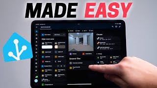

7 Rules for Smart Home Dashboards
55sQuick, actionable rules that promise to simplify smart home dashboards, appealing to both beginners and enthusiasts.
▶ Play Clip"Delivers a solid, rule-based guide that matches the title's promise, though some sections are padded with personal anecdotes."
This video provides a comprehensive guide to designing effective smart home dashboards using Home Assistant. The creator shares seven practical rules based on personal experience, focusing on simplifying dashboards to save time and improve usability for all family members. The rules cover everything from planning the dashboard's purpose to utilizing space efficiently, avoiding clutter, and implementing shortcuts for quick access.
Building a smart home dashboard can be daunting and time-consuming if done wrong. The video presents seven rules for designing a dashboard that applies to any house, based on simplifying the dashboard to save time and make it easier to use.
Categorize dashboards into three types: specific room, shared family in high-traffic area, and phone/tablet/computer. Design each accordingly. For example, a room-specific dashboard can have many buttons, while a family dashboard should have only the most-used controls.
Use sections as the dashboard type in Home Assistant. Choose max sections wide of 2, 3, or 4. Avoid creating more sections than the max to prevent gaps. Use tile cards for compact controls and customization.
Avoid adding unnecessary cards like sensor graphs. Only include devices you need daily. Use the visibility tab to show cards conditionally, e.g., doorbell feed only when someone is detected.
Creating extra views leads to maintenance and slower navigation. Instead, use a drop-down selector to switch rooms in one section. Automate the selected room based on presence or time of day.
Scrolling makes it hard to find things quickly. Use subviews or Bubble Card popups to hide less-used controls. For phone dashboards, one swipe to bottom and back is acceptable.
Muscle memory for hands and eyes is key. Place most important items top-left. Use distinct icons and colors for quick visual scanning. Consistent layout helps family members.
Create shortcuts to jump directly to specific dashboards or views. On iOS, add Home Assistant open page buttons to home screen or control center. On Android, use companion app shortcuts.
By following these seven rules, you can create a smart home dashboard that is both functional and family-friendly, saving time and reducing frustration. The key is to simplify, utilize space wisely, and prioritize quick access to the most important controls.
What are the three categories of smart home dashboards mentioned?
Specific room, shared family in high-traffic area, and phone/tablet/computer.
01:39
What is the recommended max number of sections wide for a Home Assistant dashboard?
2, 3, or 4.
04:08
How can you show the doorbell feed only when someone is detected?
Use the visibility tab with a condition based on an input boolean that is turned on by an automation when a person is detected.
08:19
What is the advantage of using a drop-down selector for rooms?
It takes up less space than multiple buttons and allows faster switching, especially with one hand.
10:46
What is the '3-second rule' for dashboards?
You should be able to find anything on your dashboard in under 3 seconds.
15:01
How can you create a shortcut to a specific dashboard on Android?
Go to settings, select companion app, manage shortcuts, add a label and description, select dashboard, and enter the dashboard URL.
18:35
Three Dashboard Categories
Provides a clear framework for designing dashboards based on usage context.
01:39Conditional Visibility for Clutter-Free Dashboards
Shows a practical technique to show controls only when needed, reducing clutter.
08:19Drop-Down Room Selector
Innovative way to manage multiple rooms in one section, saving space and improving speed.
10:463-Second Rule
Sets a clear performance goal for dashboard usability.
15:01Shortcuts for Instant Access
Demonstrates how to bypass the main dashboard for frequently used controls, saving time.
17:26[00:02] nearperfect, but building a smart home dashboard can be daunting and you can actually waste a lot of time if you do it wrong. I know from experience. I'll dashboards around my house. Made them much more familyfriendly, plus tons of
[00:19] tips for building and perfecting your own dashboard. And best of all, it's way easier than you might think. The amazing thing about customizing a dashboard is that you can design it specifically for what you need. So,
[00:33] depending on the room and devices it's controlling. That's why I came up with seven rules for designing a smart home dashboard that will apply to any dashboard in any house. And all these rules are based around simplifying your
[00:48] dashboard. That way, it will save you time and make it easier to use. Now, I'll be using Home Assistant and won't be covering the basics like how to create a blank dashboard, but I covered all the basics you need to know for this
[01:00] video in my Home Assistant beginner video. I'll link it down below and check it out if anything in this video doesn't make sense. All right, let's get into it. Rule number one is design the
[01:12] your house. This is the first stumbling I'll just put a bunch of smart home devices on a dashboard without putting much thought into it and call it a day." Huge mistake. There's a high chance you
[01:26] and your family won't use it often if you do this. But if you put a little thought in what you need before you start making the dashboard, it will go a long way. I've categorized the dashboards in my house into three
[01:39] buckets. The first is one that's made for a specific room. The second is a shared family dashboard in a hightra walking area like ours is in the kitchen. The third is one that you would use on your phone, tablet, or computer.
[01:53] what kind of dashboard you're going to make because it's going to affect the design. But don't worry, it's not that complicated. Let's start with the first category, a dashboard that's made for a specific room. This dashboard is in my
[02:07] studio or office, and it sits on my desk and allows me to quickly control devices in the room. I don't hide any buttons so I can turn things on and off as fast as possible. I'm also not worried about having lots of buttons on the dashboard
[02:19] because I'm the main person that uses it or I thought I was the main person that uses it. I love pink. I have a similar dashboard in our theater room and just buttons so I can quickly run scenes or control devices. This might seem a
[02:34] little obvious, but let's compare that with the next category. A shared family dashboard in a hightra area. Instead of packing the screen full of buttons, there are only five, which are four different lighting scenes and the
[02:48] backyard shades. And it wasn't always like this. My previous version had tons of buttons all over and it was difficult for my family to use. So, I kept the five mostused buttons and hid the rest. They actually use it now and the spouse
[03:01] approval factor is very high. There are a few extra buttons that I hid and I'll video. But if you want to know specifically how I made the calendar, that, well, I already made a video about it, and I'll link that video down below.
[03:15] The last dashboard category is for your phone, tablet, or computer. This one is slightly more challenging because the screen size can change, so it needs to look good on all of them. Also, it needs to control your entire house and not
[03:29] overwhelming. So, that's where the rest of these dashboard rules come in to help. But just to recap, rule number one, design your dashboard specifically where it will be used and it will make life so much easier for everyone using
[03:43] it. All right, rule number two is about utilizing the space on the dashboard because there is only so much screen real estate available and you don't want to waste it. So, there are a few easy things that you can do to make sure that
[03:55] dashboard in Home Assistant, make sure to choose sections as the dashboard type. So, you can use drag and drop. And now it's the default for Home Assistant. So that's great. You can also convert old dashboards you've created to
[04:08] sections. But when choosing the max number of sections wide on your dashboard, only choose two, three, or four. Don't choose one or waste space when viewing on a bigger screen. And five is just a little too crammed in my
[04:21] opinion. Two or three are my go-to, but it really depends on what you prefer and what screen size you'll be using. Here's the key thing, though. Whatever max number of sections you go with, try not to create more sections than that
[04:34] number. Let me show you why. Say you have a max of three sections, so three columns, and you end up adding five sections. The fourth and fifth section are going to go beneath the first three sections. And if your first three
[04:47] might not seem like a big deal, but if just one of those first three sections are longer than the others, then all the other sections below it are pushed down. This creates a massive gap of wasted space and requires you to scroll a lot
[05:02] more. I don't think anyone would think this looks good unless you're this guy. And that's saying something. So, here's what I recommend. If you have a max of three columns, but you want to add five different sections, you can add a
[05:14] heading card to separate the sections into two parts. That way, it looks like two sections, but everything still fits nice and tight. Also, one of the best ways to utilize space is to use the tile cards. They look great and they can be
[05:28] With the latest Home Assistant update, you can even put controls on the tile cards in the same row. This is a great way to quickly control devices without taking up too much space. This used to only be possible with third party
[05:41] add-ons like mushroom cards, but I think the guy that created mushroom cards now where all these updates are coming from, which I'm very happy about. I still use drop down that I'll show you later in the video, but there are almost no
[05:57] reason to use some of the older cards that take up so much space. Tile cards are the way to go, and I love how easy it is to customize them, like on it and changing the display name, which can come in handy if you want to
[06:10] shrink the card down more, since you can make the card smaller or larger under the layout tab. And this is perfect for utilizing space even more. So remember rule number two, utilize the space on the dashboard. Don't create more
[06:23] sections than the max to avoid large gaps and keep the cards as compact as possible. Okay, let's talk about rule number three. Do not overclutter. You might be like, "Hey, wo, this feels like the opposite of the previous rule,
[06:37] packing lots of compact cards on the dashboard." But there's actually a difference between utilizing space and overcluttering. Let me explain. There's a trap that most people, including me, have fallen into when in creating
[06:49] dashboards. That trap is adding unnecessary cards to the dashboard. Say you buy a brand new motion sensor. It can detect light, temperature, and motion. And you look at the graph in Home Assistant and it looks so cool.
[07:03] Then you add it to the dashboard right away because graphs look amazing. And you know, it really shows how smart I am and how advanced my dashboard is. We've all done it. But stop. Don't do it. You do not need that on a daily basis and it
[07:17] will just clutter up your dashboard and be a complete mess before you know it. You don't even need to put all the devices in the room on the dashboard. I know that might sound shocking, but think about it. If you don't need to
[07:30] control or see that information on a daily basis, don't put it front and center on your dashboard. But how do you decide what should be on the dashboard and what shouldn't? There's always going to be a few devices that you only
[07:42] sometimes need. Well, what I'm about to show you will make your dashboard go show you will make your dashboard go from okay to amazing and make that decision of what to include super easy. Here's how it works. Say you want to
[07:54] include a live video feed of your doorbell and the front door lock. That way, when someone knocks on your front door, you can see who it is and unlock the door right there on the dashboard. Well, how often are people knocking on
[08:06] your front door? Maybe a few minutes out of the whole day. So, the rest of the time, you don't need those controls. So, let me show you how you can still have those controls without cluttering up your dashboard. There is a visibility
[08:19] tab that can show or hide cards based on a condition. So, you could only display the live doorbell feed and the front door lock controls if someone's detected on the front porch. The way I have it set up on our family dashboard is when
[08:33] our doorbell detects a person, an automation is triggered. That automation turns on an input boolean. So the cards only show when the input boolean is turned on. Then I have another automation that turns off the input
[08:46] boolean if it's been on for 30 seconds, which hides the doorbell feed. Again, you can also display the front door lock anytime it's unlocked. That way, it's an alert to show you that it's unlocked and also controls to quickly lock it. Then
[08:59] once you lock it, it disappears. It makes the dashboard super easy to use while staying clutter-free. But there's still a slight gap with this strategy. What if you need to control the front door lock, but the controls are hidden?
[09:12] Well, we'll get to that in a minute, and I'll show you an easy way to solve it. But to recap, rule number three, do not overclutter by adding devices to your dashboard that you don't need on a daily basis, and use the visibility tab to
[09:25] only show devices when needed. Rule number four, try to create less views and dashboards. Once you start making a dashboard or two, you might think, "What's the harm in making a few more, like one for all the lights
[09:39] in the house? Yes, I need that. I've done this." And it sounds good on paper, but then it quickly turns into a nightmare. First, it's another dashboard you have to remember to update every time you buy a light or move a light,
[09:53] and it's a massive time suck. Not only that, but it was actually much slower to find a specific light since I wasn't used to the order. So, it always took way longer. Not fun. And it also might be tempting to make a dashboard with
[10:06] graphs of all the sensors you have in your house. And it is fun to make, but it's not always that helpful. There are some extra views that can be helpful, like all the sensor batteries in one spot, and I love this. So, use good
[10:20] judgment. Don't just make a dashboard view because you have access to a lot of data. This rule of less views and dashboards also applies to how you organize your rooms. I've tried to make separate views for each room. Bad idea.
[10:34] It's not fast to jump between rooms with the tabs on top. Then I tried making subviews for each room, and it's faster to jump around, especially with the back button. But the buttons for each room still take a lot of real estate on the
[10:46] dashboard. Plus, jumping between the sub view and the main dashboard isn't easy to do with one hand. So, what I found to be the best is to have that first section be a room that can be changed with a drop- down selector. Not only is
[10:58] it faster than clicking on different view tabs up top, but the drop down takes up way less space and a bunch of buttons. Plus, I can easily jump around with one hand. And the icing on the cake is that you can automate which room is
[11:11] shown. I have mine automatically switch using room presence detection. It's amazing because every time I open up the dashboard on my phone, it shows the controls for the room that I'm standing in. But even if you don't have room
[11:24] automate this with things that you already have around your house, like the time of day. So maybe if it's late at night, it shows your bedroom first or there. This is probably my favorite feature of my dashboard, but it does
[11:40] And if you're not planning on doing this, just skip to the next section of the video. So, what you have to do to set this up is first create a drop-down selector in the helper section. Add all your rooms, which you can always edit
[11:53] later, and add the drop-down to the dashboard using the mushroom card, which is a third-party add-on using hacks. Then only show the room section if the drop-down has selected that room, which you can set up by going to the
[12:07] visibility tab for the room. add a basic condition to only show the room if the drop down is equal to that specific room and that's it. So you could do this for each section for every room and that way you can keep the drag and drop
[12:20] functionality. But if you want to keep all the rooms in one section similar to how I've done it, then you'll lose drag and drop functionality and it's a little bit of extra work. I'm using a bunch of vertical and horizontal stacks in one
[12:34] section. And each vertical stack is a room and I hide all of them except for one. And that way it keeps it organized better. And to get the cards sitting next to each other, I use the horizontal stacks inside the vertical stacks. And I
[12:48] can still move things around with the arrows inside the UI, so it's not too terrible. I hope Home Assistant makes this easier, but I think it's worth it to hide and show all of your rooms in one section. So to review rule number
[13:00] four, avoid creating extra views and dashboards so you have less to maintain Instead, get creative with something like a dropown that takes up less space. All right, now on to rule number five, which is very important. Be sure
[13:14] to avoid scrolling. This mainly applies to mounted dashboards. Not only is it difficult for family members to find something if they have to scroll first, but you can't see something quickly at a glance if you have to scroll to see it.
[13:27] For a dashboard on your phone, it's a little different. It's near impossible want it to be responsive and fit nicely on a tablet as well. So, here's my two cents for scrolling on a dashboard using a phone. If you can swipe once to get to
[13:41] the bottom and swipe once to get back up and still see it all, that's perfect because you know where everything is and you can get to it quickly. I've had long dashboards that required a lot of scrolling and it was not fun trying to
[13:53] find something quickly. Instead, take all the things that you don't use on a daily basis and put them out of sight. The easiest way is to create a subview. You can get to it from a button press, and the sub views have a back button to
[14:06] get back to the main dashboard. It works well, but there's another way that I like even more because it's faster and easier to use. It's an add-on called Bubble Card that allows me to add a bunch of dashboard items on a popup. I
[14:19] can use it in one-handed mode so it's faster on my phone and on a tablet I can close it by clicking outside of it. It's very snappy and I like it a lot. For mine, I made a button to make it appear out of a badge at the top. I like doing
[14:31] room and it's easy to find on all my screens. No more scrolling forever. I'll link it down below if you want to use it. So, if there are any dashboard the front door lock that we talked about earlier, you can put it in a subview or
[14:47] a bubble card popup to still quickly access it without taking up too much room. I'll admit this rule number five to avoid scrolling is very simple, but it's very important to remember. Okay, rule number six. You
[15:01] need to be able to find anything on your dashboard in under 3 seconds. This is where everything you've learned comes together to help make this happen. And help you find things faster. But the key to it all is muscle memory for both your
[15:15] hands and your eyes. Let's focus on the muscle memory of your hands first. And this is all about the layout of your dashboard. And the order how you lay everything out makes a big difference. Whatever you put in the top left of your
[15:28] dashboard is going to be the most important thing. On a tablet, it's the first thing we see because our eyes naturally read from left to right. But more importantly, it's the first thing that is shown on a phone size screen.
[15:40] The next column to the right is the second section when scrolling on the phone, and it continues on. So for my dashboard, I don't place the dashboard cards that hide and appear on the left. That way, my scrolling isn't affected on
[15:53] my phone because if there were a lot of cards visible that are normally hidden, it pushes everything down and throws off my muscle memory to find things quickly. Instead, I put the spot where the cards appear and disappear at the bottom of
[16:06] need to check if something needs my attention, I just quickly swipe down on my phone. And it's similar to swiping on my phone to check notifications. That's prefer the complete opposite, which is totally fine. The other muscle memory is
[16:20] for your eyes. Changing up the icons and colors can make it much faster to find things on the dashboard. This is where Apple and Google really need some work. Most devices look the same, and Google is the worst at this. It hurts my eyes
[16:35] trying to find something. Yuck. There are decent amount of icons that come included with Home Assistant, but if you want even more, there's another hack add-on called custom brand icons. There are a lot more options with that, and it
[16:48] comes in handy when making things like a custom remote dashboard. But the colors of the icons make the biggest difference for me. If I'm looking to make the lights in my house warm white, I'm looking for that button with the warm
[17:00] color on it. If you followed all the rules so far by building a dashboard specifically for a location, utilizing the space, not overcluttering, keeping separate views to a minimum, avoiding scrolling, and making everything easy to
[17:13] find. Not only is it going to look good, but you should be able to find anything in under 3 seconds. Try it out and time yourself. It also makes it much easier for your family to use it, so it's worth the extra effort. But the question is,
[17:26] the extra effort. But the question is, can you get to things even faster? Oh, yeah. Which brings us to the last rule, number seven, dashboard shortcuts. I use these all the time, and it helps me get to things in less than a second. Yes,
[17:40] I'm serious. Here's how I'm using it. Well, first, shortcuts in the dashboard. Look how long it takes to normally go to the automation section in Home Assistant. Way too long. So, I created a shortcut to it on my dashboard. so much
[17:54] faster. All you have to do is make that button, navigate to that page in Home Assistant, and you don't even need to open up the Home Assistant app to go to shortcuts. You can skip that step, and go straight to the page you want. When
[18:06] garage door, I just click on the shortcut on my phone's home screen, and I jump straight to that view. It's way faster than opening up my main dashboard and trying to navigate to it. This works on both iOS and Android. With iOS, you
[18:21] can add a Home Assistant open page button to jump straight to a certain dashboard. And you can do this in the control center as well, and it's great Home Assistant. Android is a little more tricky to set up, but it's not that bad.
[18:35] Go to settings and select companion app. Scroll all the way down to manage shortcuts. Add a label and a description. Select dashboard and enter the dashboard URL. And this can be a sub view, so that's nice. If you need help
[18:49] Assistant in the browser, go to the dashboard or view, and copy everything in the URL after 8123. To add the shortcut on your phone, just hold down on the Home Assistant app and a popup menu will appear showing the shortcuts.
[19:04] Drag the shortcut onto the home screen. Or if you don't want to take up room on hold down on the app and select the shortcut from there. It's so much faster navigating on the phone. So, if you ever
[19:18] view of your favorites, a shortcut is going to get deep into in this video is customizing the look of your dashboard. There are really cool themes that you can add, like a Star Trek looking one,
[19:31] and Paul Hibbert did a great video on setting this up. I do use a theme, but it's very minor tweaks like removing the outline border for cards. If you want to yourself, I'll put it down in the description. And it's a little confusing
[19:45] how to implement the theme and set as a default. You have to go to developer tools and select actions. Search themes and you'll see the option to reload the theme which will implement it once you add the code. Then if you want to set it
[19:58] as the default for all your devices, choose that as the option and select the would be nice if this was an option in the settings or something, but beggars helpful and you make some great
[20:12] haven't subscribed yet, make sure you do. And thanks for watching. This is the most beautiful thing I've ever seen. I can't wait to hang it on the wall. Oh, is that our new family picture? Yeah, I spent a lot of
[20:25] time editing it to be perfect. M. Yeah, sometimes Photoshop takes a while. they come over. Yeah, our kids are pretty cute. Wait, kids? No, I'm talking about our family dashboard. Oh, um, yeah, I'll hang up a
[20:39] dashboard. Oh, um, yeah, I'll hang up a family picture, too.


⚡ Saved you 0h 20m reading this? Transcribe any YouTube video for free — no signup needed.