
Indicators Are for Beginners (And Why)
60sReveals why new traders rely on indicators and the dangers of false confidence.
▶ Play Clip"Delivers on the promise of explaining indicator-free trading with practical examples, though some filler and promotion reduce the score."
This video explains why the creator avoids using technical indicators in trading, arguing they are lagging and derived from price, which itself is derived from volume and market actions. The presenter advocates for pure price action analysis, focusing on market structure, supply and demand zones, and demonstrates this approach with Bitcoin charts on multiple timeframes.
The creator states they do not use indicators like moving averages or oscillators because they do not work and are based on formulas that lag behind price.
Indicators are a derivative of price, price is a derivative of volume, and volume is a derivative of market participants' actions. Thus, indicators are the last link in the formula, merely transforming current price values.
Beginners are attracted to indicators because they are promoted by trading gurus and are easier to read than a blank chart, providing a false sense of confidence.
Indicators reduce visual noise on charts by averaging prices, making them appear smoother and clearer, but this gives a false impression of market direction.
The creator spent about a year testing various indicators and combinations, but none satisfied them. They conclude that mechanical trading systems based on indicators are not effective for intraday trading.
Realizing indicators are unsuitable for intraday trading, the creator delved into price action and candlestick analysis, concluding that price itself is the only trustworthy source of information.
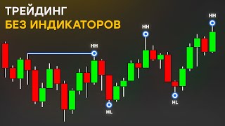
Market structure is the first thing to analyze. Markets have three states: uptrend, downtrend, and sideways. Uptrends are formed by higher highs and higher lows; downtrends by lower lows and lower highs.
Breakdowns of structure signal trend changes. For example, in an uptrend, if price breaks below a swing low and consolidates, it may reverse to a downtrend.
Using a 12-hour Bitcoin chart, the creator demonstrates identifying an uptrend, structural elements, and supply/demand zones, showing how price reacts at these levels.
A liquidity sweep occurs when price updates a high or low but fails to hold, quickly returning to the range and moving opposite. This is considered a barrier structure.
After each high, price corrects and forms demand zones; during downtrends, it tests supply zones. These zones act as strong reversal levels.
On a 2-hour chart, the same principles apply. The creator shows how to identify structure, wait for confirmation, and enter at supply zones.
The market is fractal; the same tools work on all timeframes, even seconds. Practice on historical data before trading with real money.
The video emphasizes that trading without indicators is possible and effective by focusing on market structure and supply/demand zones. The creator encourages practice on historical data to build confidence before risking real capital.
What is the derivation chain for indicators?
Indicators are derived from price, price from volume, and volume from market participants' actions.
01:11
Why do indicators lag behind price?
Because they are based on formulas that use moving averages of past prices, making them late.
00:57
What are the three states of the market?
Uptrend, downtrend, and sideways movement.
06:19
How is an uptrend formed?
By rising highs and rising lows.
06:51
What is a liquidity sweep?
When price updates a high or low but fails to hold, quickly returning to the range and moving opposite.
09:40
What is the first thing to analyze on a chart without indicators?
Market structure and how it is formed.
06:19
Why do beginners find indicators easier to read?
Because indicators smooth out noise and appear clearer than a blank chart.
03:03
What did the creator conclude after testing indicators for a year?
That mechanical trading systems based on indicators are not effective for intraday trading.
04:25
What is the fractal nature of markets?
The same tools work on all timeframes, even seconds.
12:44
Indicator derivation chain
Explains the fundamental reason indicators are lagging and unreliable.
01:11Market structure basics
Provides the foundational concept for indicator-free trading.
06:19Liquidity sweep definition
Clarifies a key price action pattern that signals potential reversals.
09:40Fractal nature of markets
Emphasizes that the same analysis works across all timeframes, a core principle.
12:44[00:02] in this video we will talk about how to trade on the market without using any indicators. If you are my subscriber and have seen my previous videos or watch my telegram channel, then you know that I do not use any
[00:16] indicators such as moving averages, oscillators and the like. I only look at the chart. I don’t need anything else. There are many reasons why I do not use indicators and one of them is because they do not work.
[00:30] Before starting, I recommend subscribing to my telegram channel. In it, you will find a lot of interesting and useful information for yourself as a trader, and it does not matter if you are a beginner or already have experience. The link is in the description.
[00:42] Subscribe. So, why do I consider indicators an ineffective tool? It’s all quite simple. Indicators, by their nature, are late in time since they are all based on some formula that includes a moving
[00:57] average of some type. To explain as concisely as possible that an indicator is not something that will bring you money, I will explain the diagram of how an indicator is formed. The indicator is a derivative of the price, in turn, the price
[01:11] is a derivative of the volume. The volume is derivative of the actions of market participants, that is, indicators are the very last link in the formula that merely transforms the current value of the market price.
[01:26] If you compare indicators to correct trading purely on the chart, it's heaven and earth. A trader trading based on an indicator is always two steps behind. Let's figure out why so many beginners, when trying their luck in
[01:40] trading, are first drawn to Candy Carter and consider them the Holy Grail. There may be various reasons for this, but one of the most popular, in my opinion, is that indicators are actively promoted by various
[01:55] trading gurus who have already lagged behind the information flow but continue to tell beginners about them, saying that these indicators work poorly, but they have no other options since they have nothing else and I don't know enough
[02:09] examples of such characters creating their own indicators that supposedly show where to buy and where to sell. Of course, they don't work effectively and simply show signals, possibly Poweriso and in overbought or
[02:23] oversold zones, and that's it. Therefore, in addition to losses in the market, some beginners also pay for dubious indicators, which is quite sad. Another The reason most new traders
[02:37] start out with a few indicators on their charts by default is because indicators are easier to read than a blank chart, and there's enough publicly available information on how to use them that even
[02:50] your grandmother could figure it out. This is because pricing on a chart can be very confusing for a trader who has never heard of price action on low timeframes. There's a lot of noise, and
[03:03] the chart is difficult to analyze, especially if you don't have experience. For example, this chart on the screen can look very confusing for beginners because it has a lot of small fluctuations, and the overall market direction is unclear. The price is
[03:17] moving sideways. Now, if you apply any random indicator to this chart, depending on the indicator's input values, it will produce much less noise. Therefore, its visual result will be much
[03:30] smoother than the price action itself. This happens because the indicator's output values are calculated using certain mathematical formulas, which are obviously calculated using different prices taken from the chart, usually
[03:45] using the closing prices of each bar and averaging them. This fact, that a certain average value is used in the calculation, is the reason why the indicator looks much smoother. clearer than the chart, the beginner begins to see clearly
[03:59] and begins to see at least something. It is obvious that the beginner wants to learn how to use at least something and try to open a position with at least some arguments, and he does this, but I believe that this gives false
[04:11] confidence in where the price will go. They think it is so easy to sell when there is a bearish divergence or buy when there are legions, or when moving averages intersect, then most likely there will be a reversal and all that kind of thing.
[04:25] Beginners believe that they can mechanically trade using these indicators and ignore everything else that was happening in the market before. I myself many indicators. I spent about a year using various
[04:41] indicators, various combinations on different markets, different timeframes, entry and exit parameters. All these combinations that I tested had in common the fact that they all had a mechanical approach to the market. The results did
[04:56] not satisfy me with any of them, but I am not saying that all indicators and all mechanical trading systems do not work. For example, Perry still uses indicators. In some cases, they are simply an additional factor
[05:09] for entering a trade, nothing more. It is worth noting that On high timeframes, indicators can have a good performance, but still, it cannot be compared with proper independent analysis based on the correct concept. In general, when I
[05:23] realized that indicators are not suitable for intraday trading at all, I began to delve into the pricing itself and how to trade purely on the chart and candlesticks on it without anything extra. At this point in time, I believe that the only
[05:36] trustworthy source of information is the price itself, its movement, but let's go back to when I just stopped using indicators. It was scary because it turned out that now there are no clues about the direction of the
[05:51] market, even taking into account the fact that these clues brought me losses. In fact, it seemed that there was nothing to tie the analysis to. Therefore, my first thought was that now, I am sure that many of you may feel lost.
[06:05] This is only on a clean chart without your favorite indicators. Therefore, now I will give you advice and a general idea of how to start analyzing a chart without indicators and what you need to look at first. First, you need to
[06:19] understand what the market structure is and how it is formed. This is exactly where you need to start analyzing any chart. The market has three states: an upward trend and a downward trend. A
[06:36] resistance when the price moves from one point to another because it resistance. Therefore, the trader's task is to determine the trend and trade in harmony with it. A trend
[06:51] is formed by rising highs and lows. A downward trend, in turn, is formed by the formation of lower lows and highs. In a sideways movement, we do not consider
[07:04] structural elements until the price leaves this range. Often, the price leaves the sideways trend in the direction of the trend. You can use this to trade with the trend or look for a trend change point to enter at the very beginning of the
[07:19] formation of a structure. On the screen, you can see what a breakdown of the structure of an uptrend and a downtrend looks like. In this case, we see how the price updates files and consolidates under this swing. Soon, it corrects from
[07:33] testing the supply zone and begins to move in a downward direction, forming a bearish structure by forming lower lows and About supply and demand zones, which work very effectively and are
[07:48] support and resistance zones, you can watch the video that is displayed in the tips. In total, you can effectively apply these knowledge in your trading and also if we consider the breakdown of the structure of a downward
[08:01] trend, everything happens in a similar way, the price updates the laurel high and consolidates above it, tests the demand zone and moves in an upward direction, forming the entire structure. Only when determining structural
[08:15] elements like hair high high low should you pay attention to significant highs and lows. One candle that does not correspond to the previous movement will not form a structure. In the next video, we will talk in more detail about the
[08:29] tell you many subtleties and how to work correctly with the trend. There will be two parts, since the topic is voluminous, but for now, learn the basic things that I just talked about and will now show with real examples. Now let's look at a clean
[08:44] chart. I will tell you what you should pay attention to first and how you can effectively analyze the market using only the structure together with supply and demand. This is Bitcoin, a 12-hour timeframe.
[08:58] Look at the chart carefully and try to determine the structure yourself. You see here. It is obvious that the trend is upward, but where do you see the main structural elements? This is how I see this upward trend and
[09:12] its structural elements. We see how the price showed growth and formed Hair hai ye hai eagle, but after 3 updates of the maximum, the price rushed down in the same direction. We see manipulation of the highs. The price could not gain a
[09:25] foothold behind the broken maximum and the formation of 2 hair highs and a third, which may hint at a possible distribution along the bike structure was broken and a downward trend began. The movement noted by lawyer lu is also noted.
[09:40] Liquidity sweep is when the price updates the maximum or minimum but cannot gain a foothold behind them, the price immediately returns to the range and moves in the opposite direction. This is considered a barrier structure.
[09:53] After the formed catch, the price strives to form a low of the top and thereby shows the Russian supply zone where this downward movement began. Now I will show the most important zones that should be examined when analyzing
[10:08] this chart. As you can see, the price after updating each maximum went into correction and formed a harlow demand zone, which act as a strong level for a price reversal. The same thing happened during the formation of a downward
[10:22] trend, only in the opposite direction, the price went to test the supply zone. Before going lower, we see that the price has already tested this zone and Locally, we can notice a sideways movement that, in its logic and pattern,
[10:36] resembles the distribution of the peacock cafu, but in fact, it is enough for us for a basic analysis of the market structure and an understanding of the zoom of supply and demand, so don't worry if you do n't understand anything about Baikov. We look at the chart and see that the price of 100 has a
[10:52] small local ascending structure and formed an overrule. We expect that the price will test the resistance zone and form a structural lower high. Accordingly, after this, we can assume that the downward trend
[11:05] assume that the downward trend will continue and the price will form a new catch, as you can see, this is exactly what happened. This technique works on all and is very effective. Now I will analyze the right side of the chart in more detail on a
[11:18] lower timeframe. Here we have an empty chart again. Stop the video and try to determine the structure you see here in accordance with our timeframes and check if you were right. The chart shows the structure that
[11:34] was formed during this fall and rise. Now look at the key points that are worth paying attention to: the price is updating the laurel high, which formed a new catch along the descending structure and is fixed above us. We can
[11:48] say that the local structure has become bullish and, in fact, this growth can continue. The mowing resistance zone is marked in red, the resistance zone that we noted on the 12- hour timeframe. The price is testing this
[12:02] area and is reversing, and now in order to enter a position, we need to wait for confirmation in the form of a breakdown of the training structure. That is, the training structure. That is, the
[12:16] below it. As you can see, this is exactly what is happening with us, but it seems too early to enter. We are interested in the supply zone, where the price is most likely to return and form lawyer x in this area. This is an excellent place to enter a position,
[12:31] regardless of the timeframe. The tools work in exactly the same way. I showed you two examples on a 12-hour timeframe and on a 2-hour of the work, you will understand that it is
[12:44] The market is fractal and all the tools work even on second timeframes. So, all that remains for you to do is apply the knowledge that I gave you in this video in practice. But before that, practice on history several dozen times. Hours to
[12:59] protect yourself from stupid mistakes, and once you feel confident that you try it with monetary interest. That's all I wanted to say in this video. If it was useful for you and you learned something new,
[13:14] please like this video, subscribe to this channel, and write comments on any topic. These actions are the best thanks for the video, which motivates you to continue creating new content for you.
[13:26] Thank you for watching, good luck to everyone, and successful tank testing.
⚡ Saved you 0h 13m reading this? Transcribe any YouTube video for free — no signup needed.