3 Guidelines for VTuber Design
41sOpens with a clear, actionable promise that hooks aspiring VTubers.
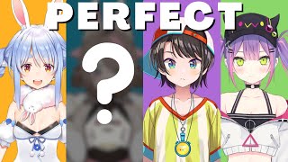
▶ Play ClipThis video presents three key guidelines for designing a VTuber model that stands out: strong silhouette, selective color palette, and the big-medium-small principle. The host demonstrates these concepts by designing a Cybernetic Cat VTuber, emphasizing clarity and personality in the design process.
A great VTuber design only needs three guidelines, which will be walked through to help viewers design their own dream model.
Suggest choosing 1-3 themes and a few supporting personality traits for clarity on first impression.
Use Pinterest or a blank canvas to collect reference images related to your ideas.
Keep the initial draft loose, as it will undergo many changes. Focus on the upper half since that's what's shown during streams.
Strong silhouette offers clarity and can signal personality. Use circles (friendly), squares (reliable), or triangles (dynamic).
Exaggerate features like head, jacket, and shoes to make the silhouette more iconic.
Limit colors to one main, one secondary, and a few supporting colors for clarity.
Colors can signify traits (e.g., red for energy, yellow for happiness), but associations are guidelines.
Use color theory (analogous, complementary) to find harmonious combinations. Neutral colors (black, white, gray, brown) can enhance variation without disrupting balance.
Design elements should be arranged in a hierarchy: main visual element, secondary elements, and supporting details, with rest areas for the eyes.
The design process takes time but is worth it. The final design is shown, and viewers are directed to a next video on separating drawings for Live2D.
The three guidelines—silhouette, color palette, and big-medium-small—provide a solid foundation for designing a distinctive VTuber model. The process requires planning and iteration but results in a strong start for a VTubing journey.
"The title promises three guidelines for standout VTuber design, and the video delivers exactly that with clear examples and a demo."
What are the three guidelines for designing a standout VTuber model?
Strong silhouette, selective color palette, and big-medium-small principle.
0:03
What shapes can be used in silhouette to signal personality traits?
Circles for friendliness, squares for reliability, triangles for dynamic.
1:42
How many main colors should be in a VTuber palette?
One main color, one secondary, and a few supporting colors.
2:35
What are neutral colors and how do they help?
Black, white, gray, brown; they enhance variation, soften vibrancy, and highlight focal points without disrupting balance.
3:32
What is the big-medium-small principle?
Design elements are arranged in a hierarchy: main visual element, secondary elements, and supporting details, with rest areas for the eyes.
4:25
Silhouette Recognition
Demonstrates how a character can be identified by silhouette alone, using Ollie as an example.
1:28Color Associations
Explains how colors can signify character traits, providing a useful guideline for design.
2:49Bae's Color Palette Example
Shows how neutral colors can tie together a chaotic palette, using a real VTuber example.
3:48Big, Medium, Small Principle
Introduces a key design principle for visual hierarchy, with IRyS 2.0 as an example.
4:25[00:00] This is how you design a VTuber model
[00:02] that stands out against the crowd.
[00:03] A great design only needs three guidelines.
[00:06] I'll walk you through all of them,
[00:07] so you can design your very own...
[00:08] DREAM VTUBER MODEL
[00:11] It takes a few week to fully plan,
[00:13] draw,
[00:14] and rig a model.
[00:16] A solid design can save you time
[00:18] and also give you a strong start to your VTubing journey.
[00:21] If you're new to the channel, welcome!
[00:23] I love all things VTuber.
[00:25] And on this channel, I'll give you the complete guide to become a VTuber yourself.
[00:28] Let's get started!
[00:30] For this video, I will be designing a Cybernetic Cat VTuber.
[00:33] I suggest choosing 1-3 themes and a few supporting personality traits.
[00:38] CLARITY on first impression is your goal
[00:41] Before we get into the specific guideline,
[00:43] you should create a reference board.
[00:45] You can do this by creating a Pinterest board
[00:47] with images relating to your ideas.
[00:50] Pinterest is nice because as you build up your references,
[00:53] it recommends similar images based on what you already saved.
[00:56] Likewise, you can organize your own set of images in a blank canvas
[01:00] if that works better for you.
[01:02] Next, draft an initial design.
[01:04] Keep it loose.
[01:06] We'll have it undergo a lot of changes throughout the video.
[01:09] And also, keep in mind,
[01:11] when you're streaming, you'll most likely be showing the upper half of the character.
[01:14] So, don't go too crazy on the legs...
[01:17] (unless, you want to)!
[01:18] *knock knock*
[01:19] *door opens*
[01:20] *distant voice* ʸᵉᵃʰˀ
[01:21] Oh, it's- it's Ollie.
[01:24] How did we figure out it was Ollie
[01:26] even BEFORE we see her?
[01:28] Of course, it's because of her silhouette.
[01:31] Characters are recognizable through their silhouette because of
[01:33] IDENTIFIABLE SHAPES
[01:35] Strong silhouette offers CLARITY,
[01:38] and they can even offer a sense of their personality.
[01:42] You can lean your designs into circles, triangles, or squares to signal certain trait.
[01:46] Circles tend to exude comfort and friendliness.
[01:50] Squares are strong, sturdy, and reliable.
[01:53] Triangles are sharp, unpredictable, and dynamic.
[01:57] Consider covering your design in a black silhouette,
[02:00] and evaluate what you can push or exaggerate to make it more iconic.
[02:04] A small tip- it can be just as simple as a small visual flair near the head.
[02:10] For my design, I exaggerated the head, jacket, and shoes.
[02:14] I also pushed angular and circular shapes as I see fit.
[02:18] With that done, we can move to the color palette.
[02:21] Hold up!
[02:22] Don't add too many colors.
[02:25] Why don't we narrow our choices juuuust a little bit?
[02:28] With an array of colors to choose from,
[02:30] how do we decide what color works best for us?
[02:32] There are many ways to approach color,
[02:34] but I recommend picking
[02:35] one main color,
[02:36] one secondary color
[02:38] and a few supporting colors in the end.
[02:41] Be SELECTIVE.
[02:43] CLARITY is what we strive for with our colors,
[02:45] and that's best achieve by limiting our palette to a few choices.
[02:49] interestingly, colors by themselves can signify a range of character traits
[02:53] such as red representing energy and passion
[02:56] or yellow representing happiness and youth.
[02:58] Of course, color associations are more like guidelines.
[03:02] So while yellow might signal happiness,
[03:04] it could signal danger to others.
[03:07] If you have trouble coming up with the color combination,
[03:10] we can use color theory.
[03:11] Color theory is thought of as the harmonious relationship of colors on the color wheel.
[03:16] Some examples include
[03:18] "analogous" where the colors are next to each other
[03:21] or "complimentary" where the colors are opposite of each other.
[03:25] I have included the link to the website,
[03:27] so you can try for yourself and see what works.
[03:30] One tip about colors is that black,
[03:32] white,
[03:33] gray,
[03:34] and brown are neutral colors.
[03:36] Neutral colors aren't on the color wheel,
[03:38] but they can compliment your palette
[03:40] without disrupting the balance of colors.
[03:42] They can enhance variation,
[03:44] soften vibrancy,
[03:46] and highlight focal point in a piece.
[03:48] My favorite example of this is Bae
[03:50] where her general design is based on the concept of chaos
[03:53] and further inspired by the Japanese temari ball.
[03:56] The blue, yellow, and red are loud and clashing, but the black and white ties her palette together in a more
[04:02] 𝘤𝘰𝘯𝘵𝘳𝘰𝘭𝘭𝘦𝘥 chaos for her design.
[04:05] For my own design,
[04:06] i thought that the robot was... kinda boring.
[04:09] so I took inspiration from a...
[04:11] lamp unexpectedly.
[04:13] What has more appeal?
[04:16] This...
[04:17] or this?
[04:18] Most people will say that the bottom set of boxes
[04:20] have more visual appeal than the top set of boxes.
[04:24] Why is that?
[04:25] This leads to the final guideline big, medium, and small.
[04:29] When it's applied to design,
[04:31] we can think of it like a stage.
[04:32] The main visual element is sharing the stage
[04:35] with the lesser secondary element
[04:37] which is being further supported by details.
[04:41] For example,
[04:42] in IRyS 2.0 her main design is concentrated on her head and her dress.
[04:47] This is gauged upon on first glance.
[04:50] The secondary elements that support these main elements
[04:53] are her horns, her ruffles, and her flowers.
[04:56] Some of the smaller details include
[04:59] her crown, her lacing, and the bows in her hair.
[05:03] While all of these elements are on stage
[05:05] taking place on her head and her dress,
[05:08] her legs serve as point of rest for our eyes.
[05:11] Otherwise, there would be competing elements with one another.
[05:15] A lot of this is subjective,
[05:17] so what you may consider to be "big", "medium", and "small",
[05:20] may differ from mine.
[05:21] I find that most VTuber designs
[05:23] tend to have their main elements,
[05:25] but struggle with some of the more supporting details.
[05:28] Perhaps you can add accessories to the hair,
[05:30] have wings in unique places,
[05:33] Or have...
[05:34] a nice hat!
[05:36] Be CREATIVE.
[05:37] The design process takes a while, but it's well worth it.
[05:40] Here is the final design I came up with.
[05:49] Watch this next video to learn how to separate your drawing for Live2D.
[05:52] It's super easy.
[05:54] Feel free to support me by subscribing to my channel,
[05:58] Or checking out my live stream here on YouTube.
⚡ Saved you time reading this? Transcribe any YouTube video for free — no signup needed.