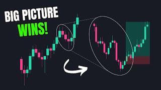

Why Your 5-Minute Trade Failed
44sRelatable trading loss story with a clear 'aha' moment when zooming out reveals the real trend.
▶ Play Clip"Delivers exactly what the title promises — a clear, practical guide to identifying higher timeframe bias with real examples."
This video explains how to identify higher timeframe bias in forex and crypto trading to align trades with the broader market direction, reducing the risk of losses from lower timeframe setups that contradict the larger trend. It demonstrates the use of multiple timeframes, key levels, and confirmation techniques with real chart examples.
A 5-minute chart showed a bullish move, but the 1-hour chart revealed a bearish overall trend. The apparent uptrend was just a corrective move, leading to a loss when the price resumed the larger downtrend.
A short setup on the 1-hour chart failed because the daily chart showed the price had just reached a significant support zone, indicating a potential higher timeframe reversal.
Using more than three timeframes adds unnecessary noise. The approach is to use a main timeframe for analysis, a lower timeframe for confirmation, and a higher timeframe for the bigger picture.
Higher timeframe supply/demand zones can cause significant trend changes on lower timeframes. Checking these levels helps set accurate targets and stop losses, avoiding trades likely to fail.
The best setups occur when higher and lower timeframes align. Trading against the higher timeframe trend (e.g., a corrective move in a larger uptrend) reduces the probability of success.
Lower timeframes contain noise and false breakouts. Identifying the higher timeframe bias first helps filter out setups against the broader trend and avoid fakeouts, like a liquidity grab in a bullish trend.
Use a maximum of three timeframes: a main timeframe for analysis, a higher timeframe for key levels and direction, and a lower timeframe for confirmation. Higher timeframes should only be used for basic concepts.
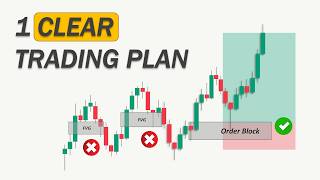
The 1-hour chart shows a bullish structure. The entry zone is at a fair value gap (order block) and the 618-786 Fibonacci retracement zone. The 4-hour chart confirms the bullish trend and identifies a key resistance target.
After the price approaches the zone, switch to the 5-minute chart to look for a clear reaction, such as a long wick rejection. Enter on the reaction candle with a stop-loss below the wick, giving the trade room to breathe.
A short setup is identified on the 1-hour chart with a supply zone and equal highs. However, the 4-hour chart shows the price is at a strong support area, indicating a high chance of rejection to the upside, making the trade risky.
Always combine higher timeframe analysis with lower timeframe setups to avoid trades that look perfect but go against bigger market moves.
What is the main mistake traders make when ignoring higher timeframes?
They can mistake a corrective move on a lower timeframe for a trend reversal, leading to losses when the price resumes the larger trend.
00:15
How many timeframes should be used for analysis according to the video?
A maximum of three timeframes: a main timeframe, a higher timeframe for the bigger picture, and a lower timeframe for confirmation.
07:27
What are the three reasons why higher timeframe bias matters?
1) Higher timeframe levels are more important, 2) It helps identify the macro trend, and 3) It filters out noise and fakeouts.
03:19
What is the ideal entry zone for a long trade based on the Fibonacci retracement?
The golden ratio between the 618 and 786 retracement levels.
09:29
What is a 'liquidity grab' in the context of a bullish higher timeframe trend?
A false breakout below a recent low on a lower timeframe that is actually a liquidity grab before the price reverses back up.
05:50
Higher Timeframe Levels are More Important
This principle explains why a seemingly perfect setup can fail, as higher timeframe zones are more significant than lower timeframe ones.
03:19Aligning with the Macro Trend
Trading in alignment with the higher timeframe trend significantly increases the probability of success.
04:30Filtering Noise and Fakeouts
Higher timeframe bias helps filter out false breakouts and noise, preventing unnecessary losses.
05:23Lower Timeframe Confirmation
Using a lower timeframe to confirm a reaction at a key zone increases confidence in the trade entry.
11:31[00:02] Dollar 5-minute chart. We apply the Fibonacci retracement tool from the start to the end of the recent impulse move and place a buy limit at the golden zone. This means that if the price pulls back to this level, it's considered a
[00:15] deep enough retracement for us to enter the market and benefit from the uptrend. However, the price suddenly drops and we end up losing the trade. To understand why, we zoom out to the 1-hour chart and realize that although the lower time
[00:29] frame showed a bullish move, the overall trend on the higher time frame was actually bearish. What seemed like an uptrend on the 5-minut chart was just a corrective move within a larger downtrend. Once the price resumed its
[00:42] higher time frame direction, it led to our loss. In another trading example, we see a clear downtrend on the 1 hour chart. A fair value gap above a liquidity zone appears to offer a promising shorting
[00:55] opportunity. So, let's set up the trade. Initially, the price reacts slightly, but it eventually hits our stop-loss once again, leaving us questioning what went wrong. By zooming out to the daily chart, we noticed that the price had
[01:08] just reached a significant support zone and we opened a sell position right after that. This means we were trading against a potential higher time frame reversal, which likely caused the setup to fail. So, how can we avoid this kind
[01:21] of mistake? It definitely doesn't require starting from the monthly time frame and analyzing all the way down to the 5-minut chart. In fact, using more than three time frames usually adds unnecessary noise. Anything beyond that
[01:35] is either too high level or too zoomed in to provide meaningful context. In this video, we'll show you how to identify the daily or higher time frame bias so you can trade in alignment with the bigger picture and avoid costly
[01:47] mistakes. If that's something you're interested in, don't forget to hit the interested in, don't forget to hit the like button to show your support. There are three types of time frames we work with.
[01:59] First, we have the main time frame where most of our analysis takes place. This includes identifying market direction and structure, spotting liquidity zones and imbalances, and finally marking the trading zone.
[02:14] If confirmation is needed and we're not entirely confident in taking the trade, we can zoom into a lower time frame to look for additional signals. For example, if we've marked a demand zone on the 1 hour chart, but want extra
[02:26] chart to see how the price reacts to that zone. Price action signals like pattern can serve as strong confirmations that the zone is being respected. These lower time frame clues can give us more confidence to take a
[02:41] long entry. On the other hand, it is also important to check the higher time frame to get a clearer view of the bigger picture and make sure our analysis aligns with the overall market direction. For example,
[02:54] an ideal trading scenario is when both the higher and lower time frames indicate an uptrend. Another strong setup is when a market structure shift on the lower time frame happens right at a key zone identified
[03:07] on the higher time frame. This brings us to the topic of today's video, which is how to analyze the higher time frame to determine the daily higher time frame to determine the daily bias. But first, why do we even need to
[03:19] determine the daily bias? And why does higher time frame matter? Reason number one, higher time frame levels are more important. higher time frame can lead to a significant trend change on the lower
[03:34] time frames. That's why before placing any trade, we should always check how reaches a higher time frame supply or demand zone. This helps us set more accurate targets and stop losses and also avoid getting into trades that are
[03:49] likely to fail. For example, here on the USD JPY 1 hour chart, we can see a strong uptrend. At first glance, it looks like a promising bullish market to enter a long trade. However, the price fails to create a new higher high and
[04:04] reversing. frame, we can clearly see that this area has acted as a strong support and resistance recently. So, despite the heavy bullish momentum on the 1 hour
[04:17] chart, the market experienced a reversal. This shows why higher timeframe key levels are more crucial. They offer a stronger indication of where major reactions are likely to happen because they reflect long-term
[04:30] trends and more stable areas of interest. Reason number two, identifying the macro trend. The best trading setups occur when the higher time frame and lower time frame
[04:42] are in alignment. Imagine entering a trade on the 15-minute chart just because you see a bearish structure forming. But without checking the higher time frame, you miss the fact that this downtrend could simply be a corrective
[04:55] move within a larger bullish trend. In this case, the price can reverse at any moment and continue in the major bullish direction. On the contrary, when the lower time frame setup aligns with the higher time frame trend, you are trading
[05:10] with the overall momentum. This greatly increases the probability of success as you are not fighting the dominant direction of the market. Reason number three, filtering noise and fake outs.
[05:23] Lower time frames often contain a lot of market noise, unpredictable price swings, and false breakouts that can easily trick traders into entering bad positions. By identifying the higher time frame bias first, we gain clarity
[05:36] on the dominant market direction. This helps us filter out setups that go against the broader trend and avoid falling for fakeouts that occur during phases. For example, on a 5-minute chart, you
[05:50] might see what looks like a breakout below a recent low. But if the higher time frame trend is bullish, that breakout could simply be a liquidity grab before the price reverses back up. Without the higher time frame
[06:02] perspective, this can lead to unnecessary losses. frames are important, let me show you how to find the higher time frame bias on a chart and explain what concepts we use step by step. But before we
[06:17] continue, if you want to get a funded account quickly, check out Funded Next's new Stellar Instant plan, which does not require a challenge phase. That's right, you get instant access to trading capital from day one. There is no daily
[06:30] draw down limit, no minimum trading days, and you can withdraw profits anytime. The best part, make just 10% and Funded Next doubles your account. They also offer plenty of other plans ranging from $5,000 to $200,000
[06:45] accounts. And finally, some of the best offers if If that's something you're interested in, check out the link in the Let's talk about using more than one time frame to make better trading
[06:59] decisions. This is a general trading plan that uses multiple time frames based on the main ones most traders focus on when analyzing charts. However, starting from the monthly chart and going all the way down to the one minute
[07:13] chart, thinking it will lead to a perfect trade. Actually, doing that can make things more confusing. The chart will be filled with too much information and noise, and you might not know what to do. That's why it is better to use a
[07:27] maximum of three time frames. For example, if your main analysis is on the 1 hour chart, you can use the 4our and daily charts to support your setup. More importantly, higher time frames should only be used to apply basic concepts
[07:41] like marking key levels and identifying the overall market direction. You do not need to go through every single time frame. Using too many charts can lead to confusion and mixed signals. Sticking to just two higher time frames
[07:55] get a clear picture without over complicating things. So in this part of the video, let's look at some real chart examples to show how we combine multiple time frames from identifying the higher time frame bias
[08:09] to finding confirmation and entering the trade. The time frames we are going to use in this analysis are the 1-hour chart as the main time frame for our analysis, the 4hour and daily charts for the higher time frame, and the 5-minut
[08:23] chart for confirmation and entry reasons if needed. So here we have the Euro dollar on the 1 hour chart. The structure is clearly bullish, consistently breaking above previous market highs, which is exactly
[08:37] what we want to see. If the market appears unclear or choppy, it's better to switch to another trading pair or simply close the chart and wait for the next day. There's no need to trade every single day. And taking more trades
[08:49] single day. And taking more trades doesn't necessarily lead to more profit. So the 1 hour chart suggests an uptrend and we are only interested in buying this pair. However, we can't enter the market right now because the price has
[09:01] moved up quickly and may correct at any moment. Therefore, we need to wait for a pullback to enter at a better price. Now the question is where is our optimal entry zone? If we focus on the most recent impulse,
[09:16] we can see that it has created a fair value gap. Let's mark the candle that created this gap as our order block zone as there's a higher chance of seeing a rejection if the price retraces back into this area. For further
[09:29] confirmation, we can apply the retracement tool from the start to the end of the recent impulse. We can see that this zone falls within the golden ratio between the 618 and 786 retracement levels, which is an ideal
[09:42] area to look for buying opportunities. All of this analysis suggests that we should wait for a pullback and look to go long once the price reaches our trading zone. Now, let's check the higher time frame to see if our analysis
[09:55] aligns with the bigger picture. So, let's switch to the 4hour chart. We don't want to over complicate our trading. So, on the higher time frame, we only aim to identify the overall direction and key market structure
[10:09] levels. Here we can observe that the price was in a long-term downtrend but the situation has now changed. The price has broken above trend lines and key supply levels indicating strong bullish momentum.
[10:23] So essentially the 4hour chart also confirms a bullish market and an ongoing Now let's identify the key zones where the price has recently reacted. Close to the current price. We can see two important levels that have acted as both
[10:38] support and resistance multiple times. At the top, there's also a strong level that has rejected the price twice and acted as a major turning point for the 4hour structure. This makes it a very significant zone and the price is likely
[10:52] to react again once it reaches that area. This means that if we go long, our longerterm target would be that upper resistance zone. But for now, there's still plenty of room for the price to move before reaching that level.
[11:05] With all of this considered, the higher time frame analysis aligns perfectly with what we observed on the lower time frame. So, let's switch back to the 1 hour chart. Now that the higher time frame also
[11:17] confirms a bullish trend, it makes sense to consider opening a buy position at the order block and placing the stop-loss just below it. However, we can also zoom into the lower time frames to look for a reaction to the order block,
[11:31] which helps us enter with more confidence. First, wait for the price to approach the zone. Then switch to the 5-minut chart here. The only thing we want to see is a
[11:43] clear reaction to the zone. This could simply be a long wick rejection from the area, which is enough to confirm interest. In that case, we enter the candle and place the stop- loss below the wick. However, we don't set the
[11:57] stop- loss too tight. We want to give the trade enough room to breathe and avoid getting stopped out by normal market fluctuations.
[12:09] were able to align the overall trend with a precise entry point, increasing the probability of a successful trade and improving our overall confidence in the setup. Now, let's see another example.
[12:21] Here on the pound dollar 1 hour chart, we have a clear downtrend. The recent impulse has created an imbalance and also formed equal highs which means that liquidity has gathered above this level. We can mark this small consolidation
[12:35] area before the imbalance as a supply zone. As smart money traders, we know that if the price retraces above the equal highs, grabs the buyside liquidity and reaches the supply zone, it would create a perfect opportunity to go
[12:48] short. So, we can set a sell limit at this zone and place our stop loss above the zone. However, before moving forward, let's check the higher time frame to see the bigger picture. Here on the 4hour chart, we can see that
[13:02] the price has tapped into a strong support area. The price has reacted to this level multiple times recently. It has been a turning point for the price and the moves away from this area have been sharp. All of which are signs of a
[13:15] key higher time frame level. This means that now as the price touches this zone again, there is a higher chance of a rejection to the upside and the price higher regardless of the bearish pressure seen on the 1 hour
[13:29] chart. So if we go back to the 1 hour chart and the potential setup we identified, it would be quite risky to take this trade. And if we play the price forward, you can see how strongly the price reacted to the higher time
[13:42] losses and eventually reversing This is a good example of why we should always check higher time frame zones before entering a trade based on a lower time frame setup. So, always combine
[13:55] strategy to avoid setups that look perfect but go against bigger market moves. So, guys, that's it for this video. I hope it was helpful. If it was, please smash the like button and don't forget
[14:08] to comment your thoughts and questions. See you in the next episode.
⚡ Saved you 0h 14m reading this? Transcribe any YouTube video for free — no signup needed.