
5 Smart Money Concepts to End Confusion
45sDirectly addresses a pain point for traders (confusion) and promises a clear solution, making it highly relatable and clickable.
▶ Play Clip"The title accurately promises a beginner-to-pro guide, and the video delivers on all five concepts with clear explanations."
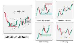
This video explains five core smart money concepts—market direction, liquidity, supply and demand, order blocks, and top-down analysis—to help traders understand price action like professionals. It provides a step-by-step framework for identifying trends, spotting liquidity grabs, and using higher time frames for better trade setups.
Identify the trend and who is in control (buyers or sellers). Use mitigation of demand/supply zones to determine control. In an uptrend, demand zones form at higher lows; if price breaks a demand level, supply takes control.
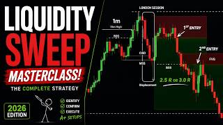
Liquidity is where pending orders and stop losses cluster. Smart money hunts these levels to fill large orders. Marking liquidity helps identify price targets, avoid traps, and plan high-probability trades.
Demand zones are areas where buyers pushed price up; supply zones where sellers pushed down. Strong zones are formed by impulsive moves (e.g., three consecutive momentum candles). Mark the base of the move.
Order blocks are supply/demand zones formed by large institutional orders, identified by the candle before a fair value gap. Include wicks that grab liquidity. Use wider stops for small blocks.
Start with weekly chart to mark key structure levels, then daily, then 4-hour (apply concepts like trend, imbalance, liquidity), then 1-hour (main trading timeframe), and lower for entry confirmation.
Mastering these five smart money concepts—market direction, liquidity, supply and demand, order blocks, and top-down analysis—provides a structured approach to reading price action and making informed trading decisions.
What is the first step in analyzing a price chart according to smart money concepts?
Identifying the market direction (trend) and determining whether buyers or sellers are in control.
00:39
What happens when price mitigates a demand level?
Demand takes control over supply.
01:06
What is liquidity in technical analysis?
An area on the chart where many pending orders and stop losses are placed.
03:40
Why do smart money traders mark liquidity zones?
To identify potential price targets, avoid getting trapped, and plan trades with higher probability.
05:28
In an uptrend, where is liquidity typically found?
Below swing lows (sell-side liquidity).
06:39
What is a bullish liquidity grab pattern?
When price wicks below a liquidity level or closes below it, then quickly returns inside the range, trapping sellers.
08:11
How are strong supply and demand zones identified?
By impulsive price moves with three consecutive momentum candles (green for demand, red for supply) and strong push distance.
10:35
What is an order block?
A supply or demand zone formed by a large institutional order, marked as the candle before a fair value gap.
13:08
What is top-down analysis?
Starting chart analysis with higher time frames (weekly, daily) and moving down to lower time frames (4-hour, 1-hour, 15-minute) for entry confirmation.
15:08
What is the main trading time frame recommended in the video?
The 1-hour chart.
16:17
Mitigation Determines Control
Explains the core mechanism of how supply and demand shift control, a foundational smart money concept.
01:06Liquidity as a Tool
Clarifies how smart money uses retail traders' stop losses and orders to fuel price moves.
03:40Objective Zone Identification
Provides a clear, rule-based method (three momentum candles) to mark supply/demand zones, reducing subjectivity.
10:35Order Blocks and Fair Value Gaps
Introduces order blocks as institutional-level zones tied to price imbalances, a key refinement of supply/demand.
13:08Top-Down Analysis Framework
Offers a structured multi-timeframe approach that keeps traders aligned with the larger trend and improves entry timing.
15:08[00:02] concepts on the chart, yet still get confused and struggle to find clear setups. That's why in this video, I'm going to explain five simple smart money concepts that will clear up your confusion and help you know exactly what
[00:15] you're looking for. These concepts include market direction, liquidity, supply and demand, order blocks, and top-down analysis. By the end of this video, you'll know
[00:27] the chart like a professional smart money trader. So guys, if that's hit the like button to support our channel and subscribe if you're new.
[00:39] it. Number one, market direction. price chart. Identifying the market direction, supply
[00:52] Identifying the market direction, supply or demand, who is in control? generally the first step in analyzing a price chart. We want to identify the trend and determine whether buyers or sellers are in control.
[01:06] direction as the controlling side of the market to increase the win rate. How does the system work? The system works based on mitigations. When the price mitigates a demand level, demand takes control over supply.
[01:22] Conversely, when the price mitigates a supply zone, supply takes control over demand. Imagine the price is moving in an uptrend, creating a series of higher highs and higher lows.
[01:35] Each time the price breaks structure to the upside, a demand zone is formed. These demand zones remain unmitigated until the price returns to them, offering a good opportunity to follow the trend.
[01:48] However, if the price breaks below a demand level, forming a change of character, it indicates that supply is now in control over demand, and the now in control over demand, and the market has formed valid supply zones.
[02:01] The price keeps moving down, creating new supply levels until it reaches the yet. At this point, there is a fight between supply and demand, and we need to wait to see which side wins.
[02:14] You should watch these levels closely. A clean break and retest can give good trade setups, while false breakouts can trap traders who enter too early. Here, we have a series of higher highs and higher lows, showing that demand is
[02:29] The market sentiment is bullish, so the price is more likely to continue pushing The direction will remain bullish, and we will only look for long opportunities as long as the price stays above the recent demand zone.
[02:44] recent demand zone. So, let's see what will happen. fails to create a new high because buyers are not strong enough, and supply area. Now, we can say that buyers are no
[02:58] the way. If we treat these points as the beginning of the impulsive move that shifted the market structure, then they become our supply zones. From there, the market keeps breaking
[03:11] structures to the downside, showing that supply is in control. Another supply zone forms, and the price reaches the next unmitigated demand area This demand zone can be an area of interest for buyers to step back into
[03:25] the market. At this stage, there is a battle between buyers and sellers, and we need to wait and watch the price action to see who takes control. It is important to remember that we cannot control the market. What we can
[03:40] do is prepare ourselves for the different scenarios that may happen. Number two, liquidity. In technical analysis, liquidity is an area on the chart where many pending orders and stop losses are placed.
[03:56] action. If the price pulls back to this support area, many traders see it as a buying opportunity because it has acted as both it a strong market structure level that can push the price higher.
[04:12] But smart money sees it as an opportunity to collect liquidity. If they want to buy this asset, they need sellers in the market. In other words, they need liquidity. When retail traders enter at this level,
[04:25] they usually place their stop losses just below it. liquidity to fill their own buying orders. In another example, imagine smart money wants to sell this pair.
[04:38] To do that, they need liquidity to fill their large orders. So, where is the liquidity? Liquidity exists where retail traders enter the market. Here, we have an area of resistance that
[04:51] Here, we have an area of resistance that has rejected the price multiple times. If the price returns to this zone, many traders will go short, placing their stop losses just above it. This means the liquidity is above the
[05:03] To hunt these stops, smart money needs to push the price higher to trigger the to push the price higher to trigger the stop losses and fill their orders. Also, when the price breaks above this resistance, many breakout traders will
[05:16] enter the market expecting the price to continue higher. Their buy orders also become the liquidity smart money needs. Once smart money gathers the required liquidity, the price will drop, trapping
[05:28] retail traders on both sides. Now, we've covered the general idea of liquidity. But the real question is, why should we mark these zones on the chart? Let's look at the main reasons. Number
[05:43] one, identifying potential targets for price. because it is required for future movements. So, we mark these levels as targets for our trades. For example, if there's a major liquidity zone below the
[05:57] price, the market may push the price there to grab that liquidity. anticipate where the price is likely to go next instead of guessing. Number two, avoid getting trapped.
[06:11] We know that manipulation happens around liquidity levels most of the time. By recognizing where these levels are, you can stay on the right side of the market and avoid being caught in false moves. Number three,
[06:24] plan trades with higher probability. Once you know where liquidity sits, you can plan entries, exits, and stop losses more strategically. you might wait for the price to sweep liquidity and then enter in the
[06:39] direction of the next move. This gives you a higher chance of success than randomly jumping into the market without context. It's worth mentioning that in an uptrend, the liquidity below swing lows
[06:51] above swing highs. This is because when the market pulls back, smart money often targets those swing lows to collect sell-side liquidity before pushing the price higher again.
[07:03] These levels act as strong support zones where stops and pending sell orders are clustered, giving the market a chance to fuel the next upward move. Similarly, in a downtrend, the liquidity above swing highs becomes more important
[07:18] to collect buy-side liquidity before continuing lower. Now, it's time to understand what happens around these levels and how the liquidity grab pattern works. But before we continue,
[07:32] if you're looking for a trusted prop firm with fast and reliable payouts, then you need to check out Funded Next. Funded Next is one of the pioneer prop firms that offers both futures accounts and CFDs all in one place,
[07:44] flexibility. They provide a wide range of challenge accounts starting from $5,000 all the way up to $200,000, and they also offer instant funding options, meaning you can start trading
[07:57] without going through a challenge phase. And for the smart risk community, you can get an exclusive 7% discount plus a 120% account reward, which is only So, if that's something you're interested in,
[08:11] check out the link in the description. A bullish liquidity grab pattern happens when the price wicks below a liquidity level or even closes below it, but then quickly returns inside the range. Now, what does this show in terms of
[08:24] It means that the market was reaching triggering stop losses and trapping breakout traders. This is often a strong signal that the market is likely to move in the opposite
[08:37] direction of the liquidity grab. For example, if price sweeps above Asian high during the London opening, but then quickly closes back below the level, it shows buyers have been trapped. This gives traders a chance to look for
[08:50] short setups expecting the price to reverse and move lower. The same logic works for a bearish liquidity grab pattern. when the price moves above a key
[09:03] liquidity level, triggers stop losses and buy orders, but then quickly reverses and closes back below that level. This shows that buyers have been trapped and selling pressure has taken control,
[09:15] often leading to a move lower. For example, in a clear downtrend, if the market gathers enough liquidity, the next downward movement is likely to creating a short trading opportunity. When a liquidity grab pattern forms at a
[09:30] resistance level, it can be a strong signal that the market is likely to move Now, the liquidity grab pattern is an early reversal sign, but in order to make it more reliable, you can combine it with
[09:43] the change of character. Number three, supply and demand. Now, what are the supply and demand zones on the chart? previously entered the market and pushed price higher.
[09:58] Similarly, a supply zone is an area where sellers have entered the market and pushed price lower. These zones are important because markets often remember where strong buying or selling occurred.
[10:10] When price returns to a supply zone, sellers may step in again, potentially causing price to move lower. When price revisits a demand zone, buyers may become active again, which can push the price higher.
[10:22] In simple terms, demand zones act like potential support, and supply zones act like potential resistance. They help us identify areas on the chart where price is more likely to react rather than move randomly.
[10:35] But, the key point here is that we want to look for aggressive buying and selling when identifying supply and demand, not slow, sideways movement. Strong zones are usually created by impulsive price moves, showing clear
[10:49] imbalance between buyers and sellers. To make things more objective, we need to see three green momentum candles to mark an area as a demand zone. Similarly, three consecutive red candles with large bodies and strong push
[11:03] distance would make a good supply zone. The reason is that we want to identify an area where traders previously showed interest, rather than just small moves in the market. Now, how do we correctly mark the supply
[11:16] and demand zone range on the chart? While traders use different methods to mark these zones, the most important rule is to focus on the area where the Marking the start of the move largely depends on the candles formation.
[11:31] let's look at some common to mark these zones on the chart. this is our latest impulsive move to the upside. This green candle represents the area that created this move. So, we mark it
[11:44] the decisions were made during this candle. When price returns to this area, we expect a rejection somewhere inside the zone. Another common way is to mark the last
[11:56] red candle before the bullish move. This candle represents the last selling pressure in the market. We mark this area as a demand zone because once price breaks above supply, it turns into demand.
[12:09] When price returns to this area, we expect a reaction, which may lead to a rejection or continuation to the upside. Here, the demand zone is drawn from the wick of the candle since it shows where price was rejected and the momentum move
[12:23] The move did not start from the first green candle nor the previous red candle. It started at the bottom of the wick, which forms our demand zone. on the chart because they highlight areas where strong price rejection
[12:39] By marking these levels, we can often expect price to react again when it revisits the zone. With all that being said, here's a very No matter how accurately you draw the supply and demand zone, getting rejected
[12:54] guaranteed. Sometimes the market reverses before reaching the demand area, and other times it needs a deeper retracement. times it needs a deeper retracement. Number four, order blocks.
[13:08] Order blocks are a type of supply and demand zone, but they form when a large number of buyers or sellers enter the market, creating a price imbalance. The imbalance between buyers and sellers can be seen through fair value gaps.
[13:22] These gaps happen when price moves quickly, leaving orders unfilled, and the market may come back to these areas later to regain the balance. We mark the candle before the gap as our order block zone because we believe
[13:34] decisions are made during that candle. We expect that if the price returns to this order block, it could react strongly as buyers or sellers step back in. So, basically, order blocks are supply
[13:47] and demand zones, but the difference is that we focus on areas where larger institutional orders are placed. Now, how do we mark the order blocks? We take the entire candle before the fair value gap and mark it as the order
[14:00] block. The color of the candle doesn't matter. For example, in a bullish gap, it makes no difference whether the candle is green, red, or even a doji without a strong body.
[14:13] All of them can be considered valid demand order blocks. Here's an important point. Sometimes a wick grabs liquidity before the imbalance happens. In that case, we also include the wick as part of the order
[14:26] This marks the real beginning of the imbalance, and our stop loss should always be placed below this wick for protection. Order blocks can be small or very large. When the zone is small, we should use a
[14:40] wider stop loss below it because even though order blocks are strong supply and demand areas, the price doesn't always reverse exactly from this box. We need to give it some room to breathe. On the other hand, when the order block
[14:54] around the middle of the zone for a better price or switch to lower time frames to look for confirmation and rejection signals. rejection signals. Number five, top-down analysis.
[15:08] So, what is top-down analysis? Top-down analysis means starting chart analysis with higher time frames, like weekly and daily, and then moving down weekly and daily, and then moving down to smaller details, like 4-hour, 1-hour,
[15:21] analysis. Now, why is top-down analysis so important? Top-down analysis is important because conditions better before you take any trade.
[15:34] When you start from higher time frames, you can clearly see the overall trend, strong levels of market structure. Then, when you move down to lower time frames, you can find cleaner entries and avoid trades that go against the bigger
[15:48] In short, it keeps you on the right side of the market, reduces bad trades, and gives you more confidence in your decisions. higher time frames, including the weekly and daily charts.
[16:03] The main chart analysis is done on the 4-hour and 1-hour charts. For extra confirmation, you can zoom into the 15-minute and 5-minute charts, Now, let me show you how to apply it step-by-step on the price chart.
[16:17] Step one, start with the weekly time frame. On this higher time frame, the only thing we need to focus on is identifying and marking key market structure levels. That's all we use the weekly chart for.
[16:30] We don't apply any other concepts here because they aren't necessary. Our main trading time frame is the 1-hour chart and lower. The reason we mark these levels is that when price taps into them, we expect a
[16:42] clearly when working on the lower time frames. But, what are market structure levels? Market structure levels are important price zones on a chart where reaction. Every reaction can be identified as a
[16:56] market structure level, but here are five key criteria that make a level strong. Here we have the euro dollar on the We don't want to overload the chart with lines, so only draw the market structure
[17:09] levels that are near the current price. When drawing these levels, keep in mind where where can capture the greatest number of touches. Whether you draw from the candle bodies or the wicks doesn't matter.
[17:22] For example, here if I draw the level like this, I can only get two touches. But if I adjust it like this, I get all of the price reactions. Also, treat the levels as zones, not precise single lines.
[17:35] level at the top that has acted as strong resistance multiple times. So, we mark it. In the middle, this key area has rejected price several times and has
[17:47] acted as both support and resistance. So, we mark that as well. precise here because we'll refine these levels later frames. Finally, we draw the tip of the long
[18:02] lower shadow as another key weekly level from the bottom. This is all we need from the weekly time frame, just marking the key market structure levels. So, we don't trade blindly when analyzing the lower time
[18:14] frames. Now, let's move on to the daily chart. On the daily time frame, we first adjust the weekly levels from the daily perspective and candlesticks. Next, we draw the daily key levels of
[18:27] market structure in a different color. The reason for this is that we want to easily distinguish between weekly and daily levels when we zoom into the lower time frames since the higher the time frame, the more important the level
[18:39] becomes. On the daily time frame, above the this level has acted as both support and resistance recently and the move away from it was strong. So, we draw it in.
[18:52] At the bottom, this level is clearly a turning point on the lower time frames. So, the price will probably react to it and we mark it as well. This is everything we need from the daily perspective. We are not applying
[19:04] additional concepts yet because we still have a long way to go before we reach the 1-hour chart. Now, let's move on to the 4-hour chart. Now, the 4-hour chart is where we start applying the key smart money concepts:
[19:17] market direction, imbalance, supply and demand zones, and liquidity levels. uptrend. We can mark the breakouts and also the
[19:29] swing points like this. However, the price has tapped into a higher time frame key level, which has the power to slow down or even reverse the trend. Additionally, just below the current price, there is a strong demand zone
[19:42] that coincides with a key weekly level. When price taps into this zone, we the price higher. To trade this 4-hour demand zone, we need to zoom into the 15-minute chart and look for confirmations when the
[19:57] price enters this area. But for now, let's move to the 1-hour chart because it's the main time frame we trade. Here on the 1-hour chart, we do not have a clear trend. The market has formed a change of
[20:10] character in the 1-hour structure by breaking below this level, which signals that a possible reversal may be coming. But we also know the 4-hour structure is still bullish, and we have a strong demand zone below the price.
[20:23] So, right now, the best thing to do is wait and see which side takes control. If the price breaks below the 4-hour zone, supply takes control over demand. In this case, both the 1-hour and 4-hour structures turn bearish, and we can
[20:39] confidently look for short trades. But if the price rejects the 4-hour demand zone and breaks above the daily structure, then both the 1-hour and 4-hour charts become bullish, and we can look for long trades.
[20:52] So, let's play the price forward and see what happens. attempts, the price finally broke below the demand zone. Now, supply is in control, and both the 4-hour and 1-hour structures are
[21:07] setup. Let's mark the breakouts and the supply zones. Here, we can also mark these equal highs, which act as a liquidity level. This creates a great trading
[21:20] opportunity. If the price pulls back into the supply zone, it will give us an entry. Once again, we get a breakout and a new supply zone forms. We can enter short trades until the price reaches the next
[21:33] important level ahead. So guys, that's it for today's If you enjoyed the video, make sure to like and subscribe, and I'll see you in the next one. If you want to stay updated and keep learning with us, feel
[21:46] Discord channels for daily chart analysis and community discussions, or join our membership program to unlock exclusive members-only videos and access to the pro zone on Discord, where we share VIP chart analysis and in-depth
[22:01] share VIP chart analysis and in-depth discussions.
⚡ Saved you 0h 22m reading this? Transcribe any YouTube video for free — no signup needed.